Important: This documentation is about an older version. It's relevant only to the release noted, many of the features and functions have been updated or replaced. Please view the current version.
Dashboard management maturity model
Dashboard management maturity refers to how well-designed and efficient your dashboard ecosystem is. We recommend periodically reviewing your dashboard setup to gauge where you are and how you can improve.
Broadly speaking, dashboard maturity can be defined as low, medium, or high.
Much of the content for this topic was taken from the KubeCon 2019 talk Fool-Proof Kubernetes Dashboards for Sleep-Deprived Oncalls.
Low - default state
At this stage, you have no coherent dashboard management strategy. Almost everyone starts here.
How can you tell you are here?
- Everyone can modify your dashboards.
- Lots of copied dashboards, little to no dashboard reuse.
- One-off dashboards that hang around forever.
- No version control (dashboard JSON in version control).
- Lots of browsing for dashboards, searching for the right dashboard. This means lots of wasted time trying to find the dashboard you need.
- Not having any alerts to direct you to the right dashboard.
Medium - methodical dashboards
At this stage, you are starting to manage your dashboard use with methodical dashboards. You might have laid out a strategy, but there are some things you could improve.
How can you tell you are here?
Prevent sprawl by using template variables. For example, you don’t need a separate dashboard for each node, you can use query variables. Even better, you can make the data source a template variable too, so you can reuse the same dashboard across different clusters and monitoring backends.
Refer to the list of Variable examples if you want some ideas.
Methodical dashboards according to an observability strategy.
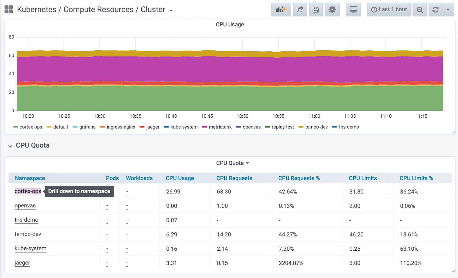
Hierarchical dashboards with drill-downs to the next level.
![Example of using drill-down Example of using drill-down]()
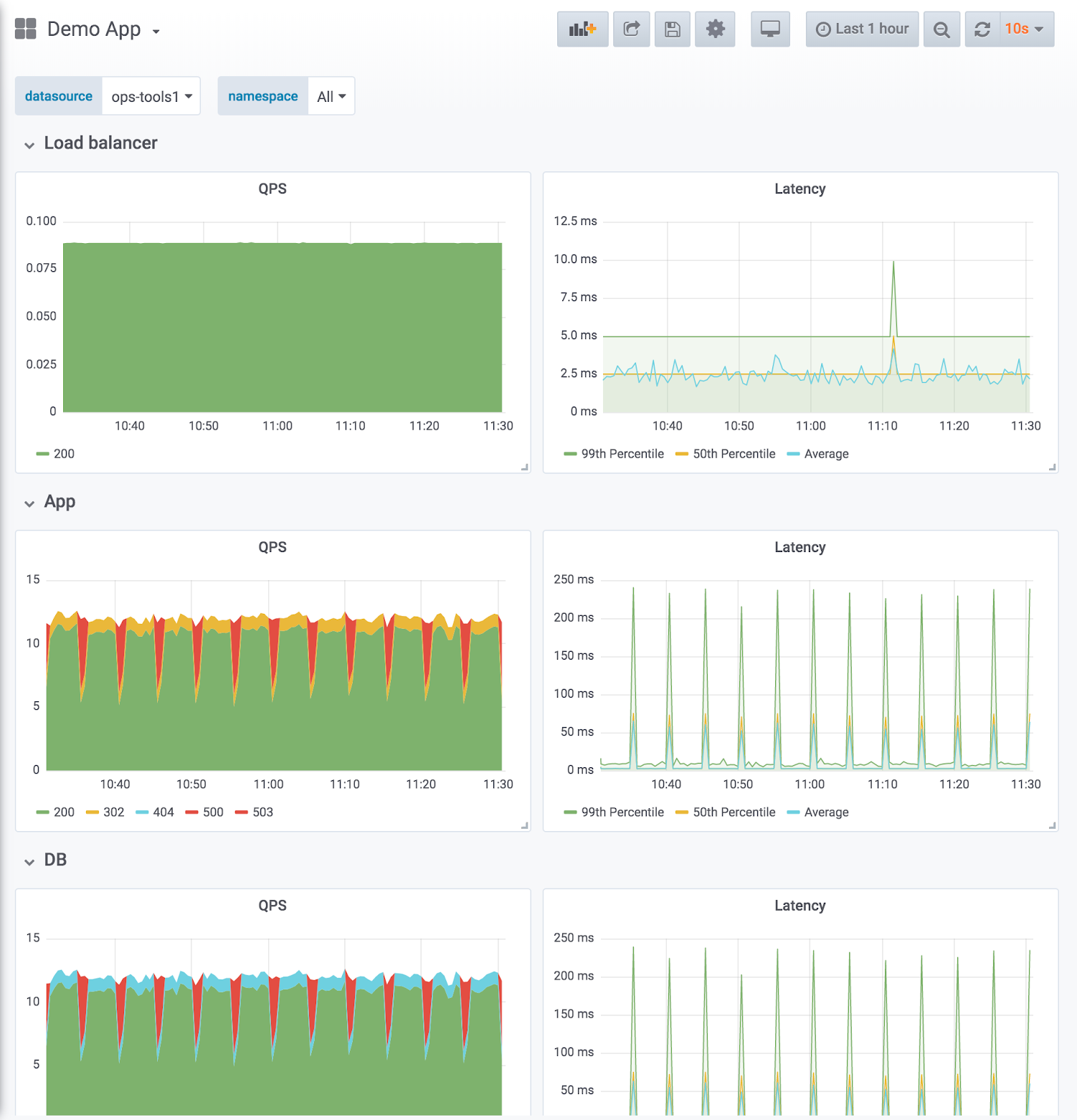
Example of using drill-down Dashboard design reflects service hierarchies. The example shown below uses the RED method (request and error rate on the left, latency duration on the right) with one row per service. The row order reflects the data flow.
![Example of a service hierarchy Example of a service hierarchy]()
Example of a service hierarchy Compare like to like: split service dashboards when the magnitude differs. Make sure aggregated metrics don’t drown out important information.
Expressive charts with meaningful use of color and normalizing axes where you can.
- Example of meaningful color: Blue means it’s good, red means it’s bad. Thresholds can help with that.
- Example of normalizing axes: When comparing CPU usage, measure by percentage rather than raw number, because machines can have a different number of cores. Normalizing CPU usage by the number of cores reduces cognitive load because the viewer can trust that at 100% all cores are being used, without having to know the number of CPUs.
Directed browsing cuts down on “guessing.”
- Template variables make it harder to “just browse” randomly or aimlessly.
- Most dashboards should be linked to by alerts.
- Browsing is directed with links. For more information, refer to Manage dashboard links.
Version-controlled dashboard JSON.
High - optimized use
At this stage, you have optimized your dashboard management use with a consistent and thoughtful strategy. It requires maintenance, but the results are worth it.
- Actively reducing sprawl.
- Regularly review existing dashboards to make sure they are still relevant.
- Only approved dashboards added to master dashboard list.
- Tracking dashboard use. If you’re an Enterprise user, you can take advantage of Usage insights.
- Consistency by design.
- Use scripting libraries to generate dashboards, ensure consistency in pattern and style.
- grafonnet (Jsonnet)
- grafanalib (Python)
- No editing in the browser. Dashboard viewers change views with variables.
- Browsing for dashboards is the exception, not the rule.
- Perform experimentation and testing in a separate Grafana instance dedicated to that purpose, not your production instance. When a dashboard in the test environment is proven useful, then add that dashboard to your main Grafana instance.


