Important: This documentation is about an older version. It's relevant only to the release noted, many of the features and functions have been updated or replaced. Please view the current version.
Stat
Stats show one large stat value with an optional graph sparkline. You can control the background or value color using thresholds or overrides.

Note
This visualization replaces the Singlestat visualization, which was deprecated in Grafana 7.0 and removed in Grafana 8.0.
By default, a stat displays one of the following:
- Just the value for a single series or field.
- Both the value and name for multiple series or fields.
You can use the Text mode to control how the text is displayed.
Example screenshot:

Automatic layout adjustment
The panel automatically adjusts the layout depending on available width and height in the dashboard. It automatically hides the graph (sparkline) if the panel becomes too small.
Value options
Use the following options to refine how your visualization displays its values:
Show
Display a single value per column or series, or show values for each row.
Calculate
Display a calculated value based on all rows.
- Calculation - Select a reducer function that Grafana will use to reduce many fields to a single value. For a list of available calculations, refer to Calculation types.
- Fields - Select the fields display in the visualization.
All values
Show a separate stat for every row. If you select this option, then you can also limit the number of rows to display.
- Limit - The maximum number of rows to display. Default is 5,000.
- Fields - Select the fields display in the visualization.
Stat styles
Style your visualization.
Orientation
Choose a stacking direction.
- Auto - Grafana selects what it thinks is the best orientation.
- Horizontal - Bars stretch horizontally, left to right.
- Vertical - Bars stretch vertically, top to bottom.
Text mode
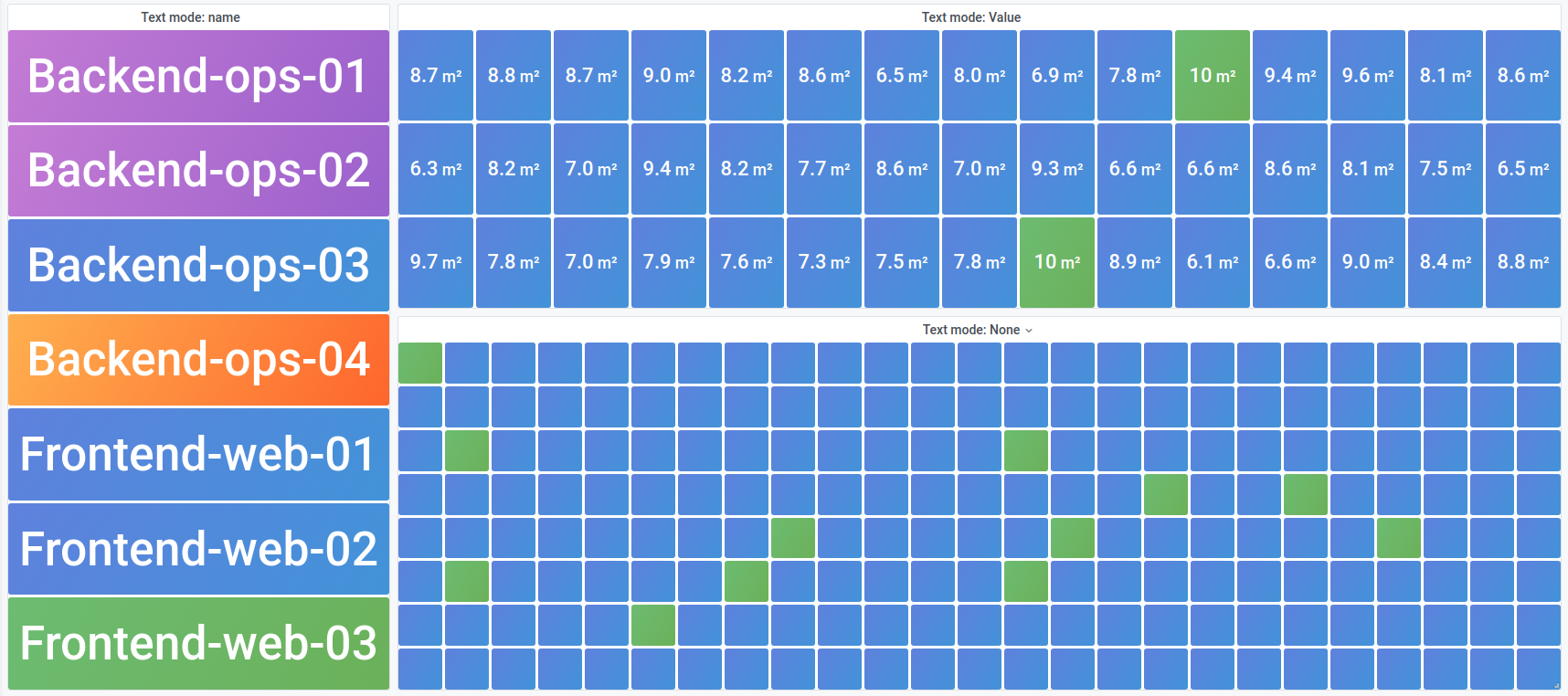
You can use the Text mode option to control what text the visualization renders. If the value is not important, only the name and color is, then change the Text mode to Name. The value will still be used to determine color and is displayed in a tooltip.
- Auto - If the data contains multiple series or fields, show both name and value.
- Value - Show only value, never name. Name is displayed in the hover tooltip instead.
- Value and name - Always show value and name.
- Name - Show name instead of value. Value is displayed in the hover tooltip.
- None - Show nothing (empty). Name and value are displayed in the hover tooltip.
Color mode
Select a color mode.
- None - No color applied to the value.
- Value - Applies color to the value and graph area.
- Background Gradient - Applies color to the value, graph area, and background, with a slight background gradient.
- Background Solid - Applies color to the value, graph area, and background, with a solid background color.
Graph mode
Select a graph and sparkline mode.
- None - Hides the graph and only shows the value.
- Area - Shows the area graph below the value. This requires that your query returns a time column.
Text alignment
Choose an alignment mode.
- Auto - If only a single value is shown (no repeat), then the value is centered. If multiple series or rows are shown, then the value is left-aligned.
- Center - Stat value is centered.
Text size
Adjust the sizes of the gauge text.
- Title - Enter a numeric value for the gauge title size.
- Value - Enter a numeric value for the gauge value size.


