Important: This documentation is about an older version. It's relevant only to the release noted, many of the features and functions have been updated or replaced. Please view the current version.
Canvas
Canvases combine the power of Grafana with the flexibility of custom elements. Canvases are extensible form-built visualizations that allow you to explicitly place elements within static and dynamic layouts. This empowers you to design custom visualizations and overlay data in ways that aren’t possible with standard Grafana panels, all within Grafana’s UI. If you’ve used popular UI and web design tools, then designing canvases will feel very familiar.
We would love your feedback on Canvas. Please check out the open Github issues and submit a new feature request as needed.
Elements
Metric value
The metric value element enables you to easily select the data you want to display on a canvas. This element has a unique “edit” mode that can be triggered either through the context menu “Edit” option or by double clicking. When in edit mode you can select which field data that you want to display.
Text
The text element enables you to easily add text to the canvas. The element also supports an editing mode, triggered via either double clicking or the edit menu option in the context menu.
Rectangle
The rectangle element enables you to add a basic rectangle to the canvas. Rectangle elements support displaying text (both fixed and field data) as well as can change background color based on data thresholds.
Icon
The icon element enables you to add a supported icon to the canvas. Icons can have their color set based on thresholds / value mappings.
Server
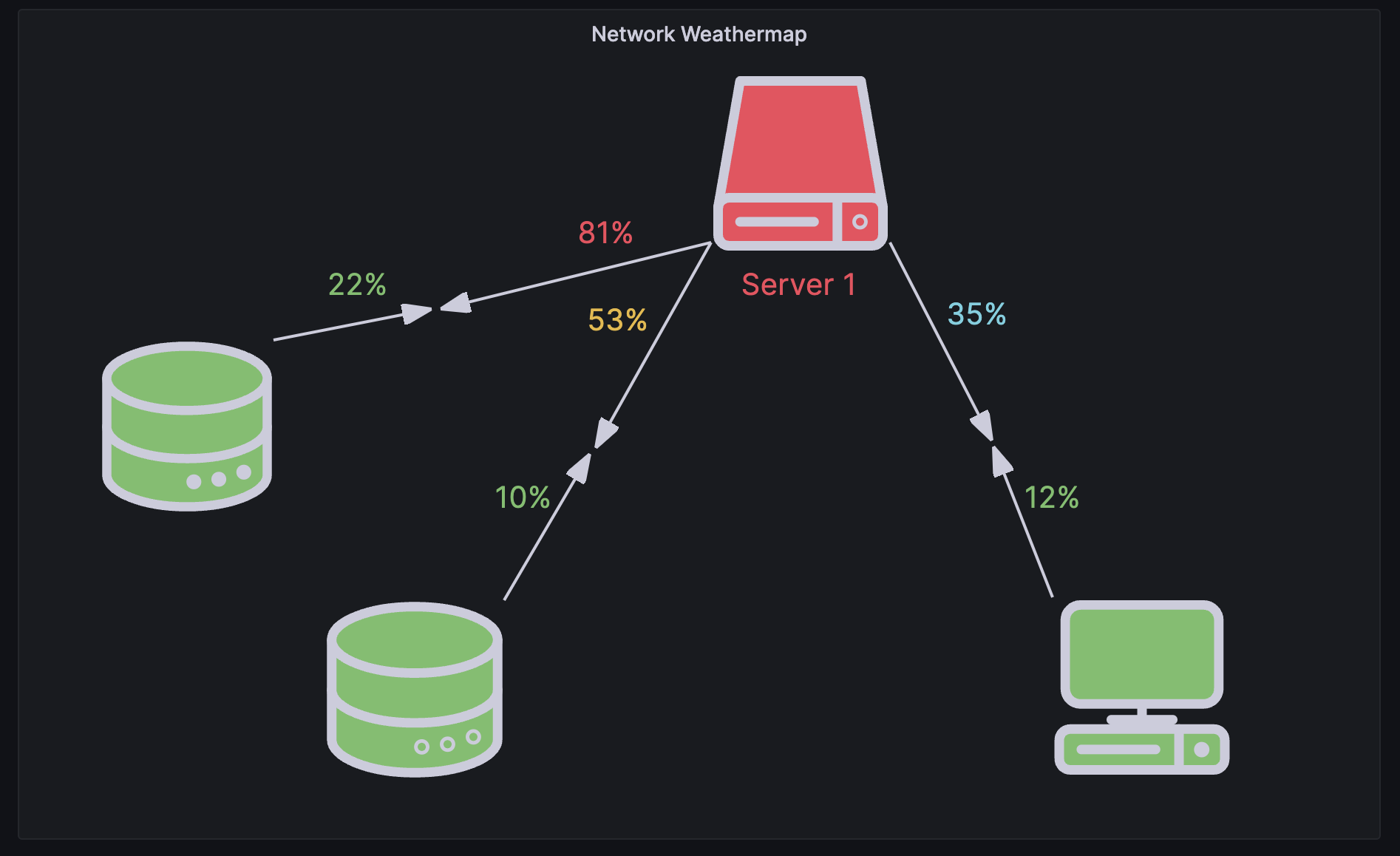
The server element enables you to easily represent a single server, a stack of servers, a database, or a terminal. Server elements support status color, bulb color, and a bulb blink rate all configurable by fixed or field values.

Connections
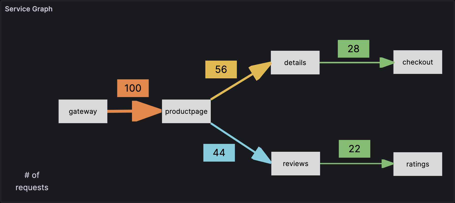
When building a canvas, you can connect elements together to create more complex visualizations. Connections are created by dragging from the connection anchor of one element to the connection anchor of another element. You can also create connections to the background of the canvas. Connection anchors are displayed when you hover over an element and inline editing is turned on. To remove a connection, simply click on the connection directly and then press the “Delete” or “Backspace” key.
You can set both the size and color of connections based on fixed or field values. To do so, enter into panel edit mode, select the connection, and modify the connection’s properties in the panel editor.

Canvas editing
Inline editor
You can edit your canvas inline while in the context of dashboard mode.
Context menu
The context menu enables you to perform common tasks quickly and efficiently. Supported functionality includes opening / closing the inline editor, duplicating an element, deleting an element, and more.
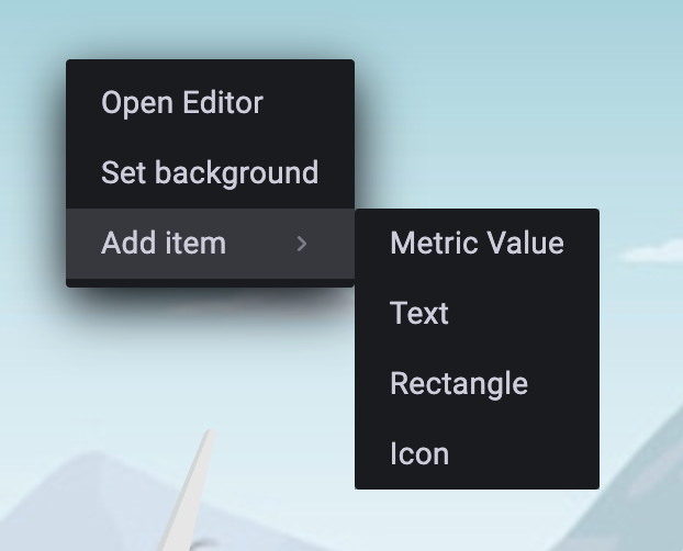
The context menu is triggered by a right click action over the panel / over a given canvas element. When right clicking the panel, you are able to set a background image and easily add elements to the canvas.

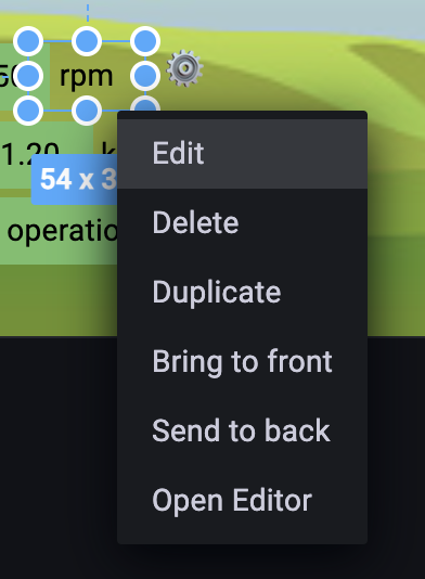
When right clicking an element, you are able to edit, delete, duplicate, and modify the element’s layer positioning.

Canvas options
Inline editing
The inline editing toggle enables you to lock or unlock the canvas. When turned off the canvas becomes “locked”, freezing elements in place and preventing unintended modifications.
Data links
Canvases support data links. You can create a data link for a metric-value element and display it for all elements that use the field name by following these steps:
- Set an element to be tied to a field value.
- Turn off the inline editing toggle.
- Create an override for Fields with name and select the element field name from the list.
- Click the + Add override property button.
- Select
Datalinks > Datalinksfrom the list. - Click +Add link add a title and URL for the data link.
- Hover over the element to display the data link tooltip.
- Click on the element to be able to open the data link.
If multiple elements use the same field name, and you want to control which elements display the data link, you can create a unique field name using the add field from calculation transform. The alias you create in the transformation will appear as a field you can use with an element.
- In the panel editor for the canvas, click the Transform tab.
- Select Add field from calculation from the list of transformations, or click + Add transformation to display the list first.
- Choose Reduce row from the dropdown and click the field name that you want to use for the element.
- Select All Values from the Calculation dropdown.
- Add an alias for the field name.
- Reference the new unique field alias to create the element and field override.


