
XY chart is GA
We’re promoting XY chart out of public preview and into general availability.
XY charts provide a way to visualize arbitrary x and y values in a graph so that you can easily show the relationship between two variables. XY charts are typically used to create scatter plots. You can also use them to create bubble charts where field values determine the size of each bubble:
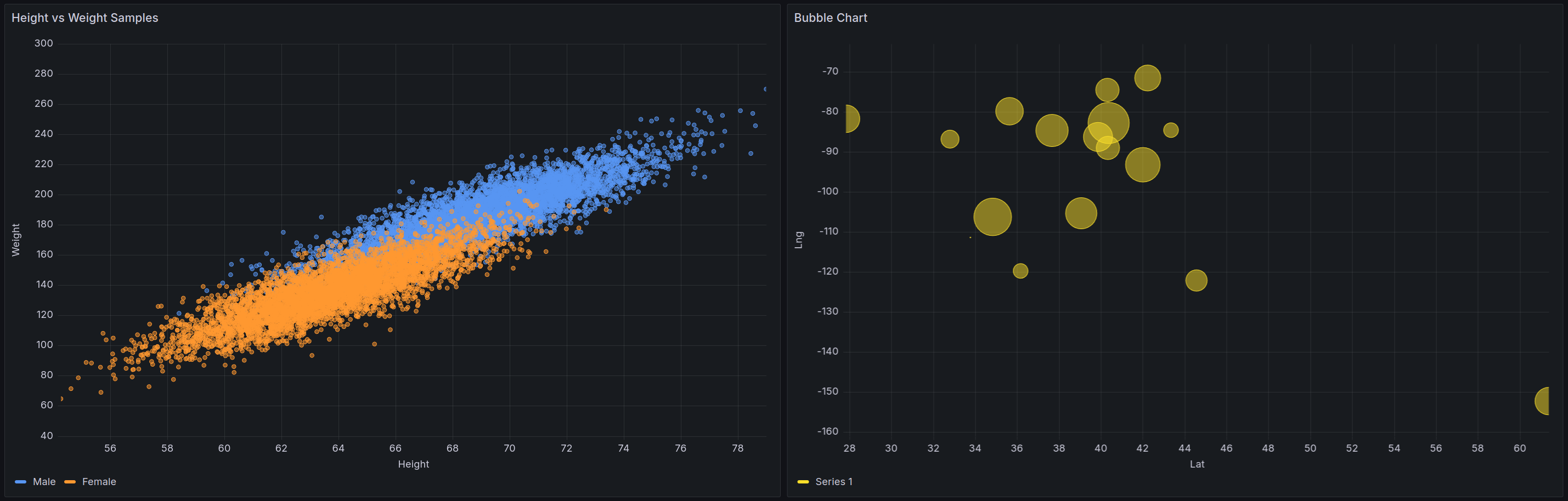
Over the past several months we’ve introduced multiple enhancements to the visualizations like auto mode, which now handles most scenarios that previously required manual configuration. Additionally, we’ve added better control over point styling and further improved performance. We’re excited to include XY chart as a first class citizen in the core Grafana visualization library. To learn more about the panel, refer to the documentation.
To use the new XY chart visualization, you must first enable the autoMigrateXYChartPanel feature toggle.
Was this page helpful?
Related resources from Grafana Labs


