Overview
One of the most common screens in a data-oriented product is a list of objects. This may be a list of user-created content (like dashboards), monitored entities (like Kubernetes clusters), or even arbitrary tabular data (from a SQL statement).
We recommend the following structure for these types of screens.

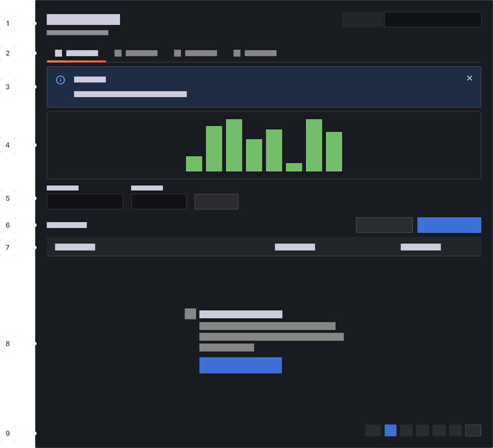
- Header - Contains the screen title and short helper text. In certain very specific cases (filters or selectors that apply across child tabs) it can be appropriate to place controls in the header. But in general, this is best avoided. Even if the controls make sense today, they make not make sense with future tabs.
- Tabs - Screen-level tabs should be the second level in the IA to reinforce the independence of each tab's content.
- Banner - Use this sparingly. If an exception condition causes the screen's data to be unable to render, steal the table row space to notify the user.
- Data viz - If additional viz is required to help users work with or contextualize the data set, put it here. Even if it feels like it should be below filters in the IA. It’s more important to keep data-manipulation controls in close proximity (to each other and data). Try to keep this under 200px high. More than that and the identity/function of the screen becomes muddled (is this a dashboard?).
- Search and filter - These controls are tightly linked to the list of items, so keep them nearby. Consider starting with a small number of filters and allowing users to add more as needed.
- Action buttons - Anything that mutates the data set should appear here. If necessary, this can also include links to distant (but related) screens.
- Table header - If you’re presenting the list as a table, include a header. Even if there is no data to display, keep the header around to reinforce that this is table view and this is where data would live.
- The actual data - If the data set contains any elements, show them here. If the set is empty (or cannot be loaded due to a problem), steal this space to explain why and offer remediation advice.
- Pager - Use if applicable. Omit when there is no data to page.
This structure is not obligatory, but using a consistent layout can help users locate key functions on unfamiliar screens.
Displaying data
Tables

Tables are a good choice for open-ended exploration as they impose minimal visual structure on the data. This less-opinionated view is useful when you can't predict how users will engage with the data. Use a table when a screen must support many diverse use cases or when you can't be sure of the shape, quality, or completeness of the data set.
Lists

Lists work best when the user is working with a set of named objects which have a well-understood data structure. Lists allow you to use typography and layout to emphasize important fields and deemphasize supplemental data. Use a list when your screen is focused on a limited number of use cases and you can optimize for them.
Tiled cards

Tiled cards are ideal when displaying a data set with a rich visual component, such as images or data visualizations. Effective use of small multiples can allow users to perform complex comparisons which would be impossible using other layouts.