Border Radius draft
Rounded corners are mostly a stylistic choice to make the Grafana UI appear more modern, feel more friendly, and add extra sense of "polish" to the visual elements.
The measurement of rounded corners is border radius, and it can be defined in pixels or percentages.
Default Border Radius
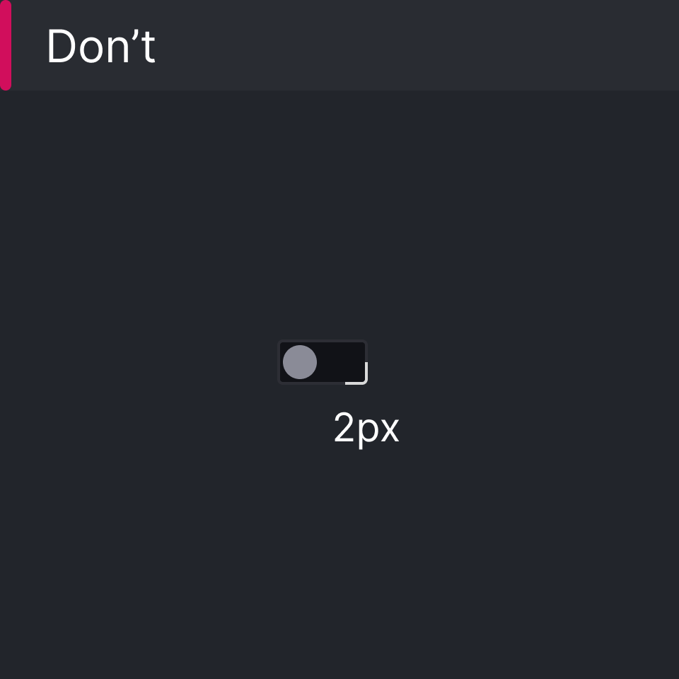
This is the general border radius or shape.radius.default, has a definition of 2px and is used for most UI elements, e.g. Buttons, Popover Panels, Tooltips, Widgets, Dialogs, etc.

Pill Border Radius
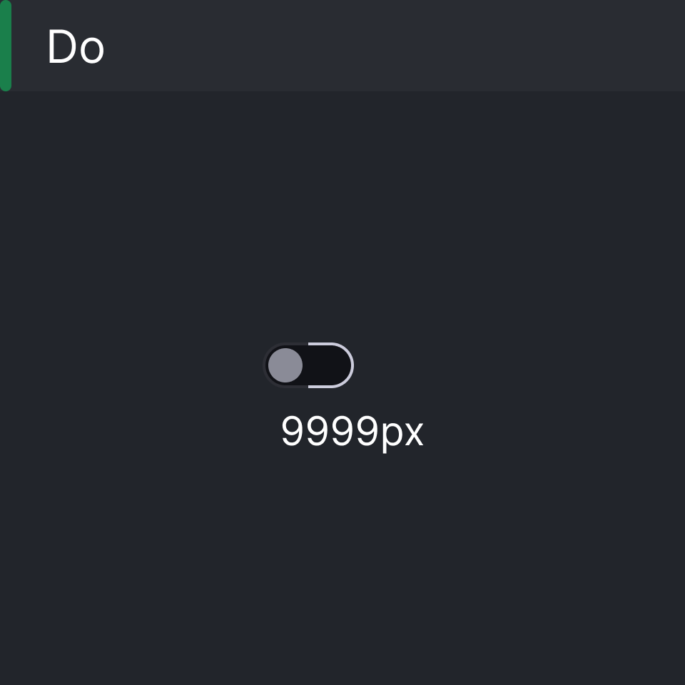
The pill border radius or shape.radius.pill, has a pixel definition of 9999px. This styling occurs less often in Grafana's UI. Smaller UI elements, such as switches, use the pill radius for a smooth, clean edge around their rounded elements.
 Smaller elements use the
 pill styling
 Do not use the
 default styling
Circle Border Radius
The circle border radius or shape.radius.circle, has a pixel definition of 100%. This styling also occurs less often in Grafana's UI, providing a full circular shape to elements.
