Alert draft Storybook
Alerts display important messages in a way that attracts the user's attention without interrupting their task.
Behaviors
| Type | Purpose |
|---|---|
| Persistent | They are usually urgent and intrusive, require immediate attention and require action to be dismissed. |
| Passive | Are informational, report a system issue that does not require any action by users. |
Types
Within Grafana, we have three different types of alerts and they can be used depending on the context and content.
| Type | Purpose | Behavior |
|---|---|---|
| Inline | To notify users of the status of an action. They appear at the top or bottom of the main content area | Passive or Persistent |
| Toast | These temporary window elements are used to display short messages; they appear at the top-right corner of the screen and can be dismissed by clicking the [x] or it will disappear after a few seconds | Passive |
| Banner | It will remain until the user rejects it or until the status that triggered the banner is resolved | Persistent |
Message Type
| Status | Usage | Action | Color | Icon |
|---|---|---|---|---|
| Informational | Provide information to users, and don’t interrupt any current actions | Do not require immediate action and can be dismissed by a user clicking the [X] or passively display until the display timer expires | Blue background | Info-circle |
| Success | When any action is successful, it is confirmed when a task is completed as expected | Typically do not require further action and can be dismissed automatically or persist in a nonintrusive manner | Green background | Check |
| Warning | Informing users that an action is undesirable | Often persists until users have taken action to dismiss the notification or taken steps to resolve the issue | Yellow background | Exclamation-triangle |
| Error | When an action doesn't happen as expected, usually something has failed and the user is expected to take action | Always persists until the user has taken steps to remedy the issue that triggered the notification | Red background | Exclamation-circle |
Content
An Alert can contain a single action, dismiss or close actions are optional.
Main elements
-
Icon Status
- Represent the importance of the message through the color and icon for each status.
-
Alert Copy/Title
- Should be explicit, clear and short that explain the most important part of the information.
-
Details
- Precise description for the notification, telling users what they need to do.
-
Button and text links
- Only persistent notifications should contain text links or buttons.
-
Close Icon
- Appears when the notification can be dismissed by the user.
Formating
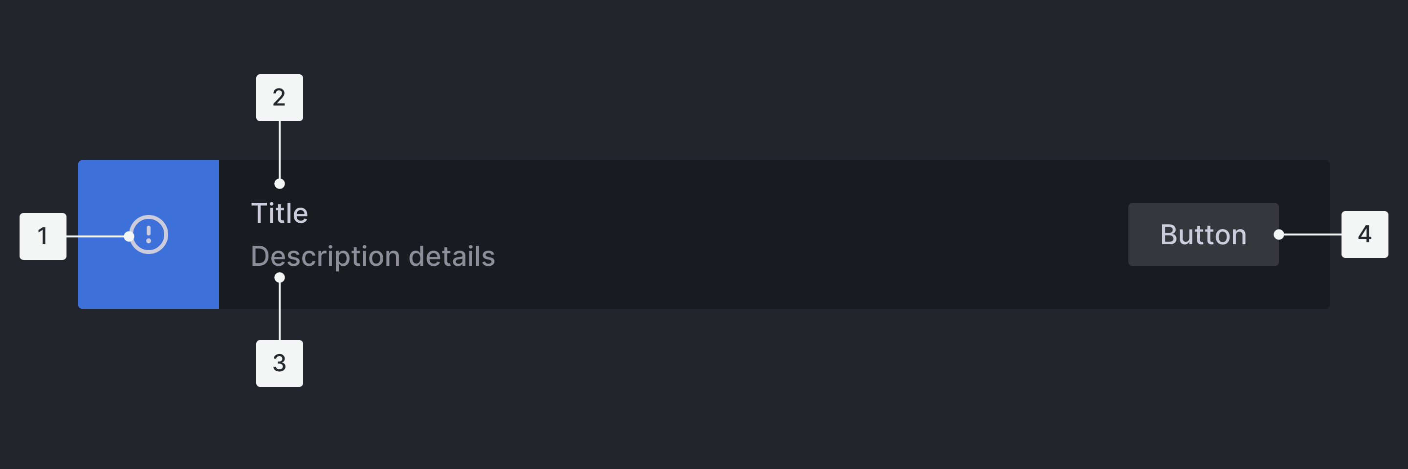
Anatomy

- Icon Status: Informs user what is the notification status
- Alert Copy/Title: Notifying with a quick summary of what the message is about
- Details: Short description explaining in more detail what the user has to do
- Action (optional): Text link button or default button which allows users to navigate to a page with more details