Contributing ready
Our design system is never complete, it’s constantly changing and evolving. We need help from Grafanistas like you to innovate and solve problems! Read this page to learn how you can contribute — we would love your help!
Participation
Having an open line of communication between the design system, designers and developers is important for success and the best way to improve everyone's awareness of the solutions we do and do not have.
-
Design system GitHub project. See what we’re working on now and later. This will be a good place to track the work of any contribution
-
#grafana-design-system
An internal Slack channel to post your questions, get answers, share your thoughts, even get updates on design system releases -
UX feedback sessions. An internal-Grafana stage to get peer feedback to improve your work. The #ux Slack channel posts reminders and shares agendas for these sessions. If you want to get added to these recurring meetings, ask to be included in that channel.
Guiding Principles
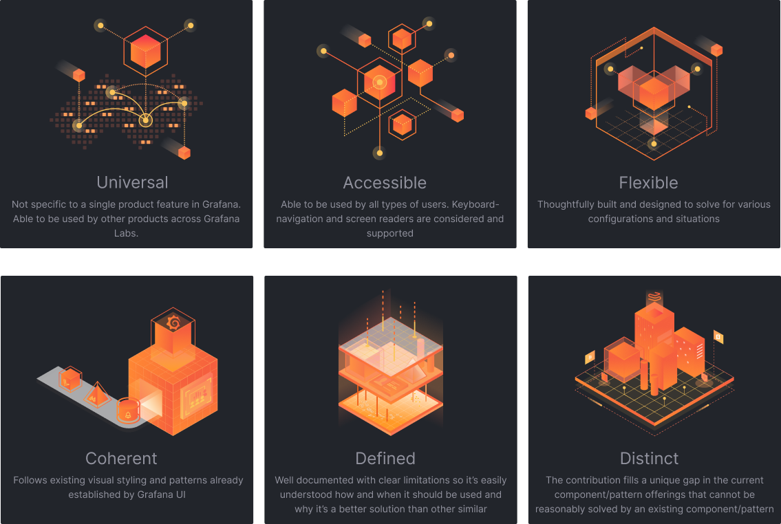
To make the design system a better product, keep these principles in mind:

Contributions and Levels
Contributions are not limited to components or code. We welcome any feedback, documentation, tools, designs, or even tools. Below are the various levels of contributions we’ve identified and some examples.
-
Fix: Bugs in code, misalignments in designs, or clarify documentation to improve conciseness.
-
Small Enhancement: Additions or expansions that don’t create breaking changes such as adding icons to the icon library or introducing a new variant to an existing component.
-
Large Enhancement: These changes usually require system-wide alignment and coordination. Things like how we handle saving or deleting. Usually, these changes require adjustments to code, design, and documentation.
-
New: A utterly new component or pattern that includes variants, documentation, and coded counterparts to the contribution. This can also include existing UI within Grafana that hasn’t historically been included in the design system and requires proper documentation and product alignment.
Before you contribute
Take a moment to review the areas mentioned above in Participation to see if a solution already exists or look in the component libraries (see; Resources) if you feel something might already exist.
Component Contributions
Component contributions usually include the following
-
A reason Explain how your component solves a problem and brings value to the system and Grafana. Be sure to include the various areas across Grafana this supports to show its shared value.
-
Figma component Put your component in a Figma branch (Figma Branching Best Practices) of the Grafana design system - dark theme file to capture your adjustments. and be sure to use the current Figma functions when building out your component — auto layout, component properties, variant properties, states, and variants.
-
Design specifications Provide developers with everything they need to build the component in code properly. This could include things like spacing, color, and typography.
-
Usage documentation Included proper usage, and specific configuration requirements, any types of interactions that need to be specified including what accessibility requirements are needed. View our documentation template for reference and a guide. Code Grafana uses React as its primary code base. For a component to be a complete contribution, the needed code to build this component in React must be included.
Pattern Contribution
Patterns are recurring solutions that solve common design problems. Try to provide a general idea of pattern and be sure to include any important details. Below are some things to consider including:
-
Overview Explain what problem this pattern is addressing, what areas are impacted and how it provides value across the organization.
-
Implementation Specify how this pattern works and what components are incorporated with it. Are there varying tiers of how this be included
-
Accessibility What important details are needed to ensure that this pattern is accessible? Be clear and concise here, as we tak accessibility very seriously.
-
Related Is there an alternative pattern or similar one that designers or developers might be looking for instead or should use depending on use case?
-
References If there is any content or resources that help support this pattern? Perhaps internal documentation or general best practices — include them here.
Resources
We have several tools available to help developers and designers build better solutions.
Feedback?
See something here that can be improved or added? Reach out on Slack or directly message Staton Hysell, Joao Silva, or Natacha de Jesus. We’d love to hear from you!