Button ready Storybook
Clickable elements that are used to trigger actions. Buttons communicate what action will occur when users interact with it.
<Button>Save</Button>
Do’s
- Apply the same width of the container for all buttons when they are in a group.
- Use only one primary button and two of the same lower emphasis when in the button group.
- Maintain the same style about using or not an icon with the label text in the button group.
Don’ts
- Do not use two primary buttons in a button group.
- Do not use buttons with icons and buttons without icons in a button group.
- Do not have more than one primary action.
- Do not pair a solid primary and solid destructive button - one must take precedence over the other.
- Do not use buttons with icons only (in case this is impossible please always add text for a tooltip and an aria label as they are needed to meet accessible requirements)
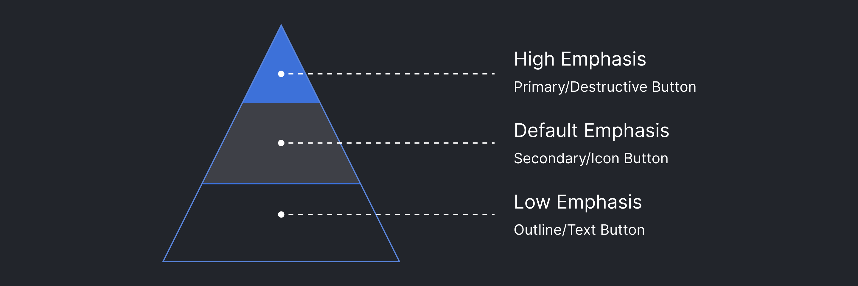
Emphasis
- High: Are used for the most important and common actions on the screen.These are Primary and Destructive buttons
- Default: Used as secondary actions that can be more than one on the same page. This is the most common button usage within Grafana.
- Low: Are complementary actions or links that are optional on the page.

Variants
| Type | Component | Emphasis | Purpose |
|---|---|---|---|
| Primary | Filled with Label Filled with Icon + Label Filled with Label + Icon Filled with Icon + Label + Icon | High | Used for "call to action", i.e. triggering the main action. There should never be more than one on a page. If you need multiple buttons for different actions, decide which action is the most important and make that the primary Button. All other Button components should be secondary. If there is no primary action, all Button components should be secondary. |
| Secondary | Filled Outline Ghost | Default | The secondary Button is the default button style and can trigger various actions. How it is used depends on its surroundings: 1. When next to the primary Button, the Secondary style can for example be used for "Cancel" or "Abort" actions. 2. When there is no main important action on a given page, all Button components should use the secondary style. |
Formatting
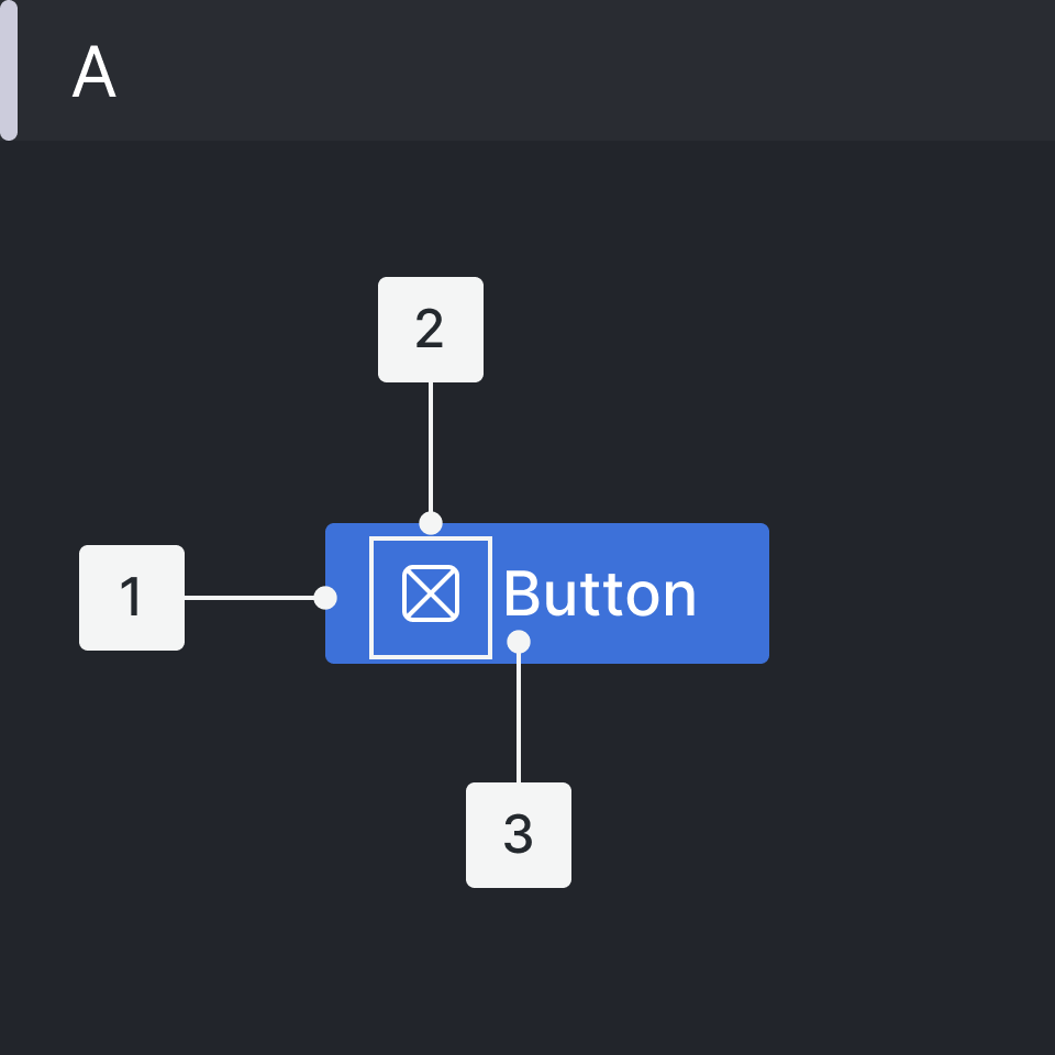
Anatomy
Icon Button
Note: Before using buttons without text always consider using IconButton instead.
- Solid container (optional)
- Icon
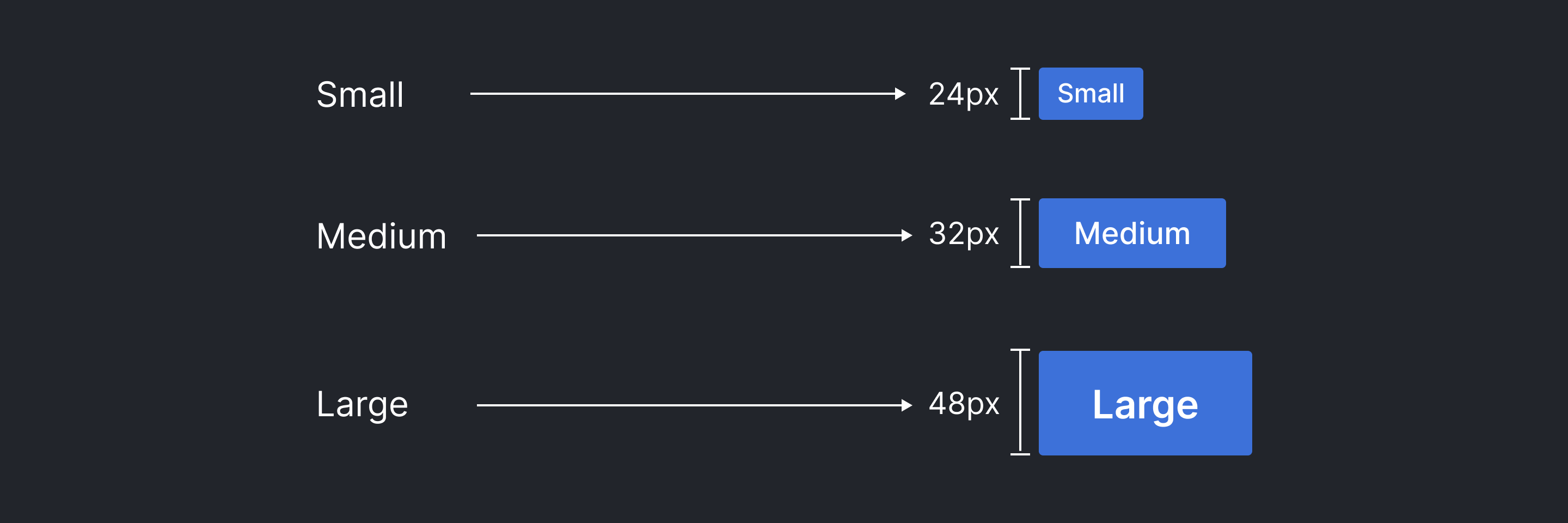
Button Sizes & Label Typography
| Size | Width-Height (px - rem) | Font-Size | Font-Weight |
|---|---|---|---|
| Small | Auto - 24px | 12px | 500 |
| Medium | Auto - 32px | 14px | 500 |
| Large | Auto - 48px | 18px | 500 |

Hierarchy & Button Pairings
-
Primary/Destructive Button — High Emphasis:
A single page should only display one button with the highest importance for the main action. Other buttons should have lower emphasis and be visually different within the UI. This primary button has to attract the user's attention.
-
Secondary/Icon Button — Default Emphasis:
A single screen can show more than one button, the other buttons can be in the same page with a primary button, these buttons have to be less important according to the actions, and do not distract users from the main content page. You should only group calls to action that are related to each other. A higher emphasis button can be paired with multiple buttons which are lower emphasis.
-
Outline/Text Button — Low Emphasis:
These buttons have less impact and are less distracting to the user's attention, on the same screen several of them can be used. They are actionable to take users to a new page, the main objective being to provide more information about that section.
Margin & Padding
| Type | Margin | Padding |
|---|---|---|
| Small | 0px 8px 0px 0px | 0px 8px |
| Medium | 0px 0px 0px 16px | 0px 16px |
| Large | 0px 0px 0px 16px | 0px 16px |
Placement
-
Primary
- On the page on the top-right
- Inside the content page on the center
-
Default
- Inside cards on the bottom-right
- Inside content page on the bottom-left
-
Text link
- Inside cards on the top-right
- Inside cards on the bottom-center
Accessibility
- Use ARIA tags when using buttons to ensure they are accessible.
- For example buttons represented by icons, the accessible name may be provided from the aria-label or aria-labelledby attributes.
- Using role="button" instead of the semantic <button> or <input type="button"> (iOS "clickable elements" fix for role="button")
