AngularJS to React: Custom configuration components
Use this guide to learn how to migrate custom configuration components for panels from AngularJS to React.
Background
The Grafana SDK provides many useful configuration components for developers such as entering number ranges, thresholds, unit selections, and color selections. You can see descriptions and examples of these elements in the @grafana/ui.
Some panels have more complex configuration options than others. These panels require you to build a custom component to support porting from AngularJS to React.
Example of Angular custom configuration
This document is focused around the grafana-polystat-panel as an example of a large complex plugin that was converted from AngularJS to React.
The AngularJS version of polystat has a custom editor for composites. Using composites allows processing a collection of metrics together to determinate overall status.
An example of a composite is a server with queries for CPU usage, memory usage, disk usage, network bandwidth, and an API response rate. A single metric is composed to represent all of these different metrics, with thresholds unique to each of them, and results in a polygon displayed with the “worst” state (that is, the lowest value).
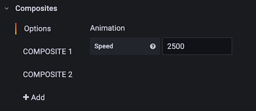
The composite editor contains global options, and many customization options that apply to a specific composite. For example:

When you expand a composite (COMPOSITE1), it shows details. Adding a new composite provides reasonable default values, and displays an ordered name on the left.
The source code for version 1 of the panel can be viewed here: Polystat Panel v1.x.
The AngularJS composite editor was a combination of HTML and code to manage the UI. For example:

This AngularJS plugin works in Grafana version 10, but the editor is difficult to use because it requires scrolling left and right to see all the values. Additionally, you must expand the editor side panel to nearly full size to see all of the options. Once AngularJS is disabled, the plugin no longer functions.
React component and configuration options
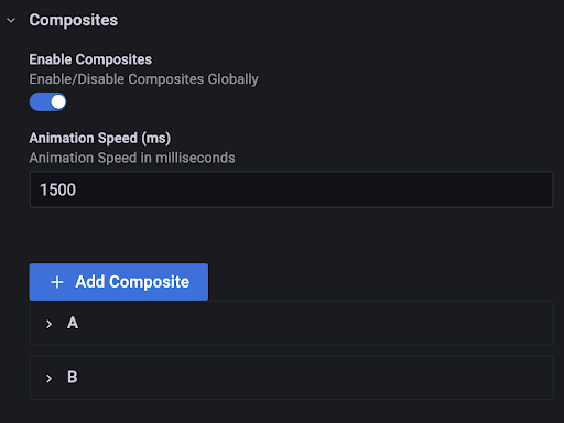
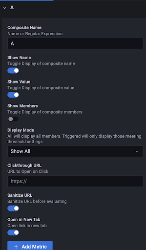
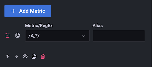
Porting your component over to React requires creating a custom editor component that looks like this:


The composite editor is now shown vertically and does not require scrolling left and right to see all of the options. You can also filter the editor in the same way that the rest of the configuration items can be filtered.
Source code for the component is now self-contained and can be viewed in the Grafana GitHub repository.
The new editor has many advantages over the AngularJS version:
- Supports re-ordering the composites and naming them for easier identification. The editor also leverages the built-in input fields and validators, reducing the amount of code required to support the panel.
- Allows many complex configuration options which are easier to implement in React. For example, the options include the ability to derive a have the name of the composite from regular expressions, template variables, or both.
- Includes additional custom editors for thresholds and overrides which differ from the common
@grafana/uipatterns. These editors can be used as a reference on how to implement these types of editors with complex logic.