

How to visualize CSV data with Grafana
While CSV data is often associated with popular spreadsheet apps like Google Sheets or Microsoft Excel, Grafana offers a number of capabilities to quickly visualize and analyze data stored in a CSV format.
In this post, we’ll walk through an example of how to use Grafana to visualize any CSV file from anywhere on the web. More specifically, we will:
- Create a data source to connect to our data
- Create a dashboard that visualizes a query
- Optionally, use a transformation to change the CSV data before visualizing it
Moving forward, you can also apply these steps to build any kind of dashboard within Grafana.
Step 1: Create a data source
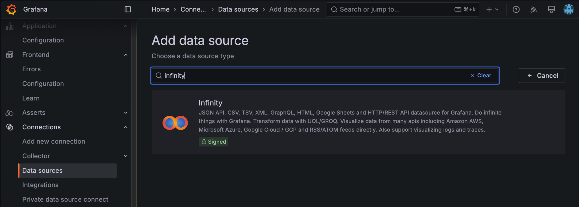
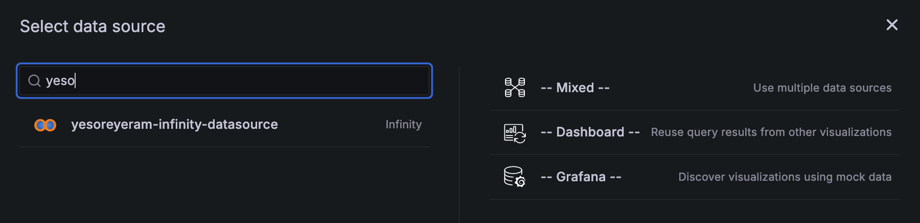
In the left-hand navigation of Grafana, select Connections > Data sources. Click Add a new data source in the top right corner. Then, enter Infinity as the data source type.
Note: Do not select the CSV plugin. While there is a plugin under that name, the Infinity data source — which lets you visualize data from JSON, CSV, XML, GraphQL and HTML endpoints — is much more flexible and actively maintained. Plus, it will grant you certain super powers that we’ll get into later in this post.
After you click the Infinity tile, you will arrive at the below screen, which will prompt you to name the data source.
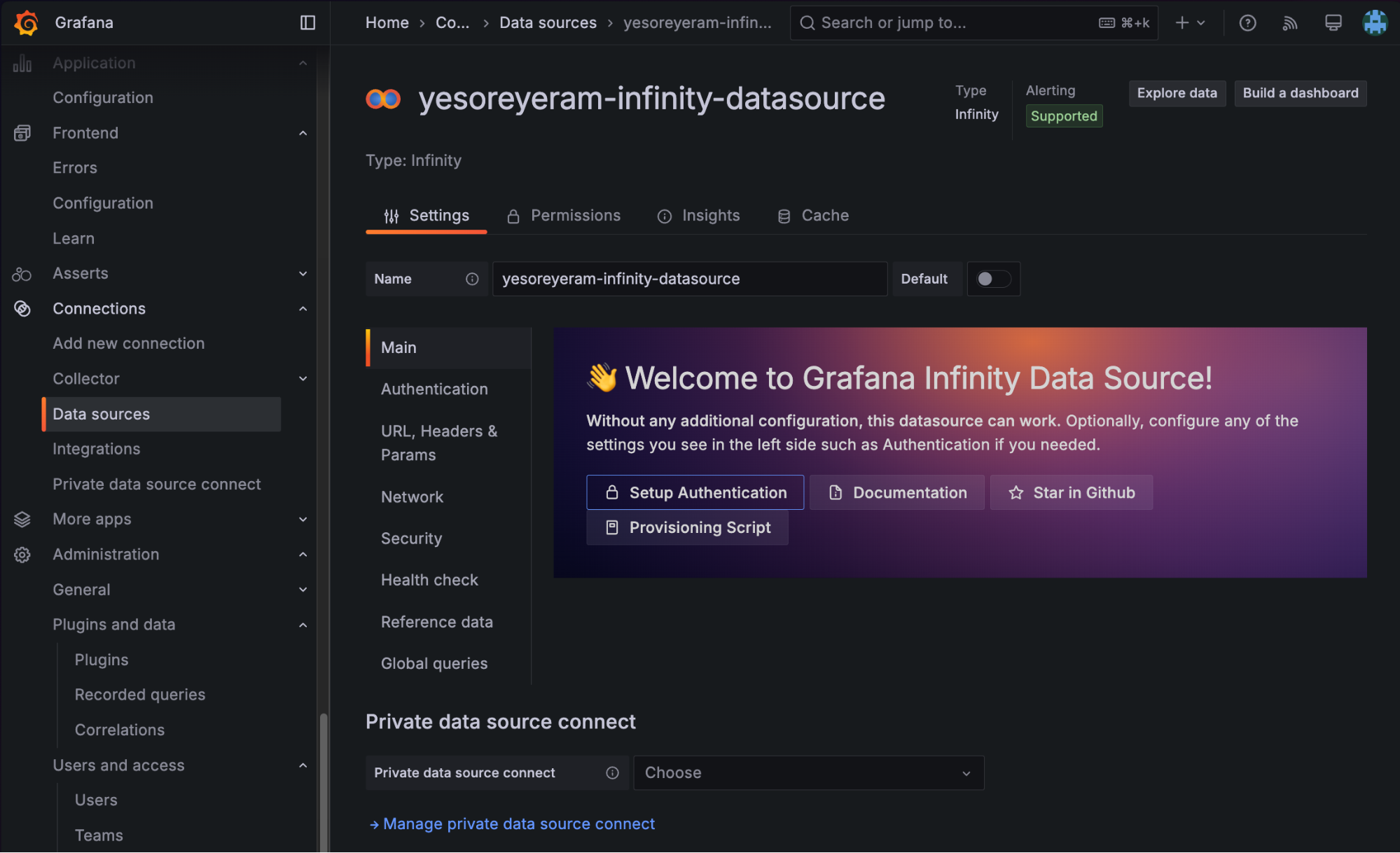
The default name is yesoreyeram-infinity-datasource, which we will keep for this example, but you can name it as you like. This screen has the option to configure access parameters for any endpoints online; for example, if you needed to provide a bearer token to access CSV at some endpoint, you could configure that in the Authentication section. We’ll be using a public data set, so we can simply continue without customizing anything further.
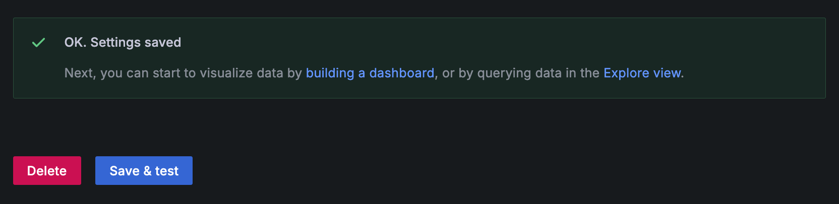
Click Save & test.
In Grafana, every data source comes with a query editor that lets you specify the data you want. The data source is a plugin that controls how the data is fetched.
Because the Infinity data source lets you flexibly fetch any resource from any endpoint online that uses HTTP/HTTPS, our “data query” will be an HTTP GET request.
To learn more about working with data sources in Grafana, check out this blog post.
Step 2: Create a dashboard
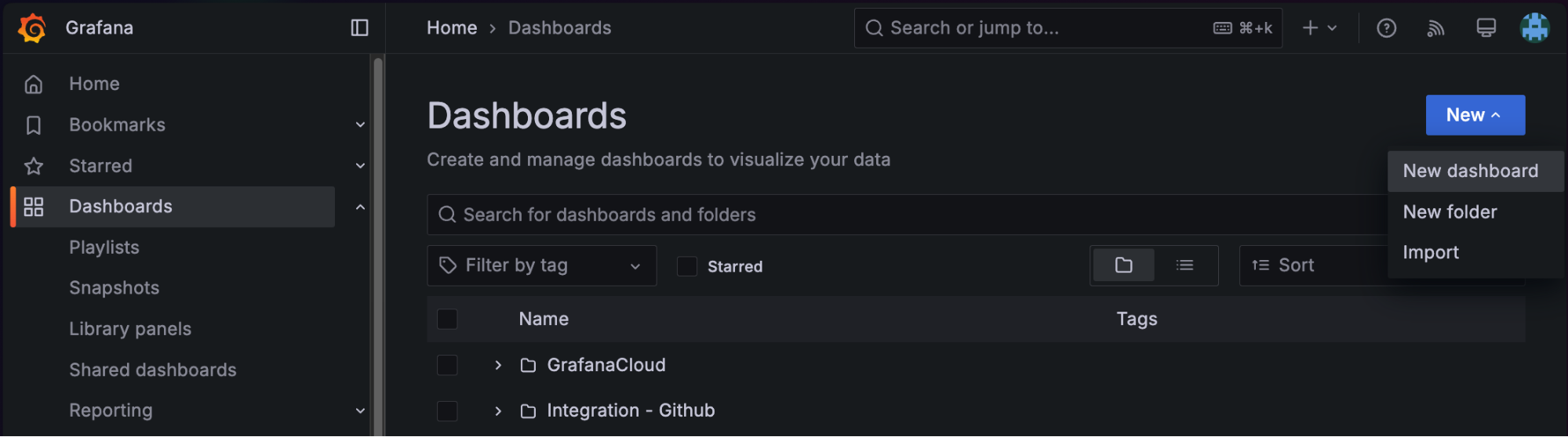
Using the left-hand nav, click Dashboards. In the resulting list, look for the New button in the upper right, and click New dashboard.
You’ll land on an empty dashboard, which will prompt you to add a new visualization. Let’s start with a simple table, showing CSV data. Click the Add visualization button.
Add visualization
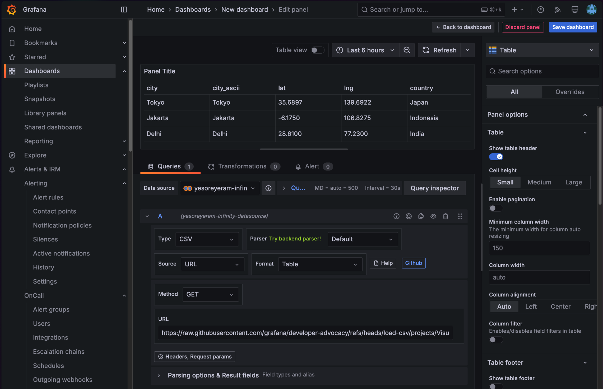
To create a visual in Grafana, we need to know where the data is coming from and what data it is. So, select the yesoreyeram-infinity-datasource data source we created previously.
The next screenshot shows all of the selections we’ll make. You can follow along by taking these steps:
- In the query section at the bottom, choose Type:
CSV. - Ensure the source is
URLand the method isGET. - For the URL, enter
https://raw.githubusercontent.com/grafana/developer-advocacy/refs/heads/main/projects/Visualize%20CSV/data/worldcities.csv, which links to a CSV file full of data about world cities and their locations. - In the upper right-hand corner of the screen, choose Table as the visualization type.
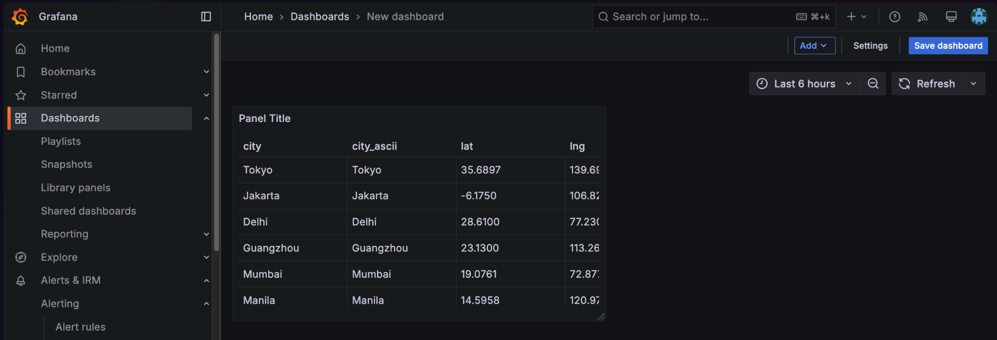
That’s it! You should see a table pop up, displaying the data.
When you’re finished, click the Back to dashboard button. We’ll arrive at our new dashboard with one visualization: a table of CSV data. At this point, we can click Save dashboard to make sure we keep track of our progress.
Add another visualization: Map of world cities
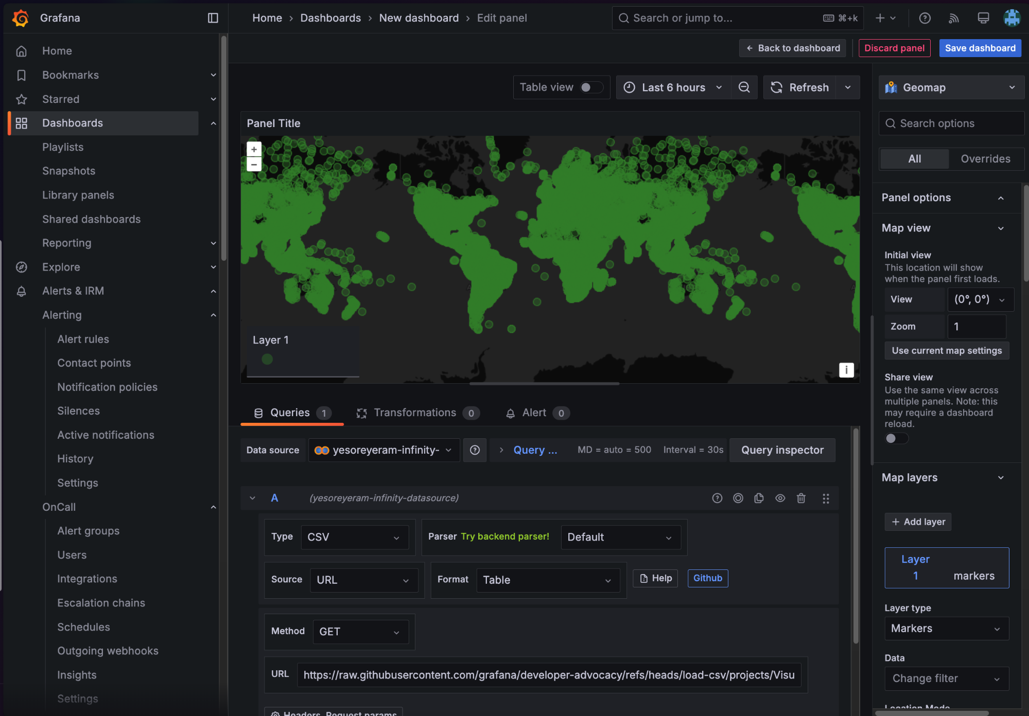
World cities are usually shown on a map, and tables aren’t that visually interesting, so let’s add something nicer. In the top-right corner of the dashboard, click Add > Visualization to create a new panel.

In the resulting screen, make the following choices to add a map:
- Data source:
yesoreyeram-infinity-datasource - Type:
CSV - Method:
GET URL: same as above- Visualization type (top right of screen): Geomap
In Grafana, geomap visualizations require latitude and longitude information. Fortunately, Grafana can detect those fields in this data set automatically. This means we’ll get an automatically populated (but very busy) map, as pictured below. There are certainly a lot of cities in the world!
You could save this visualization as-is and have a usable map. Mouse-wheel scrolling zooms in and out, so you can inspect any region of the world you like. But let’s see if we can focus on the big cities and, in doing so, explore another key feature of Grafana.
Step 3: Transform and filter data
Transformations in Grafana allow you to change your data before you visualize it. In the query editor where we found the URL for our data source, you’ll see a tab named Transformations. Click it, and then click Add transformation.
We will add two transformations:
- The Convert field type transformation to change the population field into a number (remember, CSV is all text!)
- The Filter data by values transformation to limit the data set to only cities above a certain population.
You can find both of these transformation types like this:
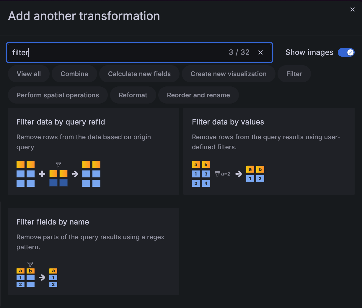
After adding both transformations, your screen should look like this:
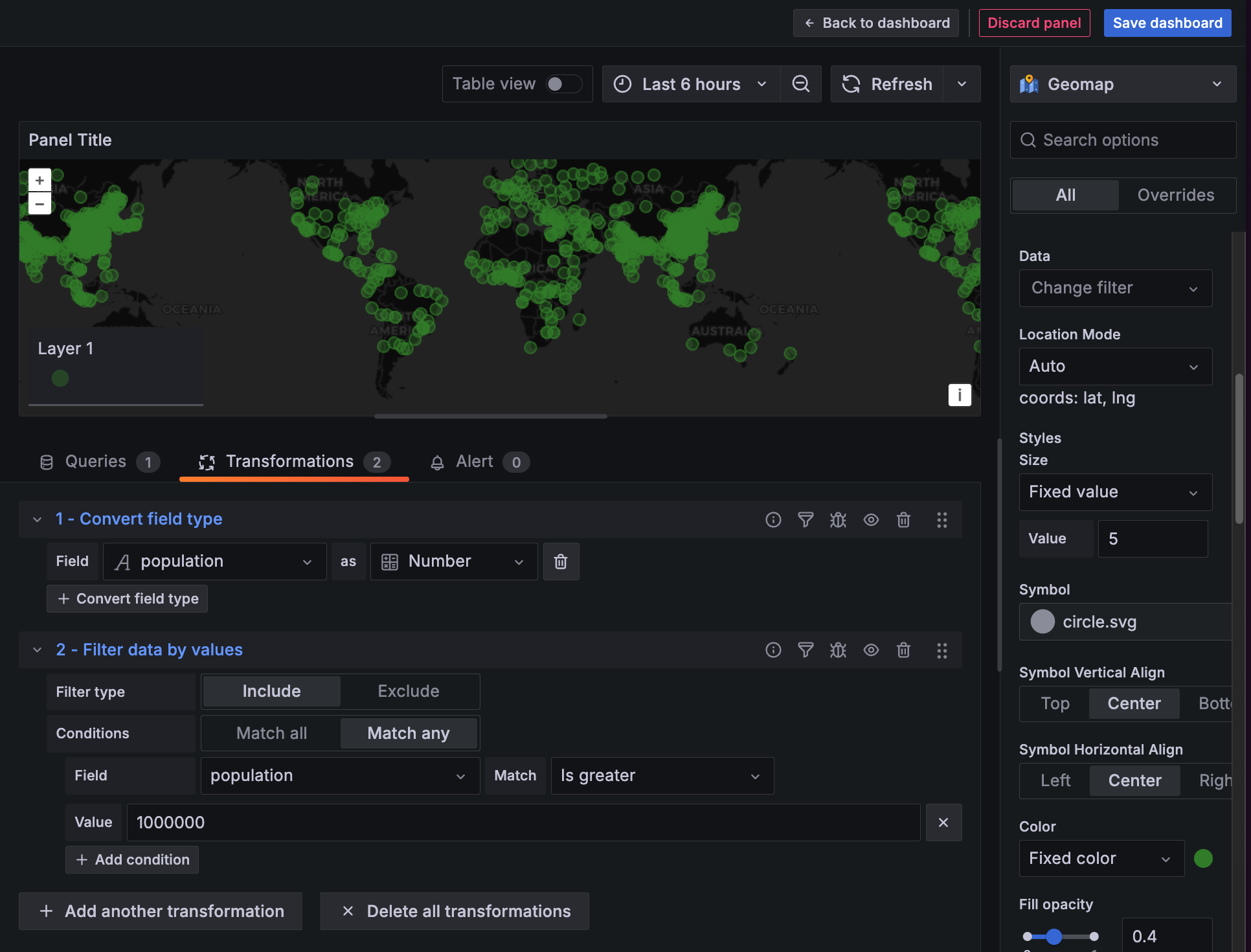
The order of these transformations is important. If you don’t convert the field type to a number first, then the Greater than option won’t be available in Filter data by values, since numerical operations don’t apply to text from CSV.
Here, we’ve filtered to cities with more than 1 million people in population. Notice how much that simplifies our map!
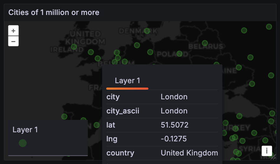
Finally, on the right-hand side, let’s give the panel a title. Then, click Back to dashboard and save your work.
Wrapping up
Congratulations! You’ve created a Grafana dashboard of publicly available CSV data.
The approach above will work for any kind of data behind any kind of HTTP/S URL, provided you can work with its format. To recap, the steps are:
- Define a data source that lets you access a specific kind of data. There are hundreds of Grafana data sources to choose from, for just about every system.
- Define a query to access. For CSV, we simply made an HTTPS GET to a URL, which was the query. Visualize the resulting data. In this example, we used the table and geomap visualizations, but Grafana supports dozens of visualization types with support for many more through community plugins.
- Optionally, define a set of transformations that manipulate the data.
If you have any further questions on this topic, feel free to ask a question on the Grafana Community Site! And if you’re interested in exporting data from a Grafana visualization to a CSV file, please refer to this blog post.
Grafana Cloud is the easiest way to get started with dashboards, metrics, logs, traces, and more. We have a generous forever-free tier and plans for every use case. Sign up for free now!


