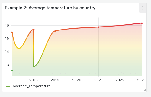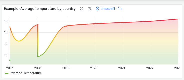
Grafana panel titles: Why we changed from center to left-aligned
As Grafana evolved over the years, so did our panel headers. In our quest for improvement, we continually added design options that created more comprehensive panels, but also an increasingly complex interface. It was a process of continual adaptation without a roadmap — which, though well-intentioned, began to result in unforeseen challenges.
We aimed to address these challenges with our redesigned panel headers in the Grafana 9.5 release. The redesign was aimed at supporting the wide range of Grafana use cases we’ve seen emerge over the years. Now, our redesigned panel headers are widely used beyond dashboards in both our React and Angular panels; other segments of Grafana have begun integrating them as well. Grafana app plugins, for example, have successfully adopted the new panel header, hinting at its significant potential.
That said, releasing this new panel design has been like riding a roller coaster. We’ve been flooded with a mix of responses from the community — positive feedback about the enhancements, as well as some frustration about adapting to new aspects, such as title positioning. In addition, we’ve heard that the redesign introduces a learning curve, particularly for long-time Grafana users.
With this blog post, we hope to accomplish a few things. First, we want to provide some context and guide you through the “why” and “how” behind the recent panel header redesign. And we also want to discuss how a simple design element has a big impact on the dynamic future of Grafana.
Grafana panel headers: A brief history
Let’s start by explaining the history behind the panel header redesign.
In 2020, usability and accessibility issues began to surface within our user base. One significant issue revolved around the panel menu. To access it, users were required to click the panel title. This action would reveal a small chevron icon only visible on hover — a counter-intuitive process that was inaccessible via keyboard and deviated from familiar menu patterns.

And the complications didn’t stop there. Panels without a title presented a problem — the menu and drag area ended up overlapping with the panel’s visuals. There was a lack of dedicated space for panel elements, leading to haphazard placement: links were lumped together with the description, the description icon disappeared when an error was flagged, and certain elements interacted with both drag and click actions.
Simultaneously, there was a growing need within the community for a more scalable panel header. For example, for plugin developers — those who make it possible to connect external services with Grafana — our default options were especially limited. Beyond simply showing a title, users were incorporating descriptions, panel links, timeshifts, streaming state, and alerts to their panel headers to add more context and functionality to their dashboards.
As a result, there was an increasingly convoluted panel header — and one unavoidable truth: a redesign was necessary to create a more user-friendly Grafana interface.
Grafana panel header redesign: Navigating the minefield
As we set out on our redesign mission, we zeroed in on three goals:
- Enhance the discoverability of the menu
- Allocate distinct space to each element
- Limit each element to a single mouse interaction
Our first challenge revolved around element placement. Scanning the myriad of panels across Grafana — from dashboards and Explore to app plugins and native features — we noted three details they had in common: a title, actions, and visualization.
We recognized that a panel is essentially a card, a common UI element that has the title on the left and the menu on the right. This simple observation guided our decision to position the menu to the right, where users intuitively expect to find it.

We also allocated the top left corner — the focal point of our field of vision — to the panel title. This positioning saves space, accommodates long titles and additional elements like timeshift, and aligns well with the single-column layout of panels in apps.

We did realize that shifting the title’s position could be risky. It was a significant departure from the traditional centered titles, a layout that our long-time users were familiar with and have built many dashboards around.
But, we found that this traditional setup was ultimately an inefficient use of space and didn’t accommodate the growing number of community members who were developing more complex panels. So we set a broader goal for the redesign: The new panel header should be usable by everyone, whether they are working on dashboards, plugins, or scenes with Grafana Scenes.
The technical challenges
Our design journey next led us to implementation. Here’s what we were up against:
- Outdated components such as menu, title, errors, and links, all cohabiting in the core Grafana dashboard code
- Inability to create custom plugins that emulated the look and feel of the panel header
- A bug-ridden code, undermining user experience and accessibility
Guided by the axiom “Always leave the code better than you found it,” we chose to invest our time in proper changes rather than quick fixes.
Changing the panel header alignment required changes to be implemented in a shared component, and the PanelChrome component from our Grafana UI package emerged as an ideal candidate. The components of that package, including PanelChrome, are meant to be used broadly, not only in Grafana dashboards, but also in plugins or Grafana Scenes.
The structure of PanelChrome was highly flexible, and its API allowed developers to pass anything, but it did not ensure a uniform panel header appearance across the product. So, we had to figure out how to standardize the options displayed in the panel header, while retaining the component’s flexibility for use outside of the dashboards page.
In the end, our new architecture for Grafana panel headers represents a hybrid between a declarative API and properties that offer flexibility to plugin developers and other projects like Grafana Scenes.
Grafana panel headers: The discussion continues
We’re excited that our panel header redesign has extended its influence beyond our initial expectations and plays a role in the next generation of plugin development in Grafana. Further enhancements are in the pipeline for new features, such as UI extensions.
But we’d love to hear more ideas from you. Since Grafana creator Torkel Ödegaard made the first commit to Grafana 10 years ago, we have always valued community feedback. We want to learn more about your specific experiences with the new and improved Grafana panel headers. Which use cases have our redesign not accommodated? Where has it excelled? To facilitate this exchange, we are sharing a Community link for collecting your invaluable insights.
Our approach is to understand and assess the wide range of user interactions with the panel header. We appreciate learning about more use cases, as this informs our discussions around future developments.
Thank you for being part of Grafana’s transformative journey this year — and for the past 10 years. Here’s to many advancements yet to come. ❣️


