Saga Design System: shaping the future of user experiences at Grafana Labs
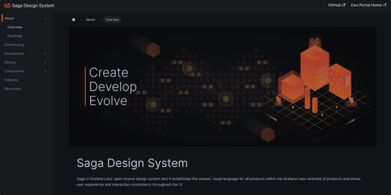
At Grafana Labs, we want to empower our fellow Grafanistas and the community to get the most out of the Grafana LGTM Stack (Loki for logs, Grafana for visualization, Tempo for traces, and Mimir for metrics). As part of this effort, we recently launched a new Grafana developer portal. And now, we’re pleased to announce the launch of the Saga Design System, which establishes a shared visual language for all of Grafana Labs’ offerings.
With Saga, we’re building a well-organized set of design elements, patterns, and guidelines that ensure visual and functional consistency across all our products. It is a guiding resource, equipping Grafanistas and the community with pre-established components and principles for crafting visually appealing and easy-to-use interfaces. This release signifies our commitment to enhancing transparency, empowering teams, embracing open source principles, and fostering diversity, all while delivering exceptional user experiences.

Why we created the Saga Design System
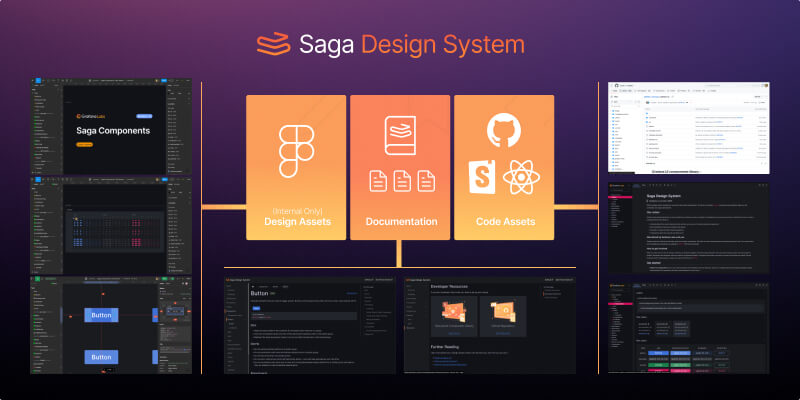
Grafana Labs has long had several key elements of a typical design system — reusable components, documentation, and even Figma libraries. However, the missing piece has always been a centralized hub that connects all of the resources together in a way that goes beyond instructions on how to implement a component and available component-props.
Saga fills this void by connecting our design and development resources with documentation that goes beyond how to use a particular component and dives into why that component is used in a particular way. An example of this is our Alert component. The Saga documentation highlights the different usage and provides context into how to write the messaging, even going as far as outlining when to use which version of the alert. The additional context and guidelines help ensure Grafana’s UI and UX are consistent across the product.

Building off the internal work we’ve done to add documentation and component examples in our Storybook React component library (grafana/ui), Saga goes a step further. Through a centralized repository of design components, patterns, and guidelines, Saga ensures engineers and designers can more efficiently create consistent experiences, regardless of the product area.
Internally, we have been using Saga to build and support our apps and plugins. With this public release, we want to share our design system to enable everyone to create apps and plugins with the same great experience.
How the Saga Design System works
We’re committed to helping Grafanistas and the community successfully adopt Saga assets. To ensure this is the case, the Saga team manages and supports the Figma assets and React components. And as Saga grows and solves more complex problems, we’re relying on these guiding principles to ensure we’re providing the most value to our users as possible:
- Universal. No part or solution within Saga is specific to a single product feature in Grafana. They can all be used by other products across Grafana Labs.
- Accessible. Accessibility isn’t an afterthought; it’s a fundamental part of every component and pattern. We’re committed to making products that are as inclusive as possible, and as Saga iterates, Grafana and the apps and plugins that run within it will become more accessible.
- Flexible. Saga components have been designed to enable a wide range of configurations from a single component in order to accommodate as many use-cases as possible.
- Coherent. We are following existing visual styling and patterns already established in Grafana to maintain a consistent experience.
- Defined. Saga components are documented with clear limitations so it’s easily understood how and when a component should be used and why it’s a better solution than other similar components or patterns.
- Distinct. Every component or pattern fills a unique gap in that cannot be reasonably solved by an existing component/pattern.
How we support usage and adoption
It’s important that the Saga team maintains an open line of communication with designers and developers in order to improve everyone’s awareness, usage, and adoption. We plan stay engaged in numerous ways:
- Our GitHub project is available for all to see what we’re working on now and in the future. This is a good place to track the work of any contribution.
- We encourage contributions to both Saga and its components.
- Internally, we have dedicated Slack channels and routinely ran feedback sessions to generate constructive feedback and iterate on work.
What’s next for Saga
As we unveil Saga, our commitment to excellence and continuous improvement remains steadfast. This is just the beginning of our journey to enhance the user experience and design across all Grafana products. In the coming months, we plan to expand the offerings within the design system, introducing new components, guidelines, and tools (e.g., page templates to improve page-to-page consistency) that empower everyone to innovate and deliver even more exceptional user experiences.
You can find our quarterly plans on our roadmap on the Saga site. We’re dedicated to an iterative approach that keeps Saga at the forefront of design innovation, aligns closely with our core values, and provides users with the best and most seamless experiences possible.
Be sure to leverage Saga on your next project and follow along to learn more and stay informed about its progress.


