Help choose the Golden Grot Awards winners
When we launched the Golden Grot Awards to honor the best and brightest Grafana dashboards of the past decade, we expected to see some pretty amazing projects. But we were truly blown away by the sheer volume and awesomeness of the dashboards that flooded our inbox.
From visualizations that are accelerating scientific discovery to a series of dashboards designed to optimize your Tesla battery performance, we were delighted by project after project that demonstrated how Grafana dashboards — and the brilliant creators behind them — are revolutionizing the world we live in.
But before we dig into the nominees, we want to say thank you — thank you to everyone who submitted a dashboard, the folks who helped us spread the word about the Golden Grot Awards, and everyone who cheered us on from the sidelines.
And now we want to ask for your help one more time. Our judges have selected five finalists in each category based on technical skill, utility, design, and impact. But we need you to weigh in and help select the grand prize winners. Your votes will count for 20% of each dashboard’s final score, and winners will be announced live on stage at GrafanaCON 2023 this June (so be sure to sign up to join the livestream).
Read on to learn all about each of the finalists, and then head over to the official Golden Grot Awards website to cast your vote before polls close on Friday, May 5 at 11:59 p.m. PDT. And keep in mind, some of the dashboards in this blog are only partial views, due to space constraints. To get a complete look of all the great work by these finalists, make sure you head to the voting page.
Personal dashboard finalists
Here are the top five dashboards created to visualize metrics related to a personal hobby or interest.
Mission control: college rocket team dashboard

Philip Do’s mission control dashboard monitors the pressures, temperatures, load, and valve actuation states of rockets on his college engineering team. Data from pressure transducers, thermocouples, and a load cell are all brought together in the dashboards, allowing the team to glean new insights into performance and to document the secrets of a successful rocket launch.
“We have been able to beautifully display rocket data to all concerned parties through a web server and find hardware issues to ensure that our mission is a success,” Do said.
FastAPI observability dashboard

Blueswen Liu’s dashboard for FastAPI applications was designed to exemplify the three pillars of observability by bringing logs, traces, and metrics together for a complete view of the application. And it worked! The detailed views of logs and tracing data revealed endpoints that were causing errors, prompting code changes to prevent future issues.
“The requests count by URL path panel showed us that certain endpoints were being hit more frequently than others, prompting us to refactor our code to improve performance,” Liu said.
TeslaMate electric vehicle monitoring dashboard

Juan Carlos Heredia Mayer used self-hosted data logger TeslaMate to create an elevated data browsing experience for electric vehicle metrics. This series of Grafana dashboards helps Tesla owners visualize everything from battery performance to charging costs in real time so they can make data-informed decisions on battery health, energy consumption, and expenses.
“These dashboards use complex calculations to convey useful information, so I decided to share them through a public repository on GitHub,” Heredia Mayer said.
European energy infrastructure dashboard

Nicky Sonneman’s dashboard pulls from four open source data streams to paint a real-time picture of energy infrastructure in Europe. By visualizing current and historical information on natural gas storage and geographical flow, as well as electricity generation and energy prices, Sonneman gets alerted on irregularities and plans accordingly.
“This dashboard gathers complex data, breaks it down into easily digestible graphs, and is on par with commercial organizations that offer the same data in their software packages,” Sonneman said.
Homelab temperature and network monitoring dashboard

Brian Wallace built these Grafana dashboards as part of his homelab project. The dashboards track everything from humidity in his equipment closet to temperature in vital utility spaces to networking status, switches, and more. All this in-depth data drives more effective troubleshooting and diagnostics, resulting in better system performance.
“I created multiple dashboards to monitor power usage, network switches, cyber power PDUs, home temperature, and more,” Wallace said.
Professional dashboard finalists
Here are the top five dashboards created in a professional capacity to visualize metrics related to business or industry.
Azure security dashboard

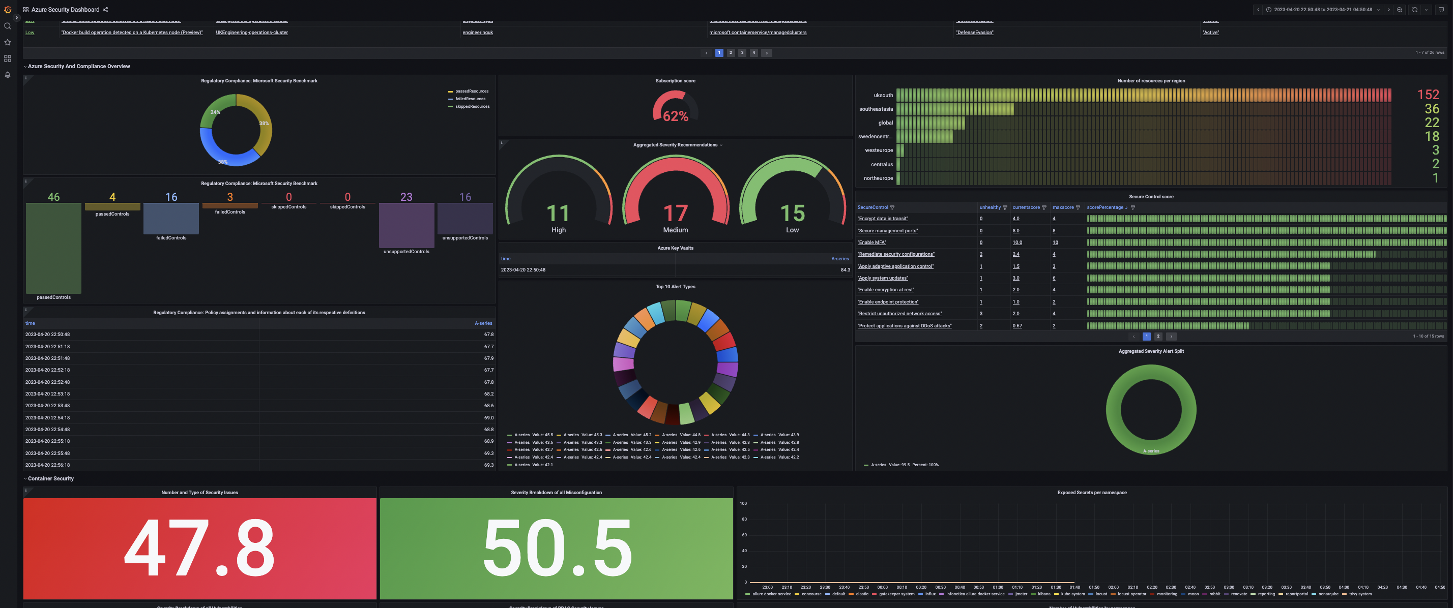
Matthew Clarke used Azure Monitor, Prometheus data sources, and a mix of query types to build a dashboard that delivers a profile of the team’s cluster security to support delivery of testing services. The visualizations draw from six data sources to monitor the operational security health of microservice cloud estates for everyone from DevOps to the executive team.
“This dashboard is accessible to staff who aren’t security analysts, it was built by a small team, and it has allowed a small organization to punch above its weight in securing its environment,” Clarke said.
AI image analysis performance dashboard

Christopher Field’s dashboard visualizes the performance of an AI model analyzing microscopic images of materials used in nuclear reactors. It showcases the original images (left) and AI-analyzed images (right), as well as performance metrics, model confidence distribution, and material defect trends.
“It is great to be able to work with scientists and engineers and provide them a tool that not only accelerates their time to discovery but also expands their capabilities,” Field said.
Business and platform KPI dashboard

Jassi P. Singh’s series of dashboards provides an in-depth view of business KPIs (process health, client SLO/SLAs, volume, and trends) as well as platform KPIs (application, infrastructure, and database health). Eight different data sources are brought together to deliver summary, drill down, and detailed views for executives, technology leadership, and operational leadership.
“We were able to liberate the data out of different systems and convert them into useful and actionable information,” Singh said.
JDE monitoring dashboard

Raymond Sowden’s dashboard unites 25 different data sources to provide a single pane of glass that monitors his team’s JD Edwards EnterpriseONE ERP deployment (JDE) and all of the supporting technologies. It is shared with technicians, practitioners, and executives to quickly communicate insights into user experience, performance, uptime, and thresholds.
“When users log performance calls, we can see at a glance where the bottlenecks or issues are without interrogating the server manager, the OS, Weblogic, etc.,” Sowden said.
IoT energy device monitoring dashboard

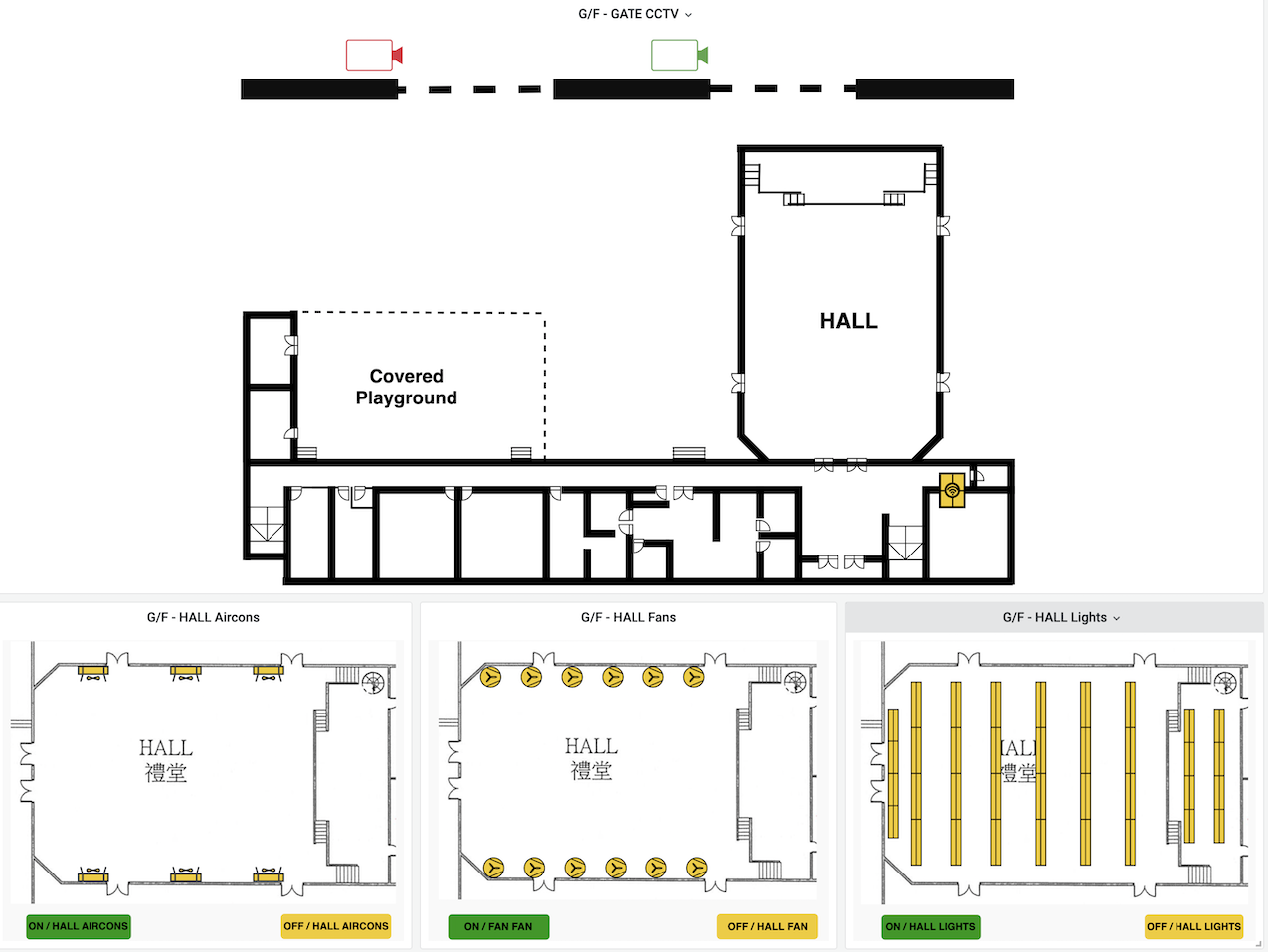
Felix Tsang’s dashboards visualize IoT energy device metrics at a Hong Kong secondary school monitoring the lights, fans, and air conditioning status across an entire campus. By tracking energy consumption metrics over time, the dashboard has helped school leadership view trends and take action to save money and improve efficiency.
“We’re bringing awareness to students about IoT devices and preserving the environment — and teaching them how to save energy,” Tsang said.
We hope these dashboards inspired you as much as they inspired us — and we can’t wait to hear which ones wowed you the most. Cast your vote before polls close Friday, May 5 and be sure to sign up to join us as we kick off GrafanaCON 2023 and announce the winners.


