
How to visualize k6 results: guidelines for choosing the right metrics
A k6 test can generate a lot of metrics. More metrics means more data to analyze, and more chances to find and correlate performance degradations. However, an abundance of data can be overwhelming.
When the volume of test metrics is high, visualization is one of the most valuable tools for performance-test analysis. Fortunately, in addition to emitting many metrics, Grafana k6 also has many output formats. This output can become the input for different storage backends and visualization tools.
k6 provides flexibility to present the data in the way that makes the most sense for your test goals and work environment. At the most accessible level, you can turn the end-of-test results into a graphical overview or visualize the CSV output with a spreadsheet. Beyond that, you can stream results in some structured format, such as Prometheus remote-write, and visualize the stream in some frontend tool, such as Grafana. k6 is also extensible, so if the built-in outputs don’t suit your needs, you can develop an output extension that does.
You have many ways to visualize k6 test results.
Guidelines to visualize performance test results
If you’re new to visualization or performance testing (including its subsets, such as load testing or synthetic monitoring), this section explains the key metrics to visualize, and provides some general advice about the visual indicators of system performance.
Key metrics to visualize
Before reading more, ask yourself what the goal of your test is. Each metric provides a different perspective on the performance of the test. So the best metric for your analysis depends on your goals.
However, if you’re not sure what metrics to focus on, a good place to start is with the metrics that measure the requests, errors, and duration (the criteria of the RED method).
http_reqs, to measure requestshttp_req_failed, to measure error ratereq_duration,to measure duration
Note: In other terminology, these metrics measure traffic (in requests), availability (in error rate), and latency (in request duration). SREs might recognize these metrics as three of the four golden signals.
Besides these built-in metrics, you probably also want to visualize your checks and custom metrics. If these aren’t in your test results, consider whether they’re necessary for your script.
Healthy performance often looks flat
Healthy performance is generally stable. In visualizations, stable behavior manifests in flat, horizontal lines.
One common visual comparison is between throughput and request duration or error rate. For example, if the system remains available under increasing load, the error rate should follow a horizontal trend even as the number of requests per second (RPS) increases. If the system loses availability under load, the error rate should increase with RPS.
Often, the availability and latency of a system remain stable up to a certain load, then degrade sharply. This degradation would manifest as a sharp upward trend in the graph. In some performance-test literature, this pattern is called the knee.

Visualize end-of-test summaries
Before reviewing how to visualize granular results, note that k6 also presents aggregated statistics in an end-of-test summary. With the handleSummary() function, you can make a custom summary.
If you need only a broad performance overview, you can use the handleSummary to create a graphical overview of results. For example, the community project k6-reporter creates an HTML report at the end of the test.
However, end-of-test summaries have limited use for deeper analysis. They aggregate data across the entire test and thus cannot say anything about trends over time. For that, you need granular output.
Granular output formats and visualizations
Across every point of the test, k6 emits metrics with values and time stamps. k6 can structure this output in various formats. The output can be streamed to a service, written to a file, or both.
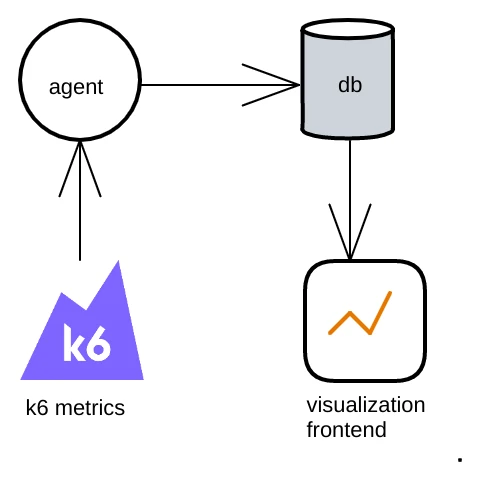
Thus, you can choose the structure and frontend that fits your workflow. For example, in this diagram of a generic workflow:
- k6 outputs metrics in some format and sends the metrics to an agent that can receive that format.
- The agent forwards the metrics to be stored in a database.
- The frontend queries the database and visualizes the output.
Syntax
Set k6 outputs and destinations as arguments to the --out flag of the k6 run command. The argument takes the form of <key>=<value>, where the key is one of the output types, and the value is the file path or remote destination. You can pass multiple outputs in one script.
For example, the following command outputs results as both JSON, which it writes to a file called test.json, and in the format of InfluxDB, which it sends to a port on localhost.
k6 run script.js \
--out json=test.json \
--out influxdb=http://localhost:8086/k6
Local files
CSV and JSON are the outputs that work with the widest range of tooling. Many libraries and tools can plot values from JSON and CSV, so you have much freedom and flexibility to turn these outputs into the visualization you want.
CSV
To output k6 results as CSV, use CSV as the argument key and the file path as the argument value:
k6 run --out CSV=file.csv script.jsThe options to visualize results from a CSV file are vast: you could use a spreadsheet, Tableau, or any number of open-source visualization tools. GNUplot is one example of many.
For the structure of CSV output, refer to CSV output in the documentation.
JSON
To output k6 results as JSON, use JSON as the argument key and the file path as the argument value:
k6 run --out json=file.json script.jsAs with CSV, you have many options to visualize results from a JSON file. For example, ChartJS is a popular JavaScript library for visualizations. Or, if Python is your language of choice, pandas is another popular option.
For the structure of JSON output, refer to JSON output in the documentation.
Server-sent events with xk6-dashboard.
For the first visualization, we want to highlight a great community project, xk6-dashboard. The dashboard runs a local web server that visualizes metrics as the test runs.
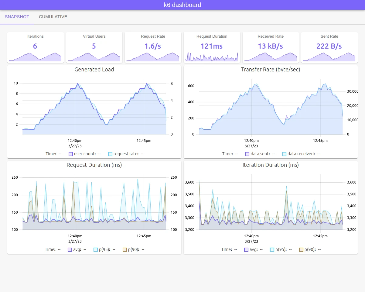
You can use it as you would use any extension:
- Download xk6:
go install go.k6.io/xk6/cmd/xk6@latest- Build the binary:
xk6 build --with github.com/szkiba/xk6-dashboard@latest- Run the test with the custom binary, using dashboard as the argument for
--out.
./k6 run --out dashboard script.js- Visit the dashboard on your localhost and view results as they appear. The default is
http://127.0.0.1:5665/
For the latest instructions, visit the xk6-dashboard repository. If you want to make your own visualization tool, the source code for the xk6-dashboard may serve as inspiration.
Generic outputs
k6 can also send metrics in near real-time in various output structures. Thus you can monitor tests as they run, or store the results to visualize at your convenience.
PrometheusRW
k6 has built-in support to output results with the Prometheus remote-write protocol. This opens many options for remote endpoints and storage.
For visualization, one option is with Grafana — either Grafana Cloud or in a self-hosted instance.
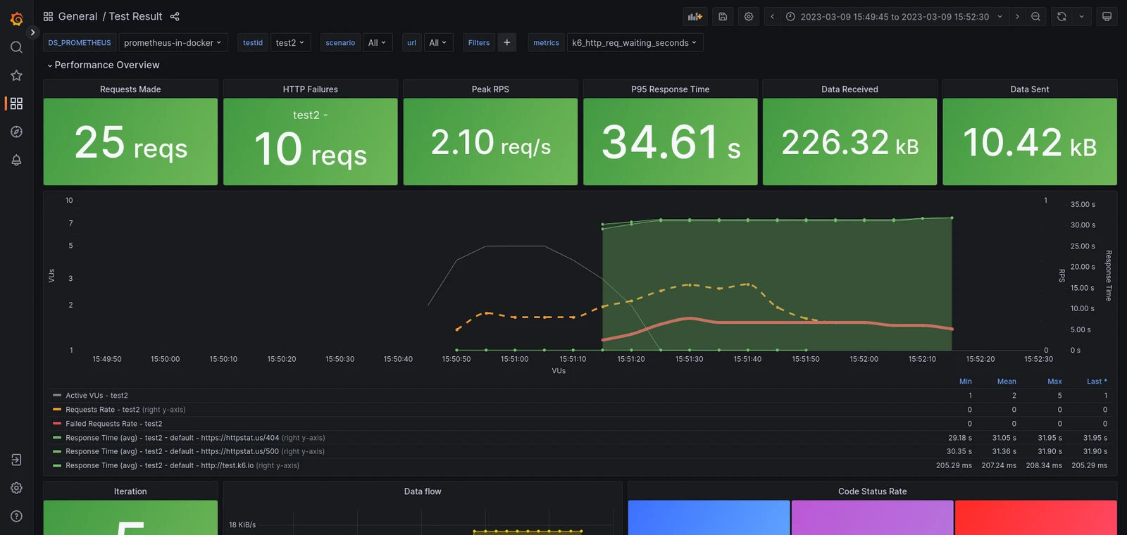
For detailed instructions about sending metrics in remote-write and visualizing data, refer to the k6 documentation about Prometheus remote-write.
StatsD
k6 can also be a client for the statsD daemon. k6 has how-to documents to use the statsD output to send k6 metrics to various services, including:
Datadog

Amazon CloudWatch
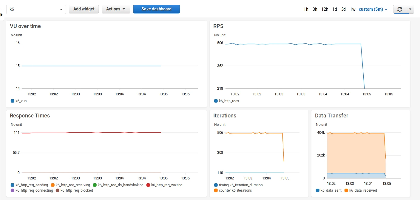
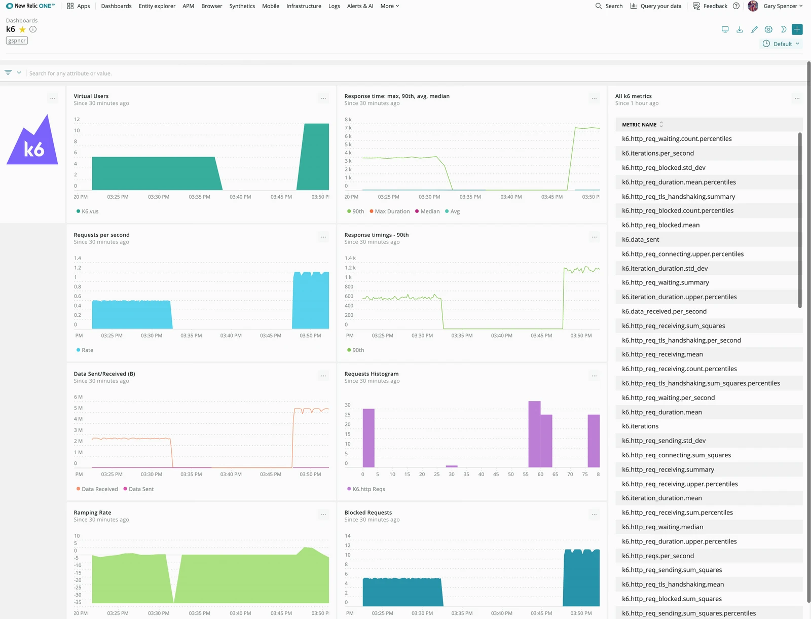
New Relic
Netdata

For statsD–specific options, refer to StatsD in the k6 docs.
Other tool-specific outputs
k6 also has outputs or output extensions to send results to some specific agent or database. Some options include the following:
Grafana dashboards
Along with Prometheus remote-write, k6 can output other results that you can query in Grafana. With Grafana, you can build dashboards to visualize results how you want, then query the data from any backend you choose.
A number of community-built dashboards have already been built. Additionally, the following outputs include pre-built Grafana dashboards for their storage:
Grafana Cloud k6: managed performance testing solution
There are a host of load testing tools and other offerings you can use to track performance. Of course, we must mention our own managed service that comes with Grafana Cloud. With the Grafana Cloud k6 app, you can run k6 scripts from your own computer, then visualize results alongside everything in your Grafana Cloud instance.

Besides the flexibility, Grafana Cloud k6 has some default visualizations with key metrics. What’s more, you can incorporate the results with other dashboards, which means you can correlate results with other observability data.
To learn more, read the documentation for Grafana Cloud k6.
One test, many outputs
k6 is extensible, and you can ship metrics in many formats. From these results stores, you can develop your own visualization or use a visualization tool. If you don’t find the output that you need, you can also build an output extension.
Read more
Grafana Cloud is the easiest way to get started with Grafana k6 and performance testing. We have a generous forever-free tier and plans for every use case. Sign up for free now!


