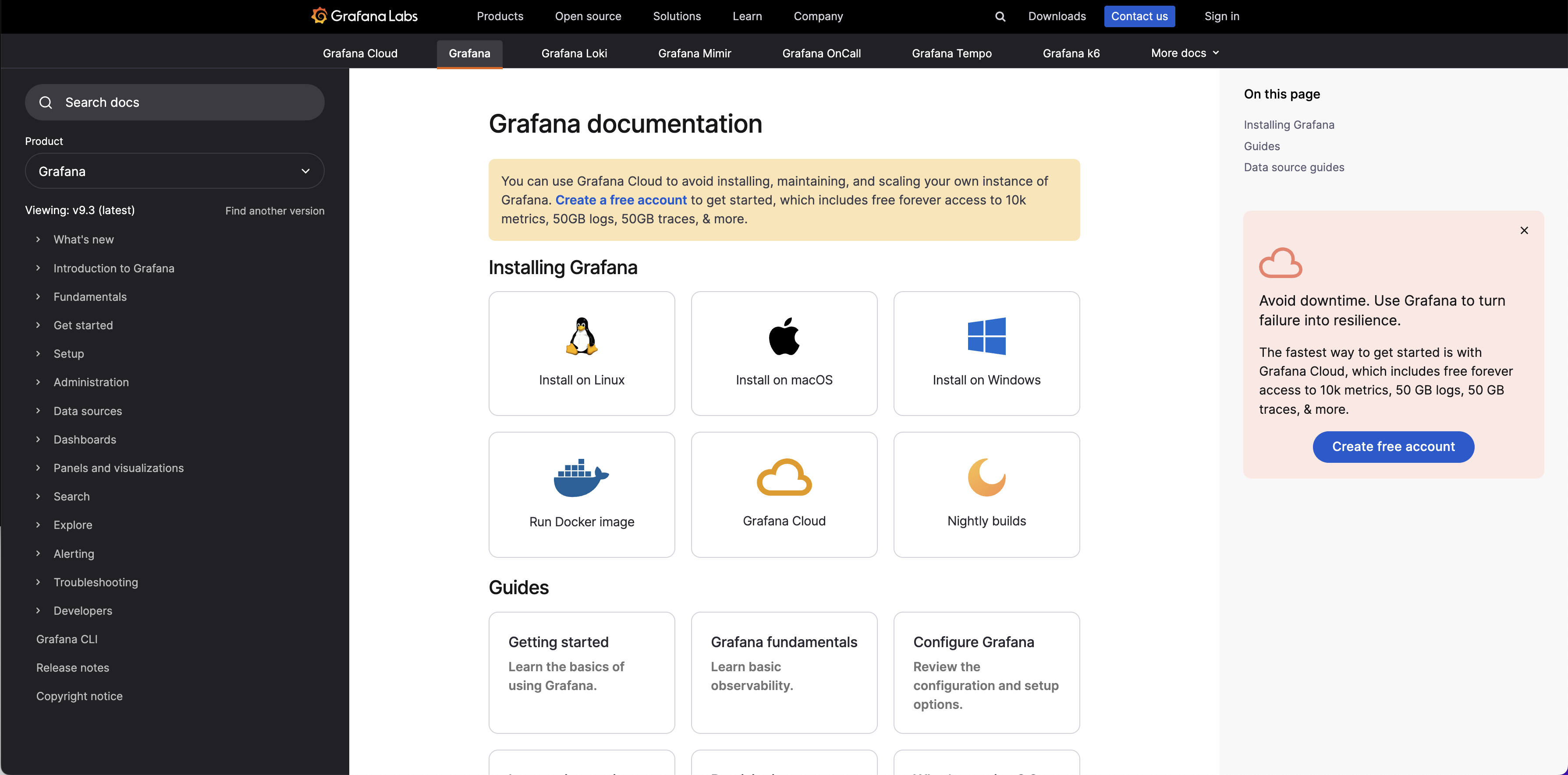
Grafana documentation: A look at the new and improved design
We recently launched a new design for our technical documentation. The goal of the redesign was to make our technical documentation more accessible, modern, and scalable as we grow.
In addition to a new look (hello, new typeface and layout!), our updated docs pages reveal the underlying work our team has done to evolve and enhance our technical documentation. This is all part of our continued commitment to creating technical documentation that helps our users get the most out of our open source projects and our products.

Design improvements for ease of use
When we approached the new design for our technical documentation, both our writing team and contributors generated a list of requests for improvements. The list covered both long-term goals and short-term fixes, with a primary focus on ease of use and readability.
Better navigation
Users are searching for information for a variety of reasons — to solve a problem, answer a question, or gain a deeper understanding of the tools they’re using. They also use a variety of methods to find what they need, most often search engines but also by navigating to different topics of interest from our docs home page.
As a result, the context of where a user is on the technical documentation site is important. In our previous design, we often led users away from the primary topic they were looking for as they clicked on different links to dive into related subtopics.
We wanted to ensure the user journey on our docs site better reflects our users’ needs and search habits. So we designed the left-hand sidebar to broadly outline key subjects of interest and nested related topics underneath. This creates an ecosystem of documentation around a topic that is easier to reference and navigate.

Added floating table of contents
Instead of a static table of contents at the top of the page, we added a floating table of contents on the right-hand side of each page. Now as you scroll, you can see where you are on the page. You can also see the upcoming topics, which supports a better user experience.
Improved access to resources
We’re now generating two different sets of resources at the bottom of each page, which provide Related documentation (powered by Hugo’s taxonomy) and Related resources from Grafana Labs that include blog posts, webinars, and more for users to explore.
More feedback opportunities
One exciting outcome from this redesign? We hear directly from our community more. We’ve always sought feedback from our users, but by enhancing the feedback option and adding more direct prompts, we’ve experienced a significant increase in contributors letting us know about specific topics that they’d like to see improved. The writing team is excited to have a direct connection to our users, and we look forward to even more feedback.
We also welcome your contributions! You can get started by reading our writing process in our Writers’ Toolkit.

What’s next for Grafana Labs documentation
The new docs design highlights some of the improvements we’ve made overall to Grafana Labs’ documentation. In the past six months, we’ve revamped how the Grafana open source documentation is structured, which positions it well to grow and further evolve with future Grafana releases.
Our technical documentation for Grafana Cloud users also continues to improve. Not only is the structure now more logically organized, but we’re also actively working on more improvements to get users started in Grafana Cloud.
Overall, we’re committed to producing and maintaining the best technical documentation possible. In a little over a year, we’ve more than tripled the size of our docs team and we all look forward to collaborating with you.
Start contributing to Grafana Loki, Grafana, Grafana Tempo, or Grafana Mimir! The Writers’ Toolkit is for anyone who wants to contribute to Grafana Labs’ documentation, understand how we build documentation, or solve an interesting problem with their tech docs.


