Five eye-catching Grafana visualizations used by Energy Sciences Network to monitor network data
Hailing from Kane’ohe, Hawai’i, Katrina works remotely as a Software Engineer at ESnet focused mainly on data visualization of their network measurement data.
ESnet (Energy Sciences Network) is a high-performance network backbone built to support scientific research. Funded by the U.S. Department of Energy and part of Lawrence Berkeley National Laboratory, ESnet provides fast, reliable connections between national laboratories, supercomputing facilities, and scientific instruments around the globe. Our mission is to allow scientists to collaborate and perform research without worrying about distance or location.
In order to achieve that mission, we need to make sure our network is running as smoothly as possible. A key piece of this is collecting a wide range of telemetry about our network. Since science is an end-to-end process that crosses many networks, we also participate in multiple external collaborations, such as NetSage and perfSONAR, to make sure other networks have the tools they need to perform this collection as well.
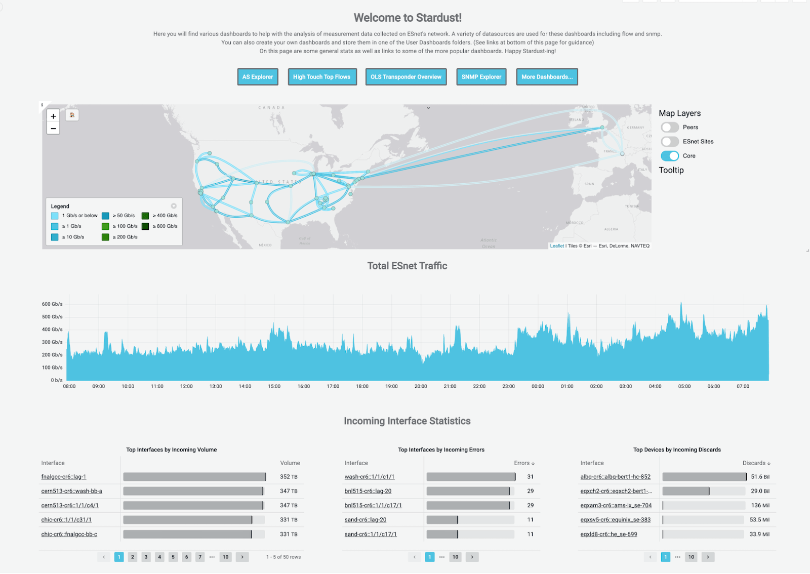
Grafana plays an important role in visualizing and understanding the data we collect both internally and as part of our collaborative efforts. Specifically, we use Grafana as the visualization component within our Stardust Environment. Stardust measures network activity and usage giving us a window into network traffic, scientific data transfer activity, and more. This allows us to do things like predict capacity needs and easily view traffic surges on our infrastructure. While Grafana includes a lot of pre-built panel plugins that are great for visualization, it is also an extensible architecture that allows us to create custom visualizations tailored to our network analytic use cases.

Network data collection at ESnet
Let’s take a brief look at our tech stack. We collect multiple types of raw data from our various devices across our network, then we use a set of services running on Google Cloud Platform (GCP) including a Kafka message bus to ingest the data, Logstash to process the data, and Elasticsearch for storage. We query that data using Grafana’s Elasticsearch data source plugin and display it across a series of dashboards specially designed for our network engineers.

As we created our dashboards, we found that the suite of panel plugins already available from Grafana not only created a number of possibilities for visualizing our data, but also sparked ideas for more (which is where I come in!).
Extending Grafana through plugins
Motivated by a combination of our external collaboration on the NetSage project and our own internal efforts with Stardust, we have since published multiple plugins to the Grafana community plugins page for other users to take advantage of as well. These plugins include: Sankey Panel, Slope Graph, Bump Chart, Chord Diagram and, most recently, the Matrix Panel.
Sankey Panel

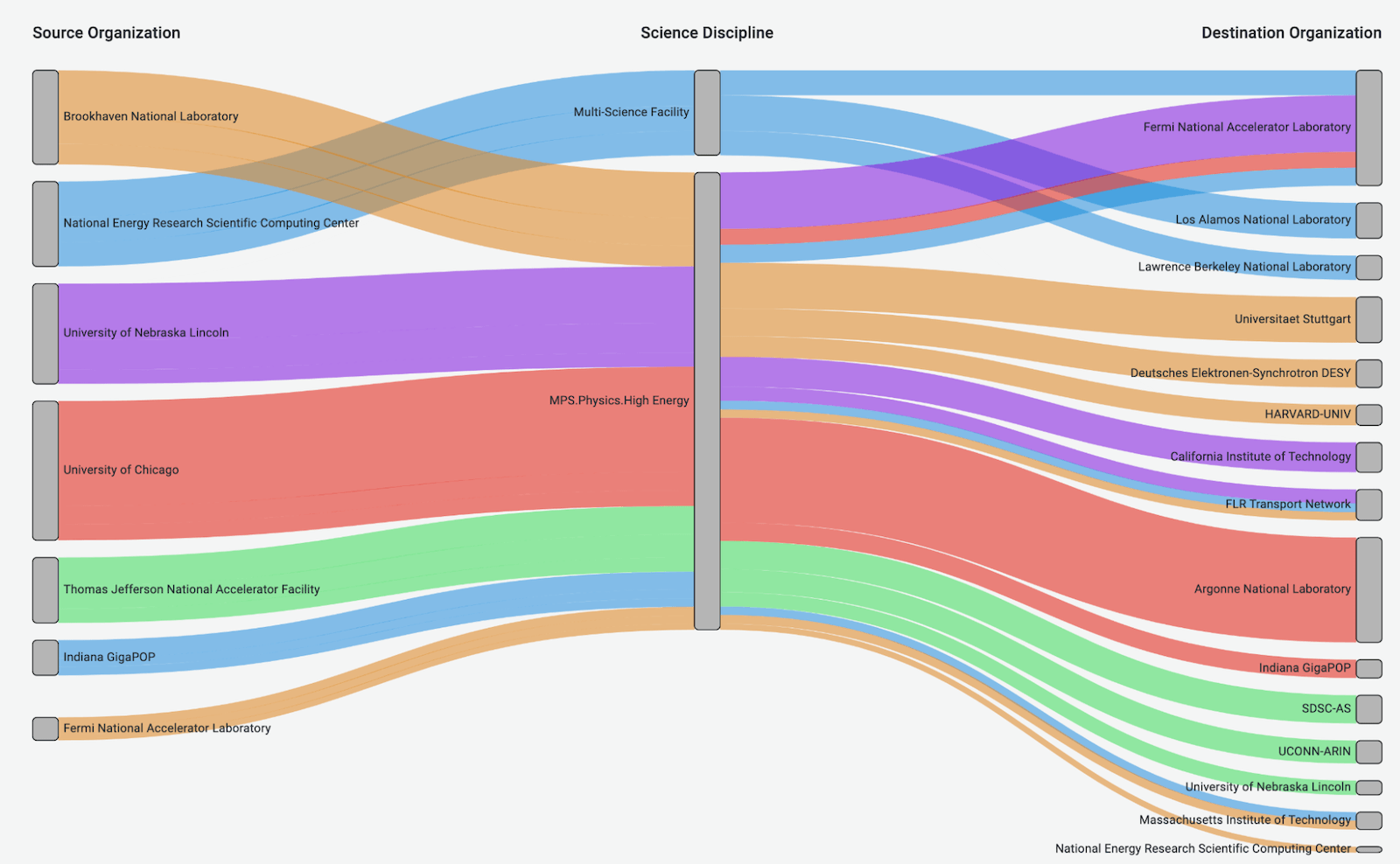
The Sankey diagram was one of our first custom panel plugins, originally written as part of NetSage, then rewritten for Grafana 7 (it now uses the nice d3 sankey library). As far as we could tell at the time, there was really nothing quite like the Sankey diagram available in Grafana. The main purpose of a Sankey diagram is to show how flows move between multiple sets of data. Since we visualize flow data, this seemed like a pretty obvious win for us to be able to visualize data this way.
Slope Graph

The slope graph was created for the NetSage project to visualize the answer to the question, “What are the true top N pairs of a given data set and how do they relate to each other?” The Sankey Panel could easily show the relationship between two variables, but it cannot show the “true top N pairs” because of the way the query aggregates and sorts the data to return. (Give me the top X for each of the top Y.) The table plugin can easily perform a large query and sort by the given metric to show the “true” top N pairs, but it is simply text and doesn’t show relationships at a glance the way a graph does. One of the purposes of a slope graph is to show the relationship between two categories, so we thought it would be a good fit here.
Bump Chart

This chart was also created for the NetSage project and allows us to answer questions like, “Who are the biggest users of our network over time?” A bump chart is essentially a time series graph, but the y axis is strictly by rank. Normal line charts would use a metric such as volume, rate, count, etc, but as you can imagine, the lines can be awkwardly bunched up or spread apart depending on the differences in those metrics. By sorting the lines strictly by rank, the resulting visualization is much easier to interpret at a glance.
Chord Diagram

The chord diagram provided us with an interesting way to visualize connectivity for things like our sites. It creates a great graphic for us to include in slides, and while it can sometimes seem confusing at first glance, it can be a powerful visual to assist in storytelling when properly embedded. There was already a nice d3 library for this, so it was a relatively simple plugin to build, which was another perk.
Matrix Panel

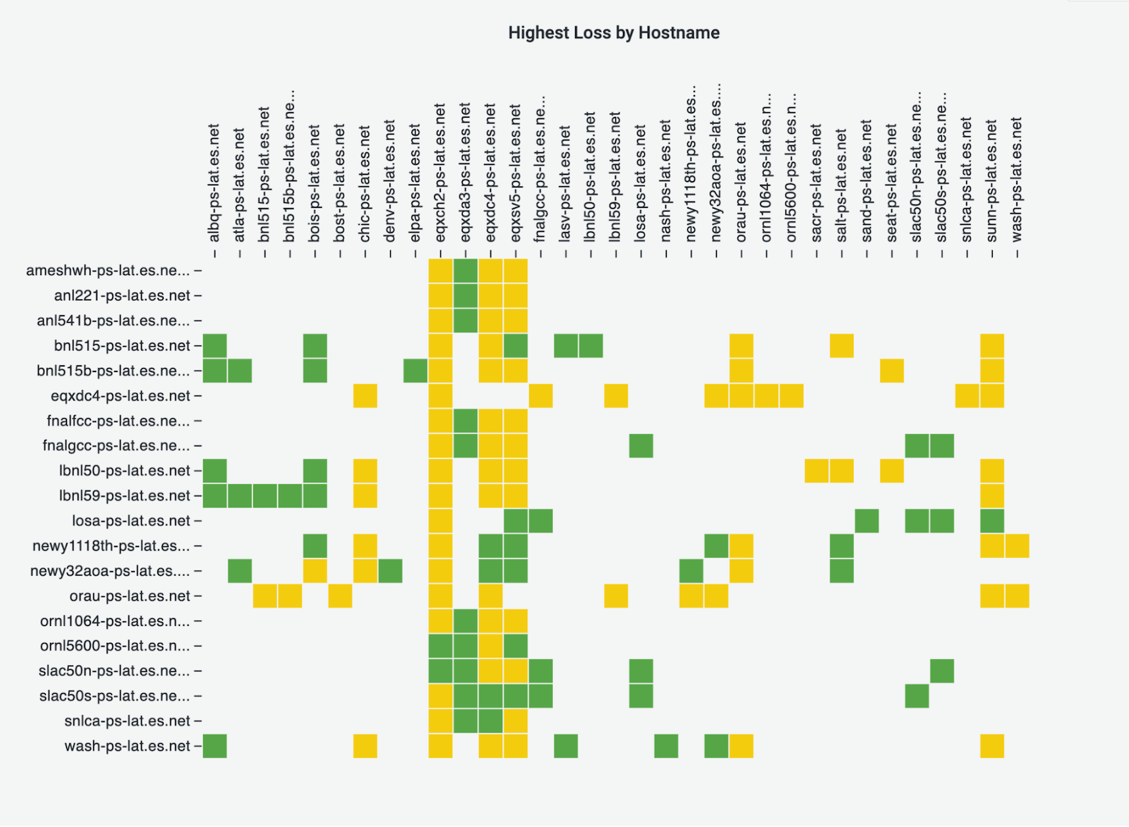
This was created to replicate a popular visualization in the perfSONAR project to show a collection of network measurements between two points. Now that Stardust ingests perfSONAR data as well, we wanted to be able to display these key visualizations on Grafana dashboards. The Matrix Panel plugin is fairly straightforward — it visualizes the relationship between any two categories. While Grafana has many different heatmap plugins, they all require time series data on one of the axes, whereas the Matrix plugin has two categorical axes.
What’s next
Plugin development has definitely been a journey, especially because about a year in, Grafana switched over to React-based plugins. We ended up rewriting three of ours, but it has definitely been worth it. It makes Grafana that much more powerful as a visualization tool for us, knowing that if we cannot find a plugin that matches our needs, we can just make one. I should also note that the Grafana developers (as well as various community members) are very helpful on the community Slack channel.
What’s next? Well, we may or may not have another plugin in the works . . . Stay tuned!
Want to share your Grafana story with the community? Drop us a note at stories@grafana.com.


