How flame graphs visualize continuous profiling data in Grafana Phlare
We recently announced a new open source project called Grafana Phlare. This highly available continuous profiling data source is built into Grafana core, allowing you to seamlessly monitor your profiling data.
With continuous profiling, you can see which parts of your applications are consuming the most resources. You can then use that data to make any necessary tweaks to reduce consumption, which translates to lower costs. And if you’re using CI/CD, you can use continuous profiling to compare version releases to see if there are any performance improvements.
But how is this data visually represented on screen? In this blog, we’ll go through a new type of visualization we’ve added to Grafana — flame graphs. We’ll also examine how we’re using the flame graph to view continuous profiling data.
How flame graphs visualize continuous profiling data
At Grafana Labs, we use flame graphs to visualize continuous profiling data in our user interface. The flame graph has become the de facto standard for visually representing the hierarchy of profiles and makes it easy to see the function call stack in our applications.
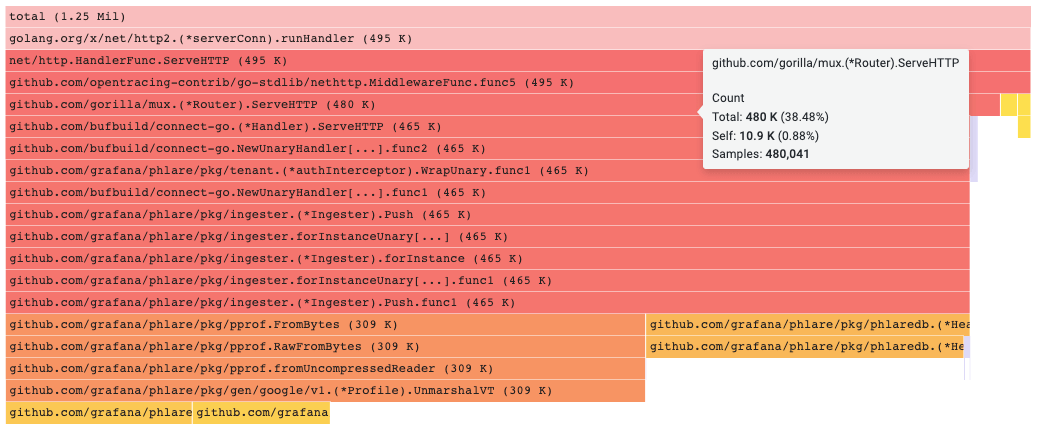
As we move further down the stack trace along the vertical axis, we can see which functions are being called and the amount of resources they are consuming.
At the top of the flame graph the block is colored in red, based upon the blocks total value. This is the root block and all other blocks are its children, therefore this block naturally takes up the full width of the flame graph. As we move further down the stack, the color becomes orange and eventually yellow based upon each block’s total value.

How does our flame graph work?
With flame graphs, you know which functions consume the most resources in your system. You can see the hierarchical nature of the call stack, which you can then use to drill down into the areas of the systems that take the longest time to execute.

Clicking on a block will focus on that block and all blocks below it. That way, you can see what child functions are being called by that particular parent function. This narrows down your field of focus. You can do this as many times as necessary to get a better overview of your system’s resource consumption or to find the function taking up more resources than you would like.
You can still see all functions in the call stack as you do this, but the width of the flame graph will be changed so that the block you have clicked on is taking up 100% of the width. This gives you a better representation of the scale of that function and the resources it consumes relative to the other functions in the call stack above and below it.
As you can see from the image above, it’s also possible to scroll over a block to view more of its details such as its self or sample values.

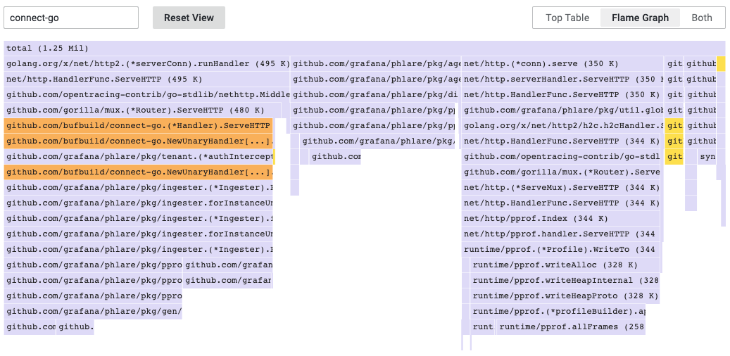
There is also a handy search input you can use to narrow down what you’re looking for. In the image above we’re searching for connect-go. The flame graph makes it easier for us to visualize by using a more neutral tone to color any block that doesn’t have the search text in its label. This leaves only the correct matches highlighted for us to take a closer look at.
But wait, there’s more!
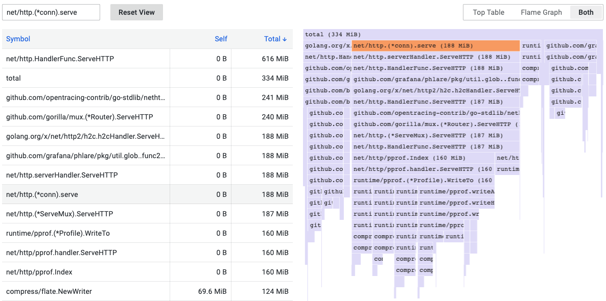
We also provide a top table alongside the flame graph. Both can be viewed at the same time or on their own.
As the name implies, the top table allows you to visualize the data in a simpler format — a table! Within a table, we have three columns: symbol, self, and total. By default, the table is ordered by self, but you can easily change that by clicking on any of the other columns in the table.
You can also click on a row in the top table to add it to the search and highlight its symbol in the flame graph. This can make it easier to find a particular symbol in the top table and highlight it in the flame graph.

What’s next?
We’re constantly working to improve Grafana Phlare, so be sure to keep an eye on upcoming releases. Having said that, we at Grafana Labs are also extremely thankful for any requests we receive for features, improvements, or bug fixes. Be sure to start a discussion or open an issue with your ideas!
Also, if you have any questions you can reach out to us on Slack in the #phlare channel.
Grafana Cloud is the easiest way to get started with metrics, logs, traces, and dashboards. We have a generous free forever tier and plans for every use case. Sign up for free now!


