Reduce MTTR and improve UX with Grafana Enterprise: Inside Optum’s observability stack
Among the 12 greatest stressors in life, six revolve around healthcare issues. From loss of a loved one to pregnancy and even retirement, these events often involve interactions with healthcare services — interactions that can either add to an individual’s stress or, ideally, help alleviate it.
For Optum, a U.S.-based health services business, any one of its nearly 127 million members could be navigating one of these life events at any given moment. In an effort to reduce those stresses, the company puts a high priority on a web experience that is fast, reliable, and streamlined to best answer user questions. It’s a critical component of the customer experience since the site’s portals are used to review health insurance information, order prescriptions, find medical providers, and more.
In his recent GrafanaCONline talk, titled “How Optum uses Grafana Enterprise for a top-to-bottom view of its healthcare website,” Portal Monitoring Team Lead Mark Smith shared how his team used Grafana Enterprise to build a website performance monitoring system that’s easy for people across the organization — from the C-suite to admins to development teams — to access and interpret data to drive better decision making.

Uniting disparate data sources with Grafana Enterprise
When Optum began researching ways to better monitor their deployments, they went into the project with three goals:
- Provide real-time information on site performance. The focus here was on the customer perspective: Can they log in? What are page load times? Is the journey responsive as they navigate the site? What’s the uptime?
- Reduce mean time to repair (MTTR). The team wanted faster altering and response times. They also wanted a complete view of a page so they could identify what was failing and what impact that had in a matter of seconds.
- Measure performance to drive improvements. They wanted to use weekly executive reports so leadership could make decisions about investments to improve performance and customer satisfaction.
And while they aim to deliver a seamless website experience for users, there’s a complex web supporting those efforts behind the scenes. The company has dozens of development teams, the system includes thousands of components, and the website represents multiple lines of business with varying degrees of overlap. Plus, their pages are complex. For example, one page includes 32 API calls, 18 browser components, 15 JavaScript components, and 34 marketing components.
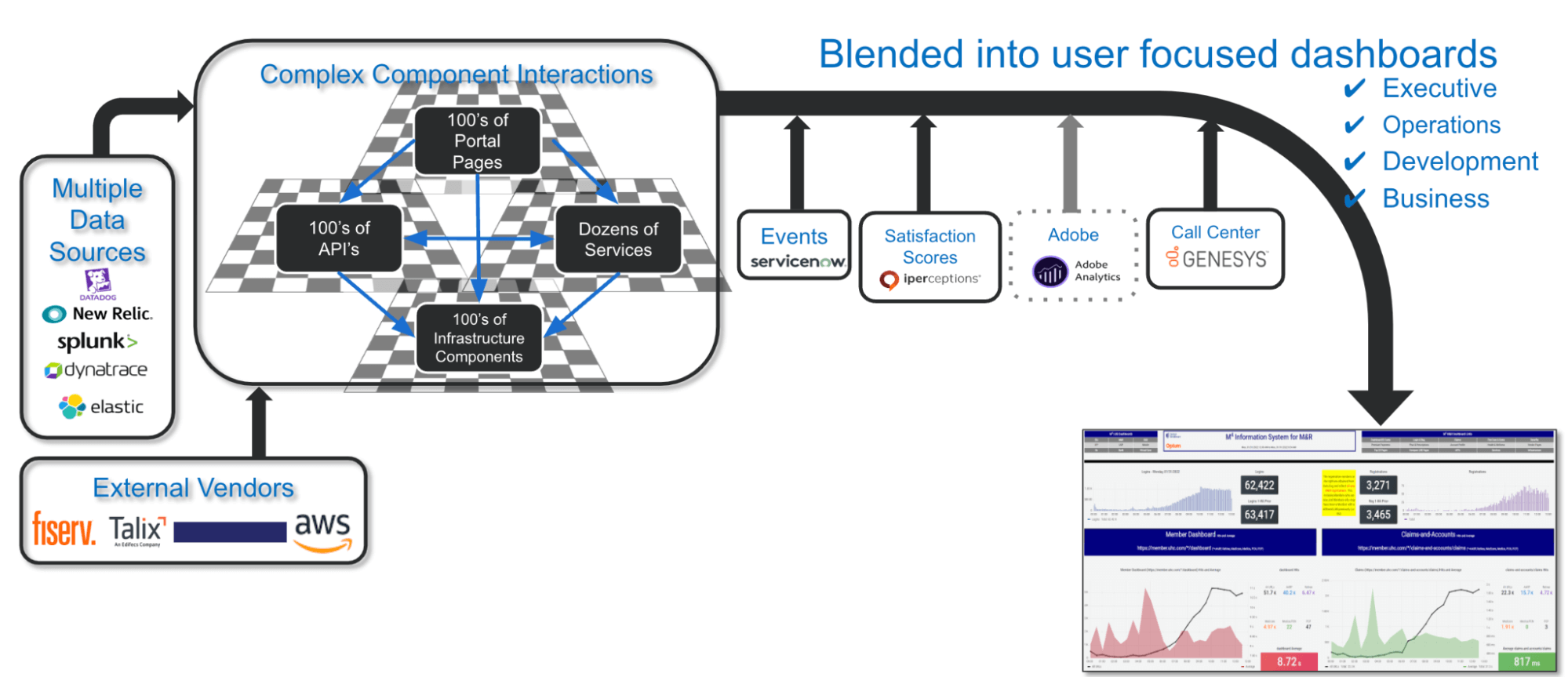
On top of all that, the company has grown rapidly — organically and through acquisitions — which has led them to use multiple outside monitoring vendors. Taken collectively, it was hard to build a monitoring system that provides both high-level overviews and detailed drilldowns.
“Vendors have told us to implement everything with them, but we’re not going to re-implement hundreds of pages and thousands of components overnight,” Smith said. “We’re not going to end up on a single vendor that’s going to be capturing the data.”
Smith estimated that a single-vendor approach would take at least three to five years to complete, which wasn’t an option. Instead, they created an architecture that blends multiple data sources, complex component interactions, and external vendor data. That data is then visualized to provide immediate insights via Grafana Enterprise dashboards.

With this approach, the team quickly built a robust website performance monitoring solution despite some hurdles, including limited internal standardization and uncertainty over how some components interact. “With Grafana and the other tools, it’s allowed us to move really, really fast,” said Smith. “We’re not spending a lot of time developing plugins or connecting to data sources — we just get it and go.”
Designing Grafana dashboards for executive users
Each dashboard in Smith’s monitoring system is designed with the user experience in mind, which means they have to be approachable for all stakeholders. For example, there are quick, simple views designed to give executives a snapshot of portal health. “The executive view is green, red, yellow — that’s what they want to know,” said Smith. It was important to his team that all information be put into context so the viewer could quickly compare current metrics with historical data and see how performance was shifting over time.

In addition to these C-suite-friendly dashboards, Smith’s team is building out detailed dashboards that go deeper into additional key metrics — everything from load times to errors to browser types — that internal users can choose from to analyze potential issues. “That deeper view allows the development leadership to understand if there is a problem, what is causing the problem,” said Smith. Ultimately, their goal is to have a top-to-bottom view of their stack — web pages, APIs, services, and infrastructure — so they can identify the exact problem within seconds.
Grafana Enterprise makes it easy to navigate between these dashboards. And because maintenance is simple and straightforward, Smith and his team of five developers have been able to efficiently keep up with URL changes and releases.
With their website performance data unified and key metrics visualized in accessible dashboards, Smith’s team now provides real-time data from a customer perspective that has reduced MTTR. “It’s allowed us to drive improvements to our member experience within our company, and we’re very thrilled with how we’ve been able to achieve that,” said Smith.
Watch the full session to see more of Optum’s website performance dashboards and hear about the design principles that guided their development. All our sessions from GrafanaCONline 2022 are now available on demand.


