How to build machine learning models faster with Grafana
Armin Müller is the co-founder of ScopeSET. ScopeSET specializes in R&D work to build and integrate tools in the model-based systems engineering domain, with a track record of more than 15 years of delivering innovative solutions for ESA and the aerospace industry.
Training machine learning models takes a lot of time, so we’re always looking for ways to accelerate the process at ScopeSET.
We use open source components to build research and development tools for technical companies. In one of our recent research projects for the European Space Agency, we had to analyze time series data to train machine learning models intended to support automated anomaly detection.
The results of these anomaly detection runs are then brought into context of existing model-based system engineering data, in particular, SysML block diagrams. As a result, analysts, testers, and even non-expert users can get to a root cause analysis much faster than traditional and non-integrated approaches.
Our web-based platform provides import and tracing functions as well as some auxiliary tools. After struggling to incorporate several visualization tools into our stack, we ultimately settled on Grafana and cut the time it takes to complete our data input analysis in half. Here’s how we use Grafana to simplify and accelerate anomaly detection.
The data: analyzing satellite sensors
Part of the test data we received for this project included a PostgreSQL database containing approximately three years’ worth of sensor measurements data collected during the assembly, integration, and test (AIT) phase of the CubeSAT MOVE-II demo mission — a program that involved a group of more than 120 students designing a small satellite that was launched into orbit in 2018. Initially, we transformed this data into normalized CSV files we wanted to feed into the learning step of a supervised machine learning approach called long short-term memory, or LSTM.
At this stage in LSTM, the focus is on identifying the time ranges of nominal data. These ranges are then fed into the model preparation, and the resulting model is used to forecast several steps ahead. The forecast data is then compared to the actual data to detect any anomalies. Furthermore, this analysis typically contains multiple time series for multiple sensor measurements. In our test case, we took measurements from three on-board temperature sensors, with a two-second sample rate over one month for nominal time range selections.
The problem: slow visualization tools
Initially, we used different CSV visualization tools — or even looked at raw CSV files at times — but we quickly realized this approach was too time consuming. One of the key aspects of evaluating an ML approach, apart from the detection and false-positive ratio, is the time it takes to train a model. With a supervised approach, this includes not only the compute time to build the ML model, but also the required classification and labeling effort.
One other tool we use on the platform is JupyterLab due to its flexibility and also because all of the analysis scripts are written in Python. One of the nice features of Jupyter is that results from code fragments (or “cells”) can be directly rendered inside the notebook. So the natural first step was to use a Python graphing library like plotly to render charts and subcharts of the time series data we had to analyze.
However, we quickly realized that didn’t really scale well — at around 100,000 data rows or more, the browser showing the Jupyter notebook got rather sluggish. At this point, we decided to try Grafana and were positively surprised by how quickly our team could load, render, and zoom into the time periods we were investigating.
The solution: integrating Grafana
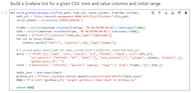
Our platform consists of a set of core services, like a big-data-capable HDFS store; extract, transform, load (ETL) components; analysis scripts; and Angular web front ends; as well as auxiliary tools. We linked the Jupyter notebook code to Grafana with a little Python helper function that used a small part of the Grafana HTTP API to render CSV files from the HDFS storage at the click of a mouse from the Jupyter notebook:

This function can subsequently be used like this:

Using Grafana dashboards to visualize anomaly detection
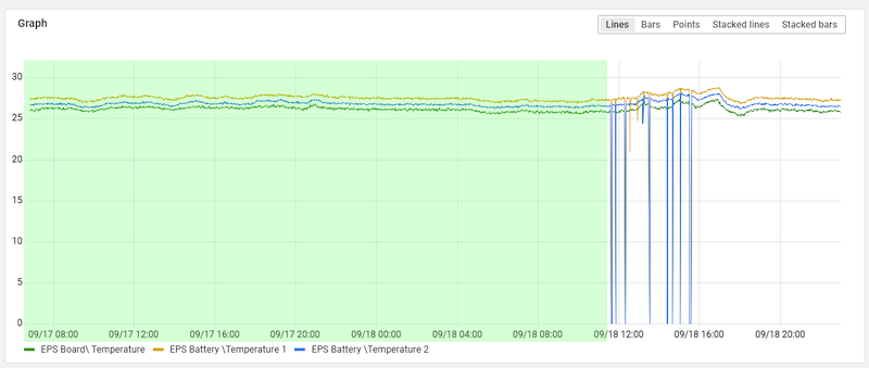
The visualization for manual inspection can then be opened by clicking on the generated link in the notebook:

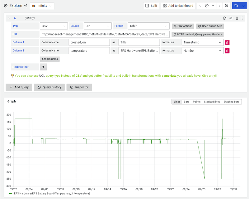
For this to work, we installed Grafana’s Infinity plugin, which loads the CSV file directly from an endpoint of our HDFS storage.
As a result, when domain experts want to get time ranges for nominal data, they can now easily zoom into various areas and identify ranges of nominal data:

Today, these ranges — i.e. the start and end timestamps — need to be entered manually into the Jupyter notebook being used for training the LSTM model.
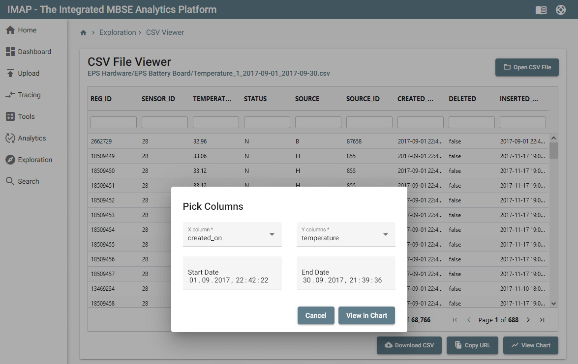
Additionally, we added a View in Chart button to our CSV browser that simply opens the loaded CSV into Grafana:


Finding efficiency at scale with Grafana
With just the HTTP API in Grafana, we get a convenient integration into a data analytics tool that helps to efficiently identify ranges of nominal data. The performance and UI responsiveness of the Grafana chart rendering more than 100,000 rows of data is really impressive, especially compared to other solutions and visualization libraries.
Ultimately, we cut the time it took to analyze the raw input data in half with Grafana. And since different anomaly scenarios require different machine learning models, this improvement has a multiplier effect across investigations.
At this time, we haven’t investigated how to deepen our integration, but there are other intriguing options we might consider. For example, it would be interesting to extend Grafana to select and send time ranges to the notebook or a configuration file directly — either by transferring ranges back to our tool or by using Grafana dashboards to visualize anomaly detection results.
Want to share your Grafana story and dashboards with the community? Drop us a note at stories@grafana.com.


