Building Grafana dashboards for a large-scale deployment in a tight timeline: Inside Cisco Live
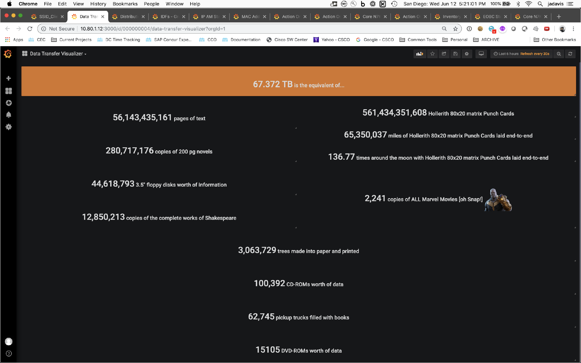
How many Marvel movies’ worth of Internet traffic do 28,000 conference goers create during a five-day Cisco Live event?
There’s a Grafana dashboard for that.
Cisco Live is the network industry’s largest annual event, delivering education and inspiration to technology innovators worldwide with a week’s worth of programming keynotes, product announcements, entertainment, and more. With events held across multiple venues, it takes a dedicated IT support staff working tirelessly to deliver comprehensive wireless connectivity and uninterrupted service for digital signage, recording systems, and presentation computers.

Led by Cisco Distinguished Engineer Jason Davis, the team also builds and displays live Grafana dashboards that showcase event-related metrics on everything from data volumes to wireless signal strength. In his GrafanaCONline talk titled “28,000 people, 2300 wireless access points, 650 network switches, and jumbo dashboards: How Grafana provides data visibility at Cisco Live” (which is now available on demand), Davis shared how his team creates engaging Grafana dashboards that delight attendees and provide mission-critical insights for team members and stakeholders.
Visualizing performance monitoring in real time for 28,000 guests
Prior to Cisco Live 2022, the last in-person event was hosted in 2019. That’s when Davis and team started using Grafana dashboards to visualize monitoring data in real time and display it to guests.
Between networking equipment, wireless connections, and controllers managing network activity, there was a lot to monitor at the conference. “The metrics of concerns are not that different from what you might monitor with a server,” said Davis. In 2019, the Grafana dashboards that Davis built kept tabs on everything from CPU and memory usage to errors, signal strength, and ambient temperature near sensitive equipment. These dashboards were displayed on jumbo screens throughout the event to engage their audience of network professionals.
“Invariably we also have people coming to these events who are not in the networking discipline,” said Davis. So the team also built Grafana dashboards that would appeal to an extended audience. The Jerry Lewis Telethon dashboard, which is an affectionate nod to the famous tote boards highlighted during the annual fundraiser hosted by the late comedy legend, showcased how much Internet traffic is used over the course of the event. And a fan favorite visualization showcased Internet volume data equivalents in quantities like pages of text, complete works of Shakespeare, and the entire Marvel movie canon.

Bigger, better, bolder dashboards with Grafana Cloud
For their 2022 event, Davis and team upgraded from Grafana 6.1 to Grafana 8.4 in order to take advantage of new visualizations and features. “I’m really enjoying the ’90s retro LED bar graph, and we’re trying to figure out unique ways of using the radar graph visualizations,” said Davis. And he’s already tried out the series override/transform/ inverse plot feature to build new dashboards that handle the differences of in/out traffic without utilizing complex math. “That was a pretty good feature add for Grafana,” said Davis.
They’ve also migrated to Grafana Cloud and are using it to augment their on-prem implementation. By running duplicate pushes of data, this will let the team test out the possibility of handling everything in the cloud for future events.
The end result? Bigger, better, bolder Grafana dashboards to share with attendees at their Las Vegas event this year. The Jerry Lewis Telethon dashboard had a new look, and Davis’s team also updated visualizations showcasing CPU, memory, and optical power levels utilizing new candlestick charts and LED graphs.

By thinking about their audience and identifying which visualizations will resonate with them, Davis and his team have built highly engaging dashboards that delight Cisco Live attendees every year. His best tip for building your own high-impact visualizations? “Start with your intent,” said Davis. Then “see what you have available to you that’s interesting, especially when you mash up data from multiple sources – I just love that.”
Watch the full session for more pro tips from the Cisco Live team and to see the 2022 version of the infamous Jerry Lewis Telethon dashboard. All our sessions from GrafanaCONline 2022 are now available on demand.


