
What's new in Grafana 8.1: Geomap panel
The Worldmap panel in Grafana is an existing feature in OSS that has been widely used, but it has some limits that weren’t easily fixed.
Now with the release of Grafana v8.1, we have introduced an upgrade to the Worldmap panel with the new Geomap panel visualization that allows you to view and customize a world map using geospatial data, all while sharing the same infrastructure with our core UI.
Here, we’ll explore some of the exciting features of the Geomap panel, which include more customizations, the ability to define the data layer, and sharing capabilities that allow the same view across multiple Geomap panels on the same dashboard. You can explore all of the latest options available in the Geomap panel documentation.
Multiple base layer options
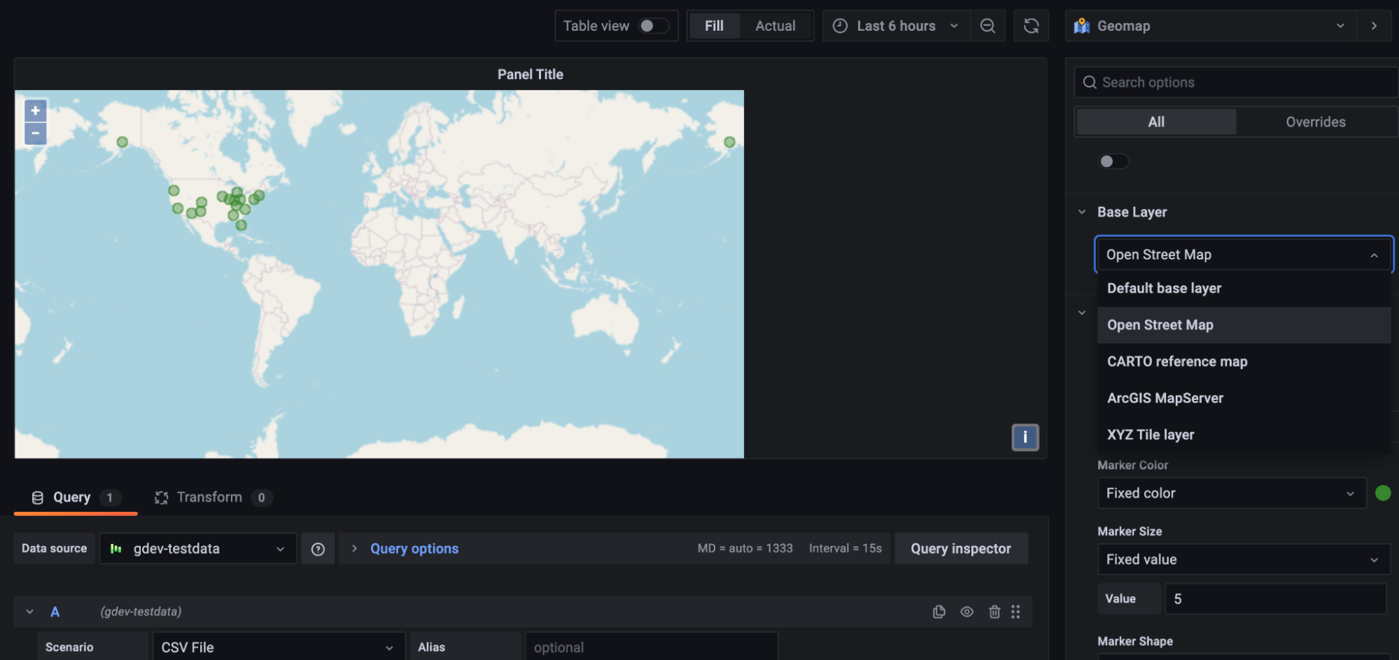
When creating a new dashboard, the Geomap panel will look similar to what would normally appear except there are now several exciting options for users to play around with.
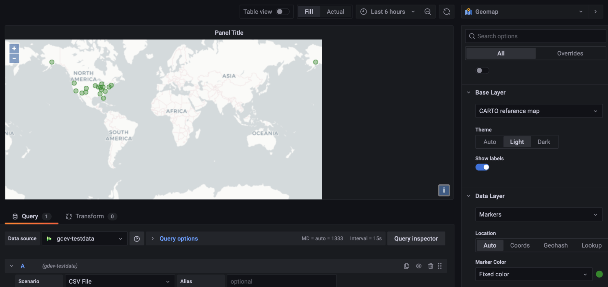
The panel ships with multiple map layer options, such as Open Street Maps and a number of ArcGIS options, as well as the existing CartoDB tile set, which is the default base map. And if you like the current CartoDB map, you can also switch between light and dark themes for better visibility.
Better customized markers
For data markers, you can now choose a gradient scale to represent a range of data points as well as change the marker size based on a data point.
The data in the example below showcases the number of flights from each state and the average price. After choosing a color, each marker now represents the size of each data point, and the legend is presented as the gradient scale of the chosen color scheme versus a single color or a threshold.
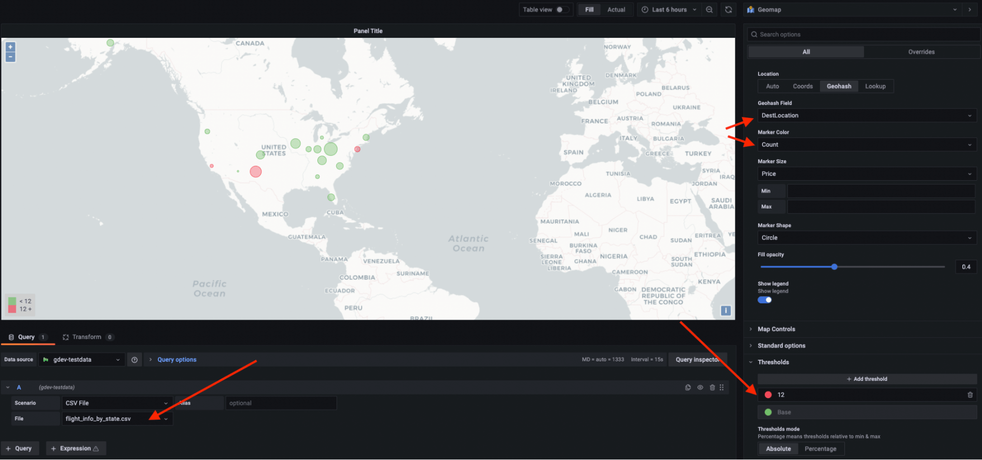
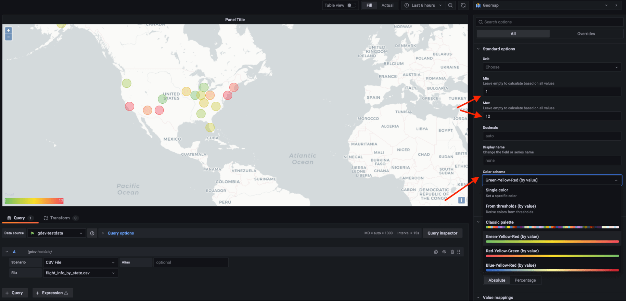
Users can now also set the min-max so that individual circles or markers render at the appropriate size in respect to the rest of the data set. For marker shapes, we offer six regular shapes. In future releases, we plan to introduce icons in our icon library as marker options.
Heat map layer
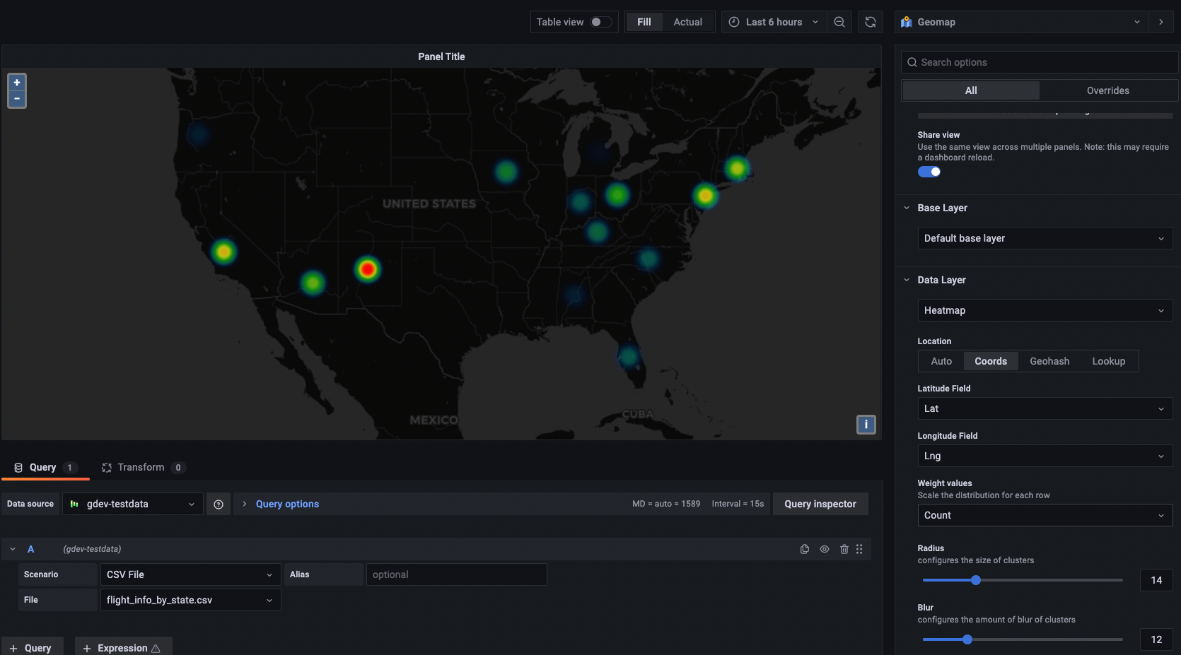
On top of the markers layer, we also offer a heat map layer that clusters various data points to visualize locations with different densities.
A defined data layer
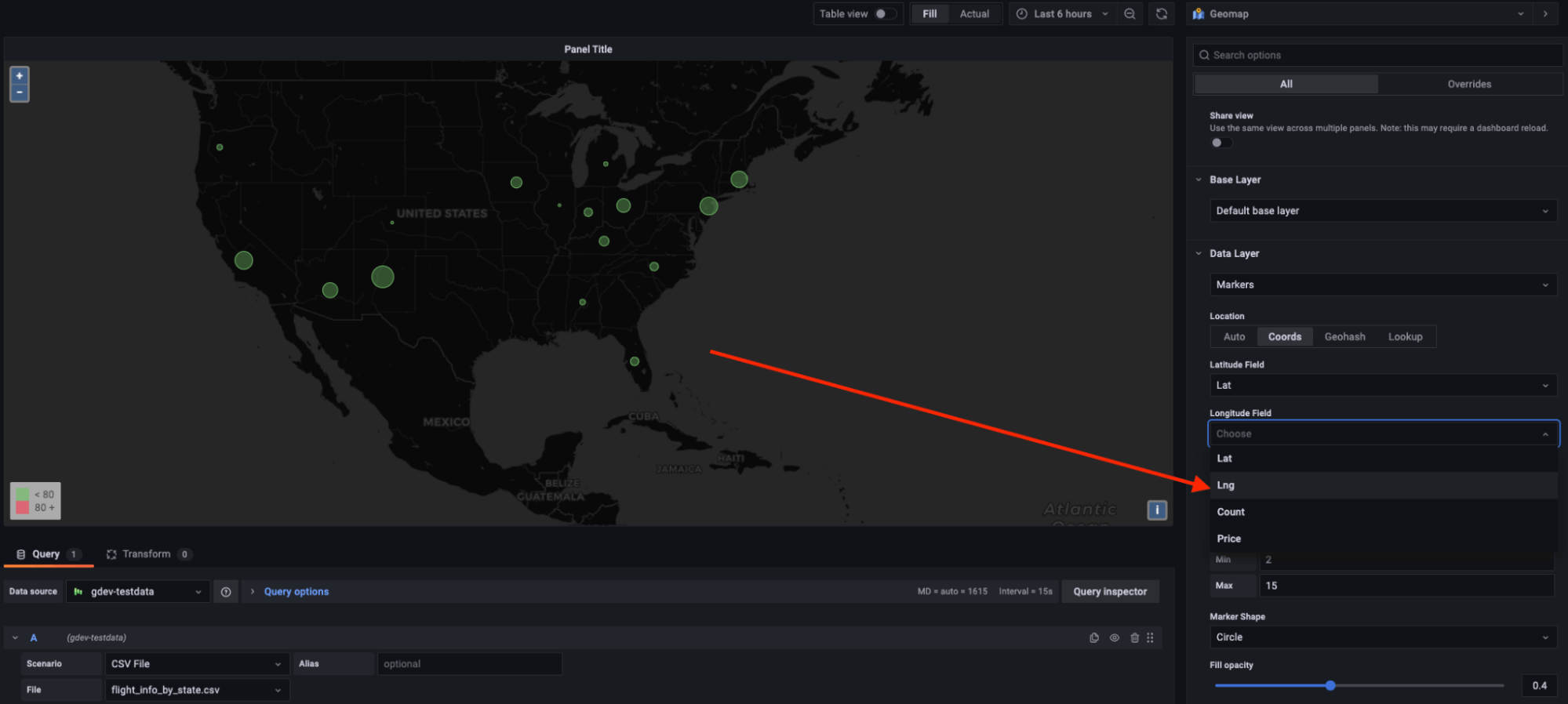
The data layer in the Geomap plugin determines how you visualize geospatial data on top of the base map. There are four mapping options that will be generated automatically from the data source: auto, coordinates (latitude and longitude), geohash, and look up. This allows you to display your data in more flexible ways that fit your data source.
New sharing capabilities
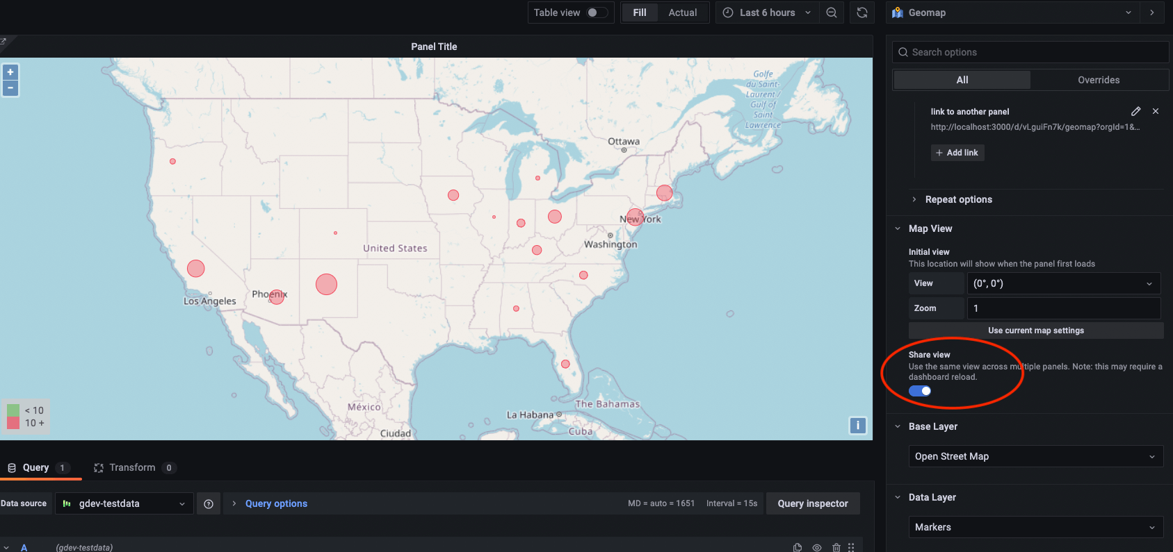
A new feature in the Geomap panel allows users to link multiple map panels within the same dashboard. Panels can be zoomed in/out or moved around together. The share view option can bind the display in a way where multiple data layers can be shared across different maps, which allows for a more comprehensive exploration of data in tandem.
Overall, the ability to separate data layers in addition to customizing map view settings and data styles in the latest Geomap panel introduces a much more flexible, dynamic approach to location-based data visualization.


