How to visualize your business performance with cohort tables using Grafana and BigQuery
Grafana presents some of the most versatile tools for visualizing and understanding the real-time performance and reliability of systems, regardless of where your data lives. But one question our customers frequently ask is, “Can I use Grafana to understand the health and performance of my business?”
More often than not, our answer is yes. In the past couple of years, a number of new data sources have been developed by Grafana and the Grafana community that make diving into your business data faster and easier. The business-oriented data sources include:
- Salesforce (Enterprise-only)
- SAP HANA (Enterprise-only)
- Oracle Database (Enterprise-only)
- SQLite
- MySQL
- PostgreSQL
- Google Sheets
- Google BigQuery
You might be wondering, “Which of these data sources does the Grafana team use?”
BigQuery is where much of our business data ends up. So when we are asking questions about the impact of our initiatives on our business, BigQuery is typically the place we are querying.
As we began developing our Grafana Cloud offering in particular, we found examples of questions that we were asking ourselves on a regular basis — questions that we found we could easily resolve by visualizing certain parts of our business.
Some of these vital questions were:
- “Are visitors to our sign-up page converting to registered users at the expected rate?”
- “Are our emails being opened at a healthy rate?”
- “Are we sure we’re developing a better experience for our users over time?”
In this post, we’ll explain how we’re answering the last question using Grafana dashboards: How do we know we’re building a better Grafana Cloud over time?
Specifically, we’ll cover how to visualize your business performance over time by creating a cohort table of a dataset. Ultimately, you will be able to replicate our tactics and begin using Grafana to visualize the performance of your business and gain an understanding of how to analyze the behavior of your customer cohorts using Grafana and BigQuery.
Building cohort tables with Grafana
What is a cohort table? Cohort tables are a result of conducting cohort analysis on your dataset.
In other words, cohort tables show us groups of objects — in our case, Grafana Cloud users (sign up for a free Grafana Cloud trial here) — based on their shared characteristics within a specifically defined time span. By grouping users based on a time span, cohort tables reveal whether or not the behavior we’re selecting for is improving over time, and how long it takes for a user from a given cohort to accomplish a desired behavior.
Now, let’s imagine a scenario where we analyze cohorts of Grafana Cloud users who are visiting the Grafana blog. For example, we believe that if a Grafana Cloud user visits our blog more than once to find our regularly published updates and tutorials, then the Grafana blog contributes towards a better overall Grafana Cloud experience by helping users learn and be more well-informed about Grafana.
Collecting the data

In this example of measuring visitors to the Grafana blog, we need to save anonymous pageview data so that we can query it at a later time. Our current implementation for collecting pageview data works as follows:
We have a frontend tracking script installed on our blog that emits pageview events to RudderStack containing an anonymousId for every distinct visitor to our site. RudderStack accepts the pageview events we emit and then routes the events to popular marketing, analytics, and data warehouse tools such as BigQuery. (Learn more about RudderStack’s event-based tracking schema in the RudderStack documentation.)
From RudderStack, the pageview events are then relayed onto BigQuery where they are saved and stored in a table that is easily able to be queried for downstream analysis.
Creating Cohort Tables
Prerequisite: Before we go straight into creating cohort tables via Grafana, you’ll want to make sure you have the BigQuery plugin installed. Visit the BigQuery plugin page to install BigQuery on your Grafana Cloud stack.
Next we’ll brush off our SQL skills and jump into Grafana to create a series of queries that will give us a table showing exactly the cohort data we’re interested to see. Here’s an outline of the steps to create a cohort table in Grafana:
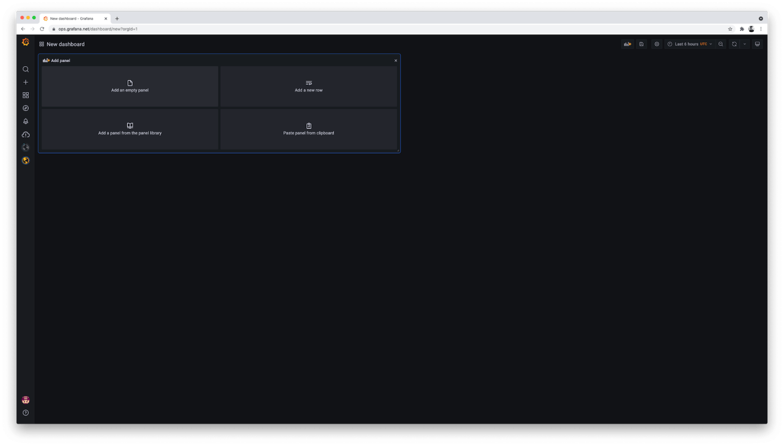
1. Create a new empty panel
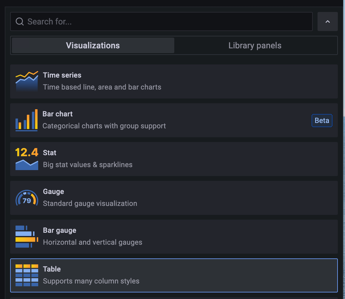
2. On the right side, change the visualization type from “Time series” to “Table”
3. Under the Query editor:
- Select your BigQuery connection as your data source
- Change the “Format as” selection from “Time series” to “Table”
- Click “Edit SQL” in your query editor to add a custom SQL query
- Copy and paste your SQL query into your editor
4. Click the Refresh button near the top right to run your query with Grafana
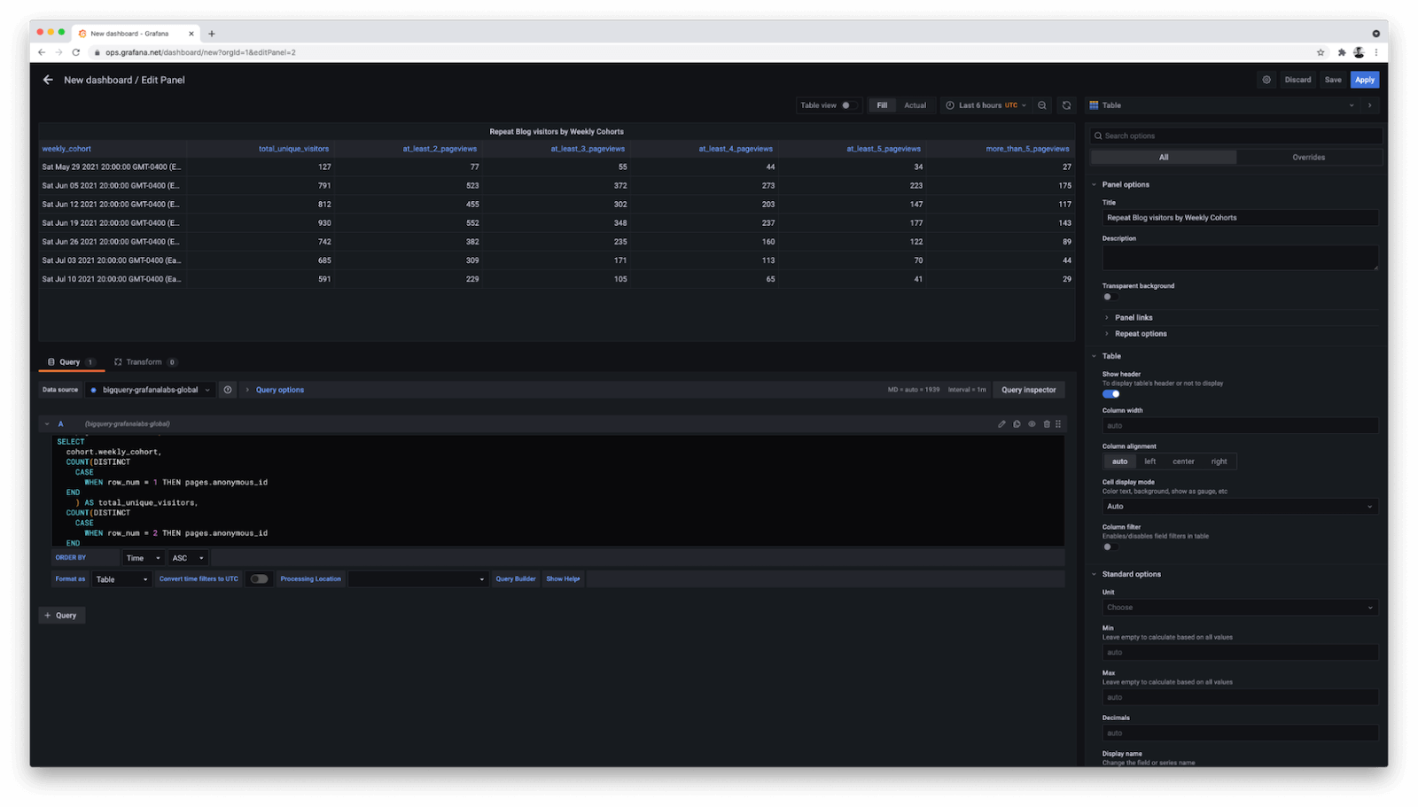
For the sake of simplicity, we are cohorting users by their first visit week. Then we look to see how many users in each cohort have more than one page visit. Over time, the older weekly cohorts should “bake” to show more pageviews if we’re consistently delivering valuable content on our blog and re-engaging our community.
Next, we’ll make one slight modification to our SQL: Instead of viewing absolute numbers, let’s calculate the percent of total visitors for each column. That way we avoid doing the mental math in our heads. (View the full SQL query on GitHub here.)
And voila! Here are the results inside a Grafana panel:

Styling cohort tables
Now that we have our cohort table in place, the last step is to add threshold-based background colors to the table cells so that our eye can easily parse the data when viewing our Grafana dashboard.
I recommend using an opaque green color to represent successful user outcomes and a brighter high-contrast color to represent cohorts that are showing few results. That way you’ll see over time how the cohorts “bake” from, in this example, bright yellow to solid green as users interact with the blog. This may reveal how content published or promoted during a certain week is better or worse than others at driving engagement.
To add threshold-based background colors, scroll to the bottom right of your “Panel options” until you see “Thresholds."
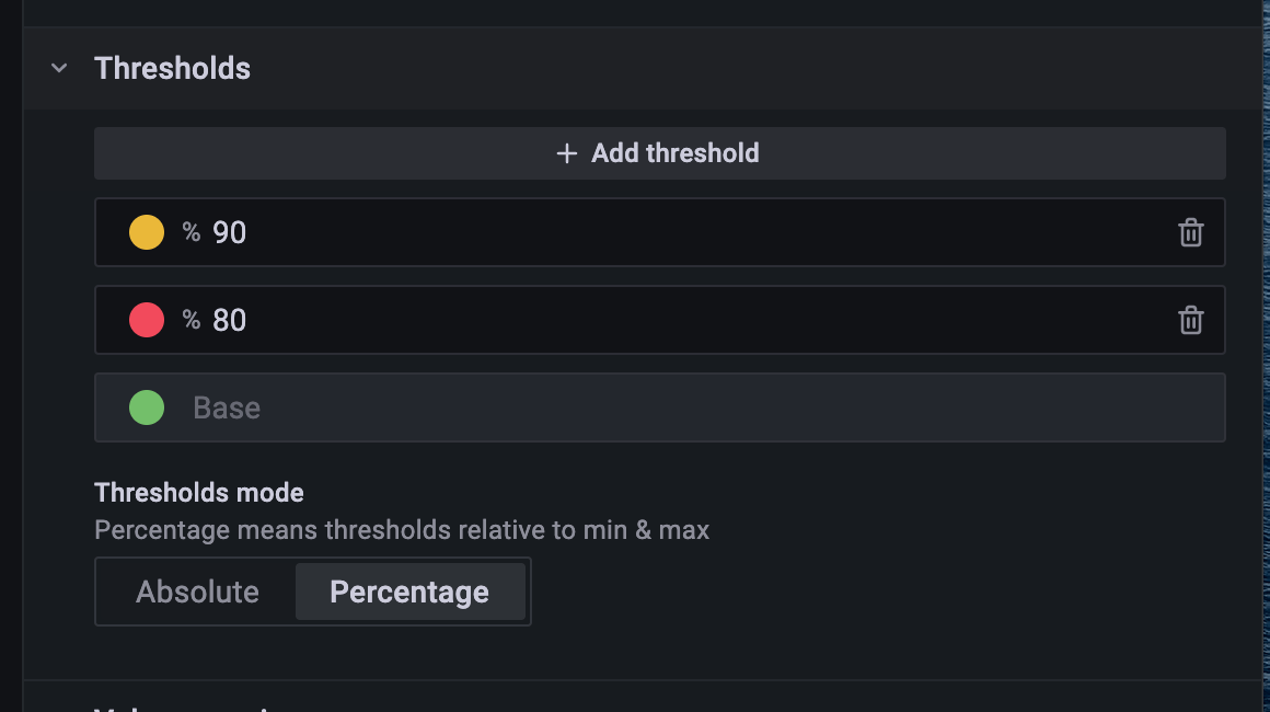
Since our data consists of decimal values representing percentages, you’ll want to set the thresholds to absolute decimal values from (0.0 - 1.0). For example, view the following 6 thresholds below:

Next, under the “Table” options, be sure to set the “Cell display mode” to “Color background (gradient)”

Finally, depending on your exact data values, you may need to add overrides on the columns to either change the unit type to Percent for your calculated columns, and you also may need to exclude the first two columns in the table from being impacted by the background color thresholds.
Here are the overrides on my cohort table columns:
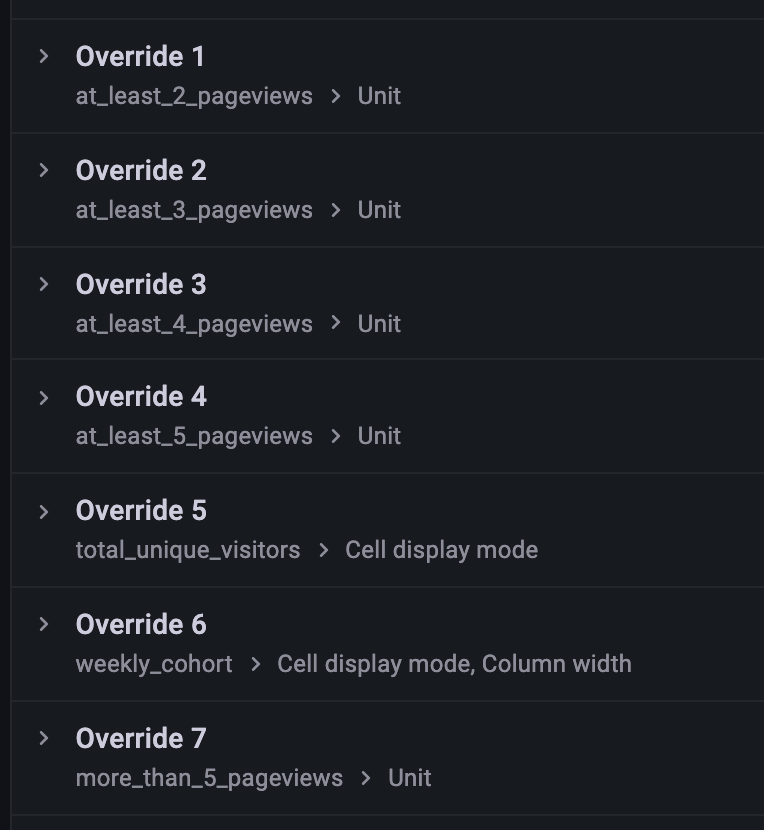
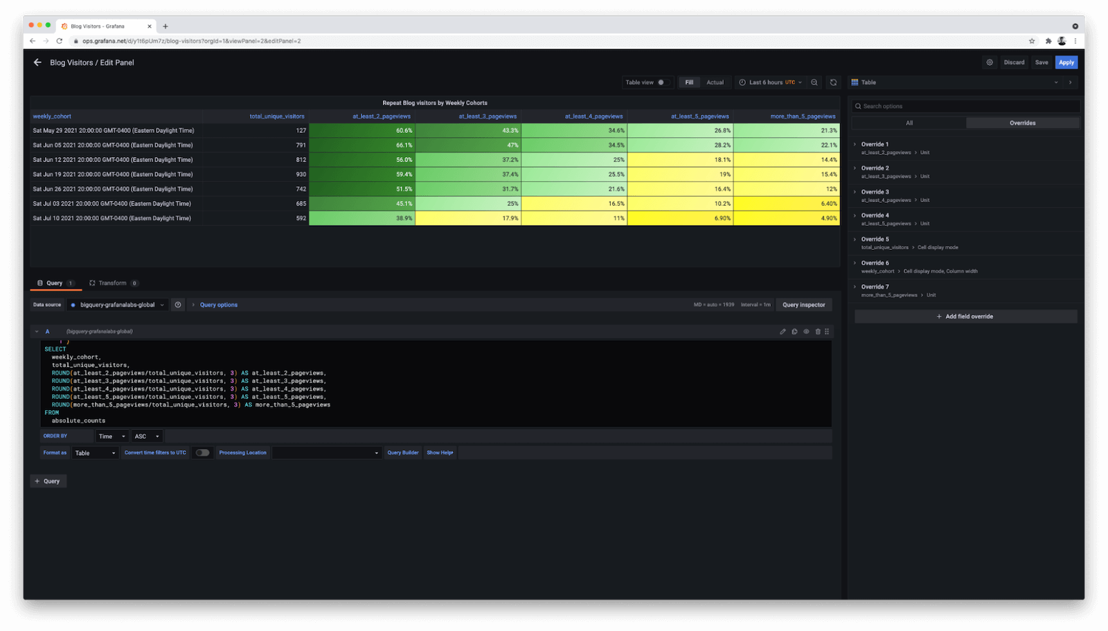
Let’s take a look at how our stylized cohort table turned out:

You’ll notice that during the week of June 5, 2021, there was particularly high engagement with the Grafana blog. More than 2/3 of Grafana Cloud users who visited the Grafana blog for the first time during this week went on to make a repeat visit, with 22% making more than 5 repeat visits. This is not a surprise coincidence: The start of GrafanaCONline 2021 occurred during this week, and the results are a testament to the engaging news and updates released on the Grafana blog during this timeframe.
That’s it! Pat yourself on the back if you’ve made it this far. You’re well on your way towards delivering great business intelligence results for your organization using Grafana.
