
The UX changes we made for Grafana 7.0 -- and what you can learn from them
Behind every part of Grafana, there are the ideas, creativity and commitment of the people who made it. While that includes code, it is not limited to it. Since August 2019, Grafana Labs has had a dedicated UX team, and we have been involved in countless recent features and improvements. We want to show you how we do our work, why you users are at the heart of everything we do – and most importantly, how design changes can make software better.
Panel edit redesign: Test your assumptions
A huge game-changer in improving your user experience is validating your ideas. This was the key to success for us when we redesigned the panel edit experience.
One of the major things you can do in Grafana is create and edit panels. Over the years, this core part of Grafana has changed a few times, bringing in a lot of sweat and tears from our developers:
This is how the table panel editor looked in Grafana v4.3…
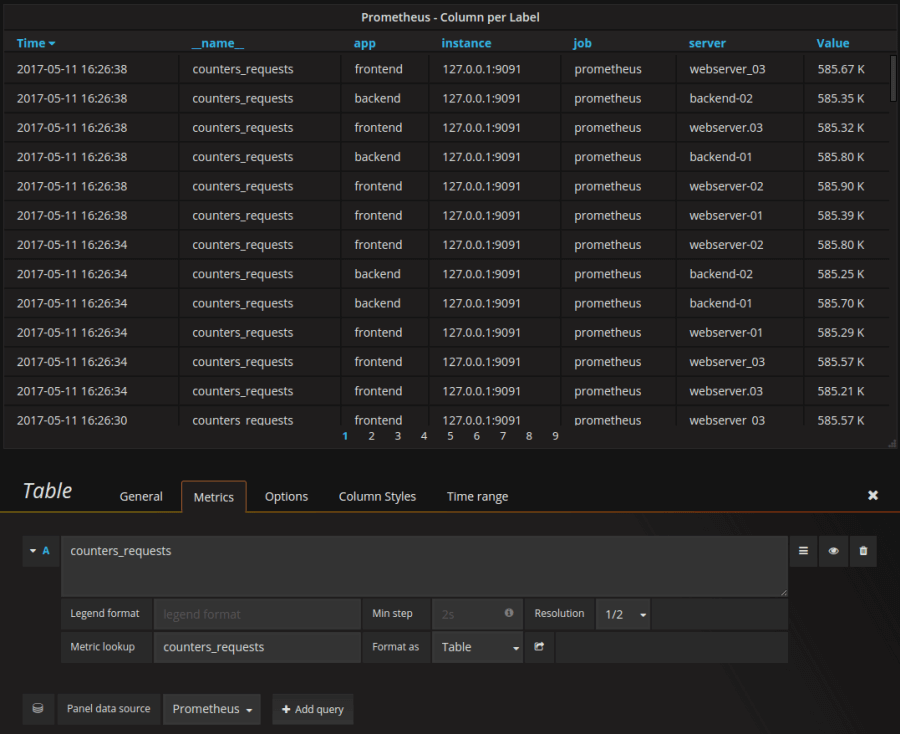
… and this is the full panel edit view for Grafana v6.0.

But all previous versions of the panel editor had one thing in common: We never fully validated our assumptions. Yes, we took GitHub and community feedback into account. Yes, we are dogfooding any and every part of Grafana we can. But still, take it from us UX designers – that’s not the same thing as actually looking at how others use Grafana. When you come up with design ideas, you end up bringing in all your previous knowledge. Also, user expectations and behaviors change over time, so your knowledge might not match what your users want. And that’s where your bias can sneak in. So we decided that we should talk to our users first.
The research helped us not only figure out what was lacking in the old panel edit, but also what the workflows of our users are. The layout with the full-width bottom pane made it hard to organize options in a scannable way. Therefore, it required lots of scrolling. Panel and dashboard level options were hard to tell apart. Icons were not intuitive; general options like title and description were hidden away. We also learned that Grafana shouldn’t have two options on how to start creating a panel because these options confuse people. Users want to understand better how to edit a panel that somebody else has created a long time ago. Some of these problems we anticipated, but a lot of them were new to us.
What we did
With our users’ help, we completely reimagined the panel editing experience. We created a new options panel on the right-hand side of the screen. This arrangement is crucial for our users because they can now tweak query and visualization hand in hand while creating a panel. But moving around elements led to even more questions. Do visualizations belong in the options pane or as a tab next to the queries pane? Where do variables go? How do the tabs behave for very narrow screen widths? Once again, we took these questions to the users – see what we showed them below.
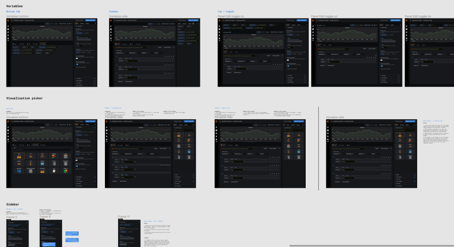
In total, we interviewed 17 people in two rounds of research. The results helped us answer (almost) all our questions and informed how we designed the panel editor of Grafana 7.0:

Our recommendation: The next time you believe you have the solution to a problem, talk to your users about it first! And since you readers are our users, if you have more feedback, reach out to us at ux@grafana.com!
Query history in Explore: Interdisciplinary teams make user research more productive
Testing assumptions is equally relevant when you design a feature from scratch. You can do that by taking a design idea and talking to people about it. That’s what we did for the panel edit experience. Or you can talk to people about how they do something and how they imagine a solution could look like. We used this kind of exploratory research for the query history feature – in an interdisciplinary way.
For exploratory research, UX designers or UX researchers tend to do all the work. They come up with theses to confirm. They compile the research questions. They conduct the interviews. As a result, the designers are the ones who know the users best. If the designers are the only ones who are creating designs, that is not a problem. But at least at Grafana Labs, developers write most of our design documents. Even the rich history feature is a joint effort between designers and developers. How can a developer make good design decisions when they only have second-hand information about the users?
What we did
We split up the work to create the rich history very evenly between design and development. Ivana Huckova, the responsible developer, did the competitive analysis and helped run the user research. After conducting half of the interviews, she brought a lot of knowledge of our users’ needs to the table. For example, our thesis that there are two types of querying behavior – either running a lot of different queries on a per-use basis, or always running the same recurring queries – could be validated thanks to the insights from her interviews. So once we started ideating, we were able to co-create in a truly joint effort.
You can read more about the resulting feature here.
And Ivana, who doesn’t interview users on a regular basis, can use this next-level empathy for many projects to come.
Meta analytics: Privacy-friendly analytics can bring a lot of value
Most people in tech are probably a bit skeptical about being tracked in their usage. We know we are – privacy first! But there are ways to use analytics for good. Our new meta analytics Enterprise feature has the power to significantly improve the user experience, especially for Grafana instances with hundreds of dashboards and users.
Until now, Grafana has been all about looking at and understanding your data. But it didn’t help you understand how you and your organization are using Grafana. Of course, privacy is a top priority for us at Grafana Labs. So we haven’t collected any usage data in Grafana so far. But zero metadata means that dashboard management has basically not existed. It is impossible to identify which dashboards and data sources are being used, let alone by whom and how often. So there is no way to tell whether and when to remove them. This leads to an ever-growing number of dashboards, and the more dashboards you have, the harder it is to keep track of them. Some admins we talked to estimate that almost 60% of dashboards might not get used at all.
One user said, “Right now, when no one is using a dashboard, I delete it and pray that nobody complains." Dashboard insights could help solve that problem. And in our user research, we found more upsides. Analytics can provide insights on who are experts for certain dashboards and data sources, or who is working on the same thing. This adds a social layer to Grafana. Apart from that, these insights can help you find out which dashboards are useful, or whom you can ask for help. And they can help you find errors way more quickly through the new enhanced search using this meta data.
What we did
We collected lots of input from our Enterprise customers. We asked them what are the most challenging aspects of managing big instances of Grafana. Their problems were extensive, but so were their ideas on what could help them. They gave us fantastic feedback on the concept we showed them (concept image), and shared what kind of information would be useful for them to effectively manage their instances. Based on that, we introduced the contextual application of this metadata. Now, users can use search and see which dashboards are being used and which have been stale for months. We added a dashboard insights drawer with the most important usage data, and a visual indicator that shows recent users per dashboard.
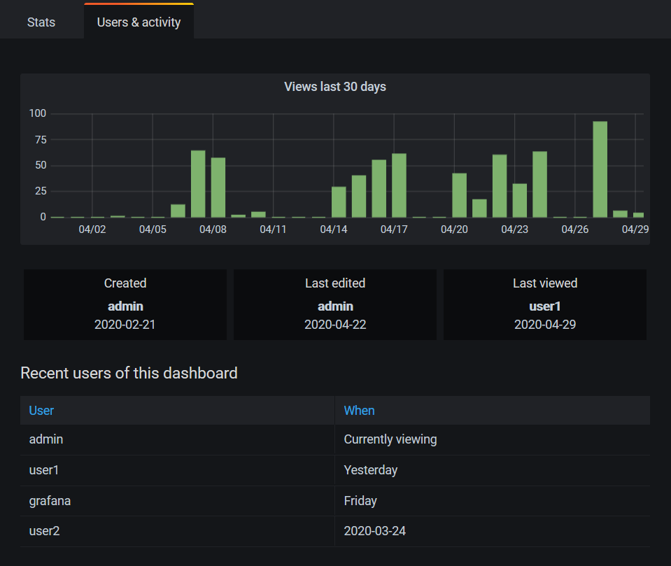
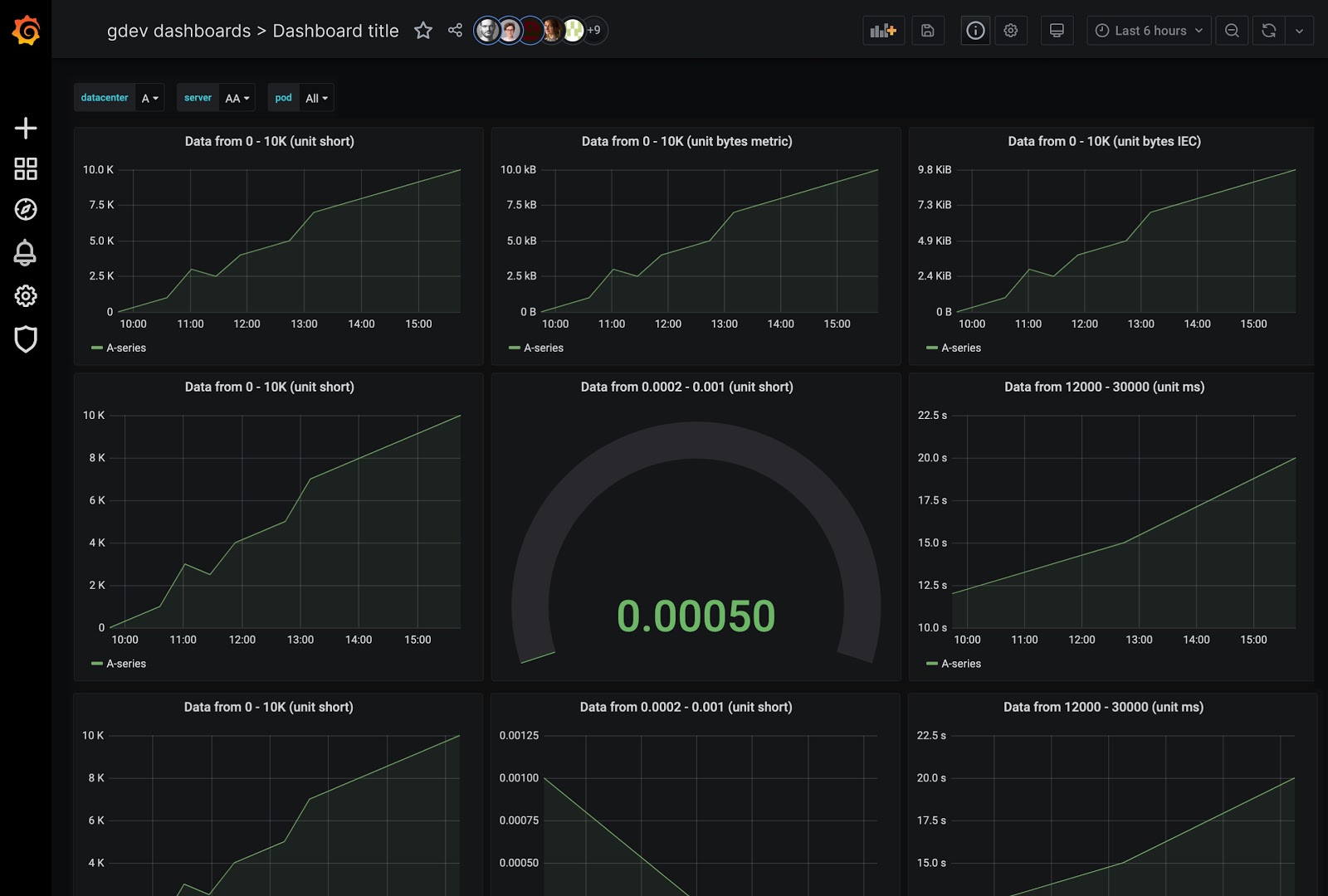
With all of these features, we hope to give our Enterprise users an even better understanding of how they use Grafana. And as you can see, metadata doesn’t have to be a privacy issue. Think “The Force”: Don’t go to the dark side but apply it wisely, and you will give your users great power.
Look and feel: Create a branding that works for all your touchpoints
The new 7.0 is not only about big features, but also small details – which, once combined, make a big difference. We improved the look and feel with multiple tweaks. This makes your software not only visually appealing, but also helps users connect with your software and your brand. And visual consistency makes digital solutions more intuitive.
You might have noticed that we changed the look and feel of Grafana.com recently. Our brand and offerings had evolved, and the website as well as Grafana needed to evolve with it. In the older versions of Grafana and the website, we used various types of icons. Their visual styles didn’t align and their implementation didn’t either. Cue extra work for the frontend team. Illustrations didn’t use the same color palettes, so some areas were a bit too bright and colorful. This made it hard for our users to navigate.
What we did
We improved the look and feel in several ways. We improved the colors, addressing accessibility issues and significantly reducing the shades of grey used in Grafana. We introduced a new icon set for the entire Grafana interface and made our use of color more consistent. Also we’ve created new and improved visualization icons – you might have seen them in Grafana 7.0 or on Twitter.
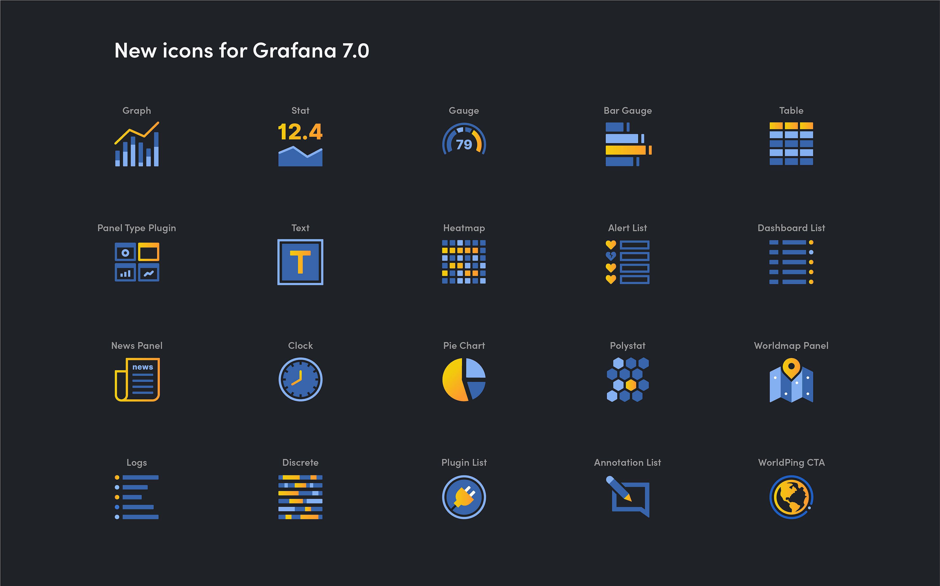
Having a consistent brand design helps users in many proven ways. It doesn’t only help form the first impression but also reduces confusion. And it is becoming the norm: Especially for younger people, a consistent brand experience is a must-have. So if you ever wondered why everything has a brand nowadays – it’s not just to look nicer!
A big thank you goes out to the makers of our new icon set Unicons, done by Iconscout. We wanted an open-source-friendly icon set, but we knew that we would need some custom icons to make it work in Grafana. They had their designer create them for us and were very open to our feedback and nitpicks. Thanks, Iconscout, Grafana wouldn’t look the same without you!
Grafana UI library: Use a design system
We at Grafana Labs are in the very privileged situation that we do not only design for ourselves. A wonderful community is supporting our work and building on top of it. That means that the tools and information for that should be freely available to use. So with Grafana 7.0, we released the first version of the Grafana UI library.
Grafana has grown organically since its creation in January 2014 (according to a now-offline calculation once made by Eric Riess, that’s almost 30 internet years!). With it, the number of people working on it has also grown. Different areas of Grafana use similar but not quite identical elements. Even though we have used a component-based system for a while, we didn’t have a single source of truth. We didn’t know which components we have and how they are supposed to look. Any rules we came up with weren’t documented – even within Grafana Labs. What about the people outside of the company? Plugin developers out there need to use the same elements.
A wise comic book author put it this way: “With great power there must also come great responsibility.” With our growing user base, our responsibility grows as well, and we want to take it as it scales. You have done a tremendous job figuring out how to best use the Grafana design. But we thought it’s about time that we clean this up a bit and make the process easier for everyone.
What we did
Our designers and developers joined forces and started creating a documented design system. It can help both designers and developers, Grafanistas as well as community members. The first version of our public component library is live in Storybook now! And our plan is to update it as Grafana grows and evolves. We’re hoping to save time and energy maintaining and updating components. You can save time and energy too: It will answer your UX questions and let you know how to use which component when. And soon, design mockups, Grafana interface, and plugins will be more in sync than ever before!
If you think the design system might be useful to you, please get in touch with our UX team. You can reach us via e-mail at ux@grafana.com, on GitHub, or in our public Slack! We really appreciate feedback to help us make it even better.
There’s more where this came from
As you can see, we have been quite busy making Grafana better. And we will tell you more about it right here on the blog! Be prepared for all the dirty details and behind-the-scenes content of how we design and improve features at Grafana Labs. In the meantime, enjoy Grafana 7.0 and don’t forget to leave us feedback! 😉 You can reach us via ux@grafana.com or in the #grafana-fails channel of the Grafana public Slack.


