Behind the Grafana UX: Redesigning the Thresholds Editor
As part of building the new Gauge panel in React, we also wanted to update the panel controls, especially the thresholds control.
A threshold in the context of Grafana is simply a value that, when exceeded, a condition occurs. An example would be a single stat panel with a green background that changes its background color to red when a threshold is breached.

Above is the old implementation that is still used in the single stat panel. There is an input field where the user writes two values separated by a comma. To indicate to the user how it’s used, there is a tooltip that explains how it works. Underneath, we had three color swatches that opened a color picker if clicked on. The color on the left is the base color. The color in the middle is the first threshold color. The color on the right is the second threshold color. This is something that is not clearly indicated.
The implementation was not intuitive and often difficult to understand. The control also only allowed for two thresholds.
There were three key improvements we wanted to make:
- It should be easy to add thresholds
- Users should be able to add as many thresholds as they want
- It should also be clear how the thresholds work. There should not be any need for a tooltip
Solution #1: The List
First, we looked at how competitors handled thresholds to see how their solutions could work for Grafana. The initial result the team came up with was to create a list of thresholds.
A new feature here was the “Min” and “Max” values. In the version we were using, the “Min” and “Max” were in a different control (Gauge control).
We started with “Min” at the top and “Max” at the bottom, and the user could add thresholds in the middle.
It worked and was an improvement over what we had. But the result wasn’t something we were happy with.
One big issue here was where to put the “+ Add” button. Users want to have the button where the action happens, but not having the button at the bottom felt weird. Having both “Min” and “Max” at the top solved this. But what if the user wanted to add a threshold between two other thresholds?

Solution #2: The Horizontal Line
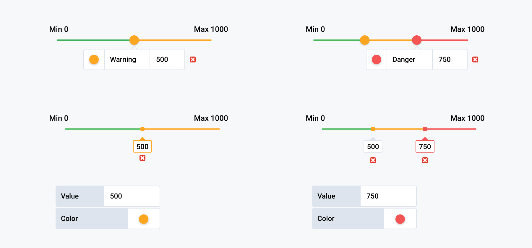
So we went back to an earlier idea, which was simply to have a line that the user could click on to add a threshold, a bit like gradient controls in drawing softwares.

The big appeal of this idea was that the line would clearly show what the color meant and how it would be shown in the Gauge panel.
The first problem, however, was how to indicate to the user to click on the line.

The nice thing about this solution is that users can clearly see what the colors mean. Orange is from 500 up to 750, and above 750 it would switch to red.
The user can also choose where to add new thresholds. For example, a user can add a threshold between the 500 threshold and 750 threshold or after the 750 threshold.
But it still wasn’t clear to users that, depending on where one clicks, it would give them a different result. So where should the information live?
In this example, the info for only one threshold is shown at a time. Also, the “Min” and “Max” are set in the Gauge control.
So what about combining the line solution with the list feature we had before? How the threshold works is shown, which is nice. But we still had the problem of where to place the “+ Add” button.

Here, we also set “Min” and “Max” in the thresholds control. This will be discussed further down.

With this combined solution, however, another problem emerged with the horizontal line design: It limits the amount of thresholds users can add.
Solution #3: Rotate the Line
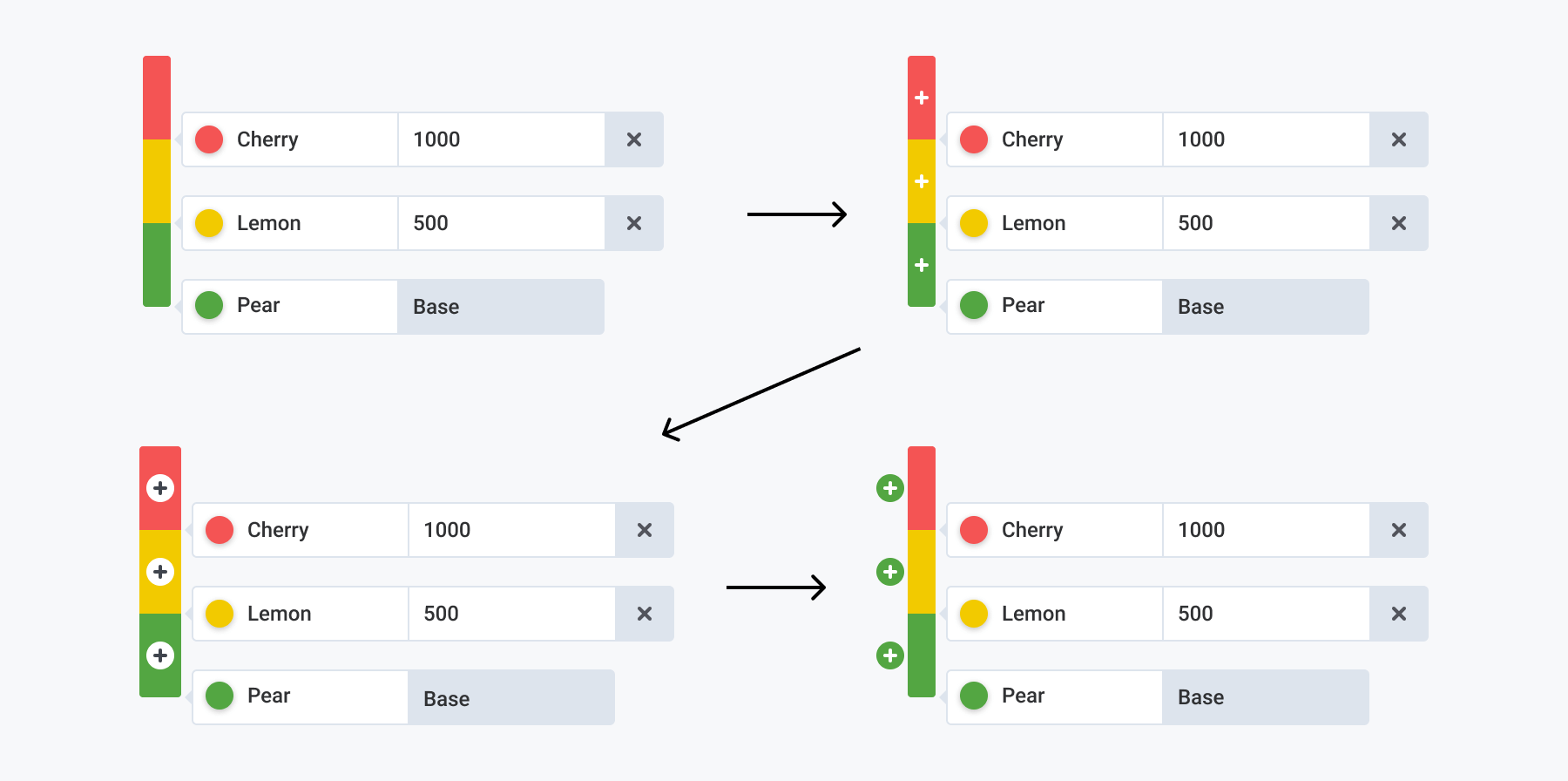
By rotating the line and combining it with the list we had a breakthrough.

The thresholds instantly became clearer. What is seen in the control is what will be seen in the Gauge.
But we were still left with the issue of how users would add new thresholds. The idea of clicking on the line had a bigger appeal than an “+ Add” button.

Also an ongoing discussion throughout this whole process was whether the thresholds control should set the “Min” and “Max” values. A “Min” value made sense at first, but since “Min” and “Max” values here were Gauge specific and other panels were going to use the thresholds control, we removed the “Min” and “Max” and added a base color.

The idea of clicking on the line to add thresholds was still not ruled out. But making that function clear to the user was still difficult.
So we evolved the design to add the “+” sign to the line, which eventually became a “+” button next to the line.
The Final Design

The single stat panel still uses the old thresholds editor so you can compare it with the new thresholds editor, which you can find in the Gauge or Bar Gauge panels.
Grafana Labs co-founder Torkel Ödegaard has also been experimenting with different ways to improve the UX of the single stat panel so there may be more updates to share soon.
In the meantime, if you have any feedback about the new thresholds editor – or Grafana in general – share them here.


