Sneak Preview of New Visualizations Coming to Grafana
We have been working on a new panel and component architecture for the last half year (or more), and it’s finally starting to bear fruit in terms of new visualizations and capabilities.
Meet the Bar Gauge
We don’t introduce totally new ways to visualize data very often, so we’re excited to share with you this new addition to the family of single value type of visualizations (Singlestat, Gauge): the Bar Gauge.
With a traditional circular Gauge, it’s not always easy to see the levels from a distance. It works when you have a small square area, but when you want something that can stretch or stack efficiently, it doesn’t utilize that space very well. This led me to start thinking about a straight bar gauge.
Bar Gauge Basic
This visualization started simple: It looks very similar to a bar chart. There is a minimum and a maximum, and each bar color depends on the thresholds defined and the colors assigned to them.

And unlike the graph panel, you can stack these horizontally.

Bar Gauge Retro LED
But I wanted a different mode that was more visually interesting. I started thinking about old stereos that had these physical spectrum displays with discrete LED cells.

I started trying to mimic that in the visualization, creating these cells that light up if you reach a certain threshold. The nice thing about this way of visualizing a gauge is that you can see the threshold boundaries in the unlit cells. You can easily see if it’s close to warning or to being red. Also, it just looks really cool! For a few examples of this display mode, check out the image below.

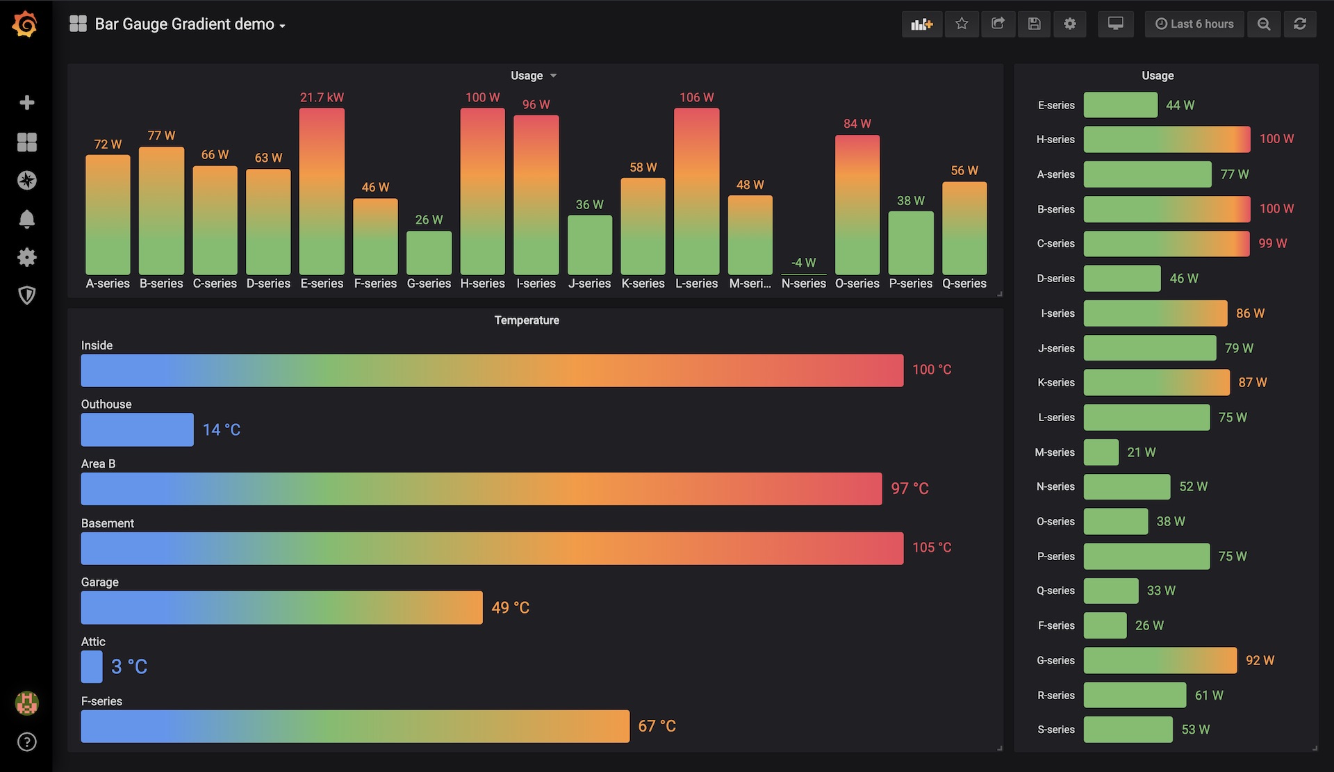
Bar Gauge Gradient
Next, I turned the thresholds into a gradient. Instead of a single color, you can start with a pre-defined “OK” color and add different colors to different thresholds. You can go from green to yellow to orange to red, or the reverse, or any other combination. It’s super flexible, and you can have any number of thresholds. I think this turned out pretty well.

Threshold Editor

All the thresholds for these visualizations are defined using the new threshold editor we introduced for the new Gauge panel in version 6.0.
Animations
Adding css transition animations was a simple one-line change, but it made this dashboard look quite nice. So if you have an auto-updating dashboard, you can get animated transitions between different states.
Other Visualizations in the Pipeline
I shared a preview of the Bar Gauge on Twitter recently, and the response was… positive.
— santak (@santak) March 15, 2019
We’re excited to be working on new core visualizations again in Grafana. It feels like it has been years since there was a substantial update on this front. (Because it has been!)
- We plan to update the Singlestat panel as well, to align its options UI with that of the new Bar Gauge and Gauge panel.
- The new Gauge, Bar Gauge, and Singlestat panel will be able to repeat vertically or horizontally for every series, table, column, or row.
- The Table panel will be rewritten with virtualized rendering (faster without paging) and new features.
- Some form of multi graph visualization (many graphs stacked) is coming.
- We’re working on improved support for non-timeseries data.
Try It Out and Give Us Feedback
This new Bar Gauge panel will ship in beta form in the next Grafana Release (v6.2), but you can try it right now by downloading the latest nightly build. Then in your config / env settings, you can enable alpha panels.
[panels]
enable_alpha = true
Via ENV variable set GF_PANELS_ENABLE_ALPHA=true.
Please open bugs or feedback issues on GitHub.
Until next time, happy dashboarding!
Torkel Ödegaard


