
Friends don't let friends abuse pie charts
Pie charts have been a popular feature request for Grafana, both on our GitHub as well as at conferences and customer meetings. We’ll hear things like, “We love Grafana, but we need pie charts for the business guys to use it,” usually accompanied by an eye roll or sigh.
We agree. Pie charts are terrible, but they have such a bad rap because people constantly use them incorrectly. We find ourselves having long conversations exploring the vice and virtue of the lowly pie chart, and here’s our perspective.
Don’t get in the way of the data
Our overarching mission is to Democratize Metrics, but we have a second motto called Don’t get in the way of the data. This internal mantra begs us to always ask: Are we doing what’s best for the data? Grafana is a tool to beautifully display metrics, but it’s also a vehicle to help people quickly answer questions and enable them to ask new ones.
We often make decisions to try and guarantee the success of the user. Most folks probably don’t realize the amount of effort and testing that went into the Grafana color palette, making sure those colors could work alongside each other on the same graph in harmony, on dark and light themes. It’s a small touch, and one that I believe helps make Grafana successful – you can build effective and beautiful graphs without reinventing the wheel yourself.
Similarly, when we think about the time and effort of introducing new panel types, we are looking to maximize success of displaying the data. Pie charts (despite being used in every management presentation, ever) often get in the way of the data. They increase cognitive load for anything more than 2-3 segments, they are ill suited for time series data and practically useless for those who are color blind.
A table is nearly always better than a dumb pie chart; the only worse design than a pie chart is several of them […] Given their low data-density and failure to order numbers along a visual dimension, pie charts should never be used.
- Edward Tufte, The Visual Display of Quantitative Information
Why we believe pie charts are bad
There are many well-researched, firmly held beliefs on why pie charts are bad, but here are the reasons why we believe they are ineffective within Grafana:
Visual CPU overload
We use the term Visual CPU a lot here, which is akin to cognitive load. For dashboards, it’s all about how quickly you can get the information into the person’s brain. Pie charts make the brain take apart the pieces and rearrange them in a comparable manner, which gets in the way of letting your brain actually do the comparing [1]
Over-reliance on color
When you get past a few clear segments and more colors are introduced, you ask the user to work to determine which color goes with which piece. Further, for the color blind among us, pie charts create more problems than they solve. Color can a fantastic way to convey information, but it must be supplemental.
Ineffective for time series data
Grafana speacializes in time series data, and with that, many of the metrics being displayed have some notion of time. Pie charts can’t do it.
Taking an example, let’s look at the Grafana GitHub issue requesting pie charts (issue#568), plotting the density of discussion by quarter, as a pie chart:
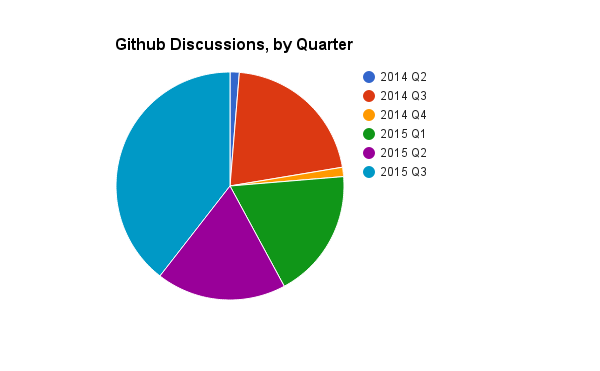
Quick, was there more discussions in 2014 Q3 or 2015 Q2?
Compared this to plotting the same data as a bar chart:
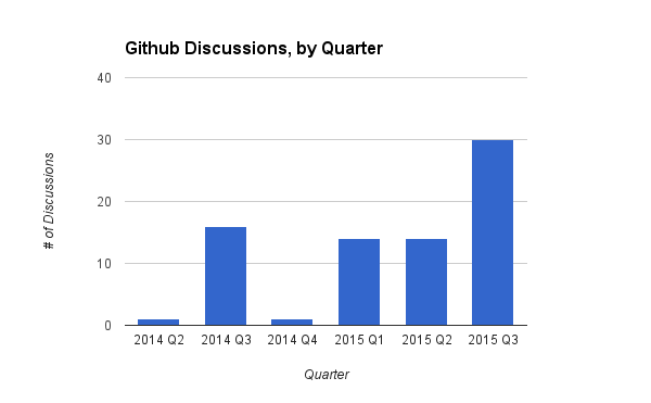
Immediately, you are able to see the difference between Quarter 3 of 2014 and Quarter 2 of 2015. Your visual CPU draws the line across and instantly knows which is larger.
Pies aren’t meant to grow
Grafana is alive! Your query may only have a couple series when you create the dashboard, but you don’t always have control over how it may grow. If that query ends up with more series over time, you’ve created a visualization that cannot scale with your data.
Pie charts obstruct data when there are more than 2-3 clearly defined segments. Anything more and it becomes nearly impossible to quickly discern the differences in values. Using that same GitHub issue, let’s look at the density of comments by user:
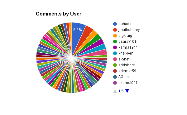
That’s one useless pie.
In this case, a table can carry so much more data in an actionable way. As many of the users only have one comment, it’s much more interesting to see specifically who is the most active.
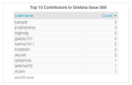
In related news, Grafana now has table panels!
Pie charts should not be used to illustrate complicated relationships among many segments. It is easier to compare two vertical bars than two slices in a pie.
-Dona Wong, The Wall Street Journal Guide to Information Graphics
A place at the table

Should pie charts be burned from the face of the Earth? Of course not. They can be an effective visual tool when used properly – but people need to understand the right times to use them.
So when pie charts are eventually added to Grafana, it will be important to help people to make the right panel choice. Are you showing time series data? Are there more than 2-3 distinct segments? Will these segments grow over time on this query? Would a traditional bar chart be better for this data? A table? A singlestat panel?
Or maybe for that one metric, on that one day, the best visualization really is a pie chart. And if anyone gives you a hard time about it, you can feel confident telling ’em why.
When will pie charts come to Grafana? Keep an eye on the GitHub Issue.
For further reading:


